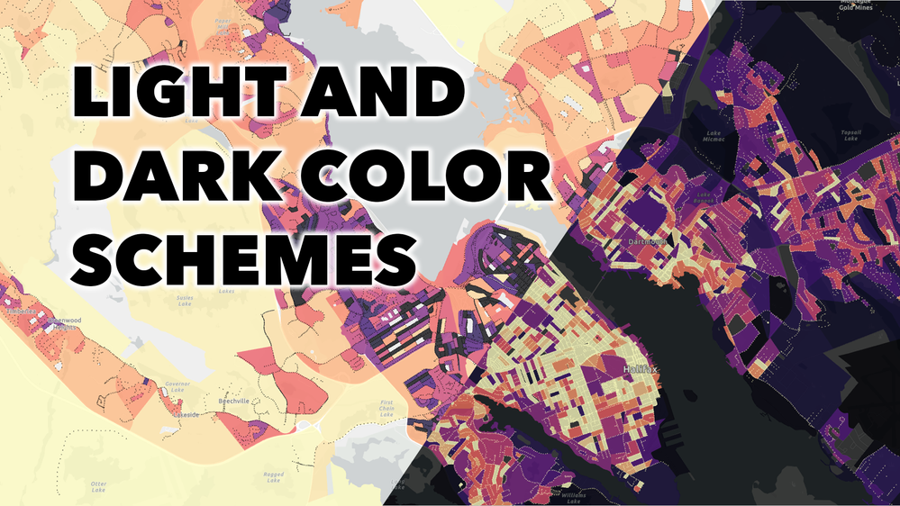
In map design, the choice of color scheme is dependent on the basemap. If you have a light basemap, most people will interpret dark colors to mean “more” and light colors to mean “less”. If you have a dark basemap, the opposite is true. The video below shows examples of designing with light and dark color schemes in ArcGIS Online and ArcGIS Pro.
(Watch the video with subtitles here: https://mediaspace.esri.com/media/t/1_zvd6e57g)
Takeaways:
- If you’re using a light basemap, dark colors will stand out more and so appear to mean “more”.
- If you’re using a dark basemap, light colors will stand out more and so appear to mean “more”.
- You can flip color schemes to control which end equates to more and which equates to less.
- The subject of your map can sometimes override these rules.
- In ArcGIS Online, you can search for color schemes designed specifically for light or dark basemaps.
- If you’re struggling to find the right color scheme, try changing the basemap.
- Colors all look different against different backgrounds.
There are a lot of other considerations that go into designing choropleth maps. You can learn about some of them in this related video: Configure a choropleth map.
You can follow along with the map in ArcGIS Online or in ArcGIS Pro.
You can find the data at Halifax Open Data.
You can find more videos like this one on the Quick Cartography playlist.