Choosing colors might be the hardest part of mapmaking. At least I find it challenging. A trick I often use to make this part of cartography easier is to choose similar colors to represent similar things and different colors to represent different things. People naturally assume that things that look similar are similar, and you can use this assumption to your advantage to make a more intuitive map.
I thought I’d make a video about this technique, but I had too many examples of how helpful it can be, so I ended up with three videos instead! In them, I use both ArcGIS Pro and ArcGIS Online to demonstrate the power of color matching in maps.
All of the data in these videos is from Halifax Open Data: https://catalogue-hrm.opendata.arcgis.com
Follow along with the map: https://www.arcgis.com/home/item.html?id=1d64e0d983dc4861b3276c9602dab43c
To watch the video with subtitles, visit https://mediaspace.esri.com/media/t/1_gvb3mgan
Follow along with the map: https://www.arcgis.com/home/item.html?id=4d49bc7574ae4b62bf405e2d44a007df
To watch the video with subtitles, visit https://mediaspace.esri.com/media/t/1_5b5y6zws
Follow along with the map in ArcGIS Online: https://www.maps.arcgis.com/home/item.html?id=c8853977fdc3407f8cee3ff3fbd64ecc
Follow along with the map in ArcGIS Pro: https://www.arcgis.com/home/item.html?id=616b2d3b71df44e7981a48e7b885244e
To watch the vidoe with subtitles, visit https://mediaspace.esri.com/media/t/1_zhzrsu8a
Learn more
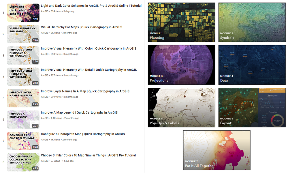
You can find more map-making skills on the Quick Cartography playlist, and on the Introduction to Cartography site.
