- Home
- :
- All Communities
- :
- Products
- :
- ArcGIS Spatial Analyst
- :
- ArcGIS Spatial Analyst Questions
- :
- Choosing output resolution for interpolated surfac...
- Subscribe to RSS Feed
- Mark Topic as New
- Mark Topic as Read
- Float this Topic for Current User
- Bookmark
- Subscribe
- Mute
- Printer Friendly Page
Choosing output resolution for interpolated surface
- Mark as New
- Bookmark
- Subscribe
- Mute
- Subscribe to RSS Feed
- Permalink
- Report Inappropriate Content
Hi all,
I'm interpolating series of bathymetric points using kriging, and then exporting my data to raster. I'm struggling to determine an appropriate output resolution that is supported by the characteristics of my input point data. Does anyone have any advice? Two factors I'd like to take into account are 1. the density of the input points (such that increased density = increased resolution, and vice versa) and 2. the 'complexity' of the seafloor (or other real-world surface), perhaps calculated as the variance of the z-value of input points (in this case depth). In this regard, a less complex surface (low variance) could be interpolated at a higher resolution because we'd have more confidence that z-values will remain consistent, and a more complex surface (high variance) would be interpolated at a lower resolution to avoid introducing false precision.
RE factor 1, I read a great paper - Hengl, T. 2006. Finding the right pixel size. Computers & Geoscience. 32: 1283-1298 - that suggested, "...the grid resolution should be at most half the average spacing between the closest point pairs...". I've been working off this calculation, but would welcome other ideas.
RE factor 2, Any ideas for how to use input point variance as a scale factor for resolution size? Has anyone heard of this being done before?
I'd be glad to hear of any other factors I should take into consideration. Thank you.
- Mark as New
- Bookmark
- Subscribe
- Mute
- Subscribe to RSS Feed
- Permalink
- Report Inappropriate Content
I think the resolution depends not only on the spacing of the input data, but also on the precision of measurement and its intended usage.
Will a variable resolution size aid its usage? How would you implement this in a raster (if a single raster can only use a single pixel size)?
Some reading on the method for interpolation (not sure if Kriging is the way to go, since the resulting value at the observation may differ from the observation):
- Mark as New
- Bookmark
- Subscribe
- Mute
- Subscribe to RSS Feed
- Permalink
- Report Inappropriate Content
I have seen point 1 used on many occasions as a good rule of thumb. I would be as concerned on the distribution of the points pattern within the area you are trying to interpolate...not forgetting that you spend a great deal of time research the appropriate kriging method for your data. Kriging is not something to be taken lightly, you can rapidly generate a really poor interpolated surface as with any other interpolator.
- Mark as New
- Bookmark
- Subscribe
- Mute
- Subscribe to RSS Feed
- Permalink
- Report Inappropriate Content
Kriging is used to fool the innocent.
And you can take a gratifying amount of time messing around with it.
- Mark as New
- Bookmark
- Subscribe
- Mute
- Subscribe to RSS Feed
- Permalink
- Report Inappropriate Content
hahaha I love it...I am going to use that in class Neil 
- Mark as New
- Bookmark
- Subscribe
- Mute
- Subscribe to RSS Feed
- Permalink
- Report Inappropriate Content
Apologies to Heather for rather hi-jacking her thread.....
Thanks to Xander for providing that link to the thesis on hydro surveys in a shipping channel.
I took some time to read through it.
Despite reams of x-validation stats and what-not, it took till page 80 odd to actually see some picture of what the actual interpolations looked like.
If the author hadn't actually placed a polygon on each map showing where the "channel" was supposed to be, it would be hard to spot! So, from a visual perspective, non of the techniques discussed did any sort of reasonable job. If fact, awful.
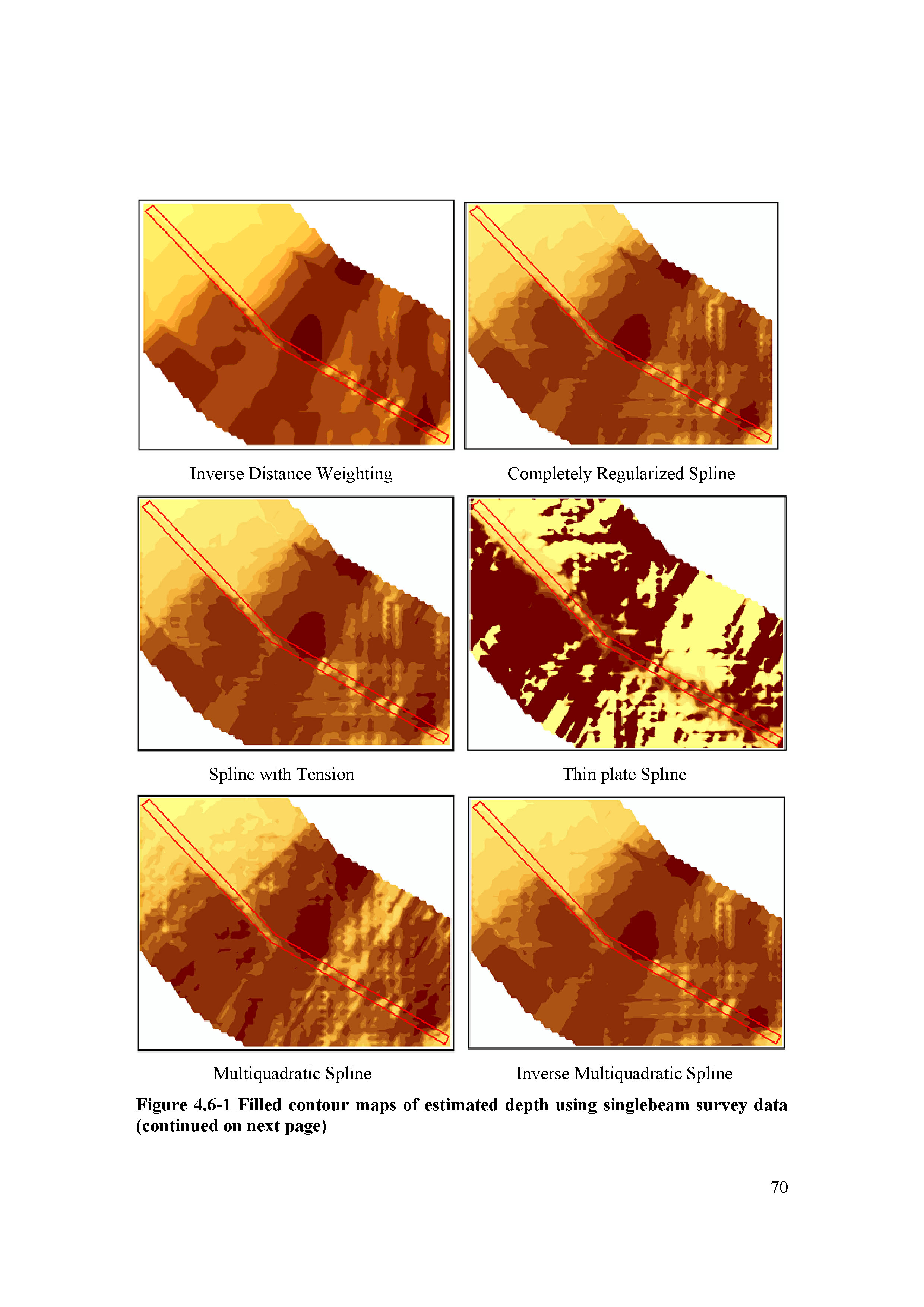
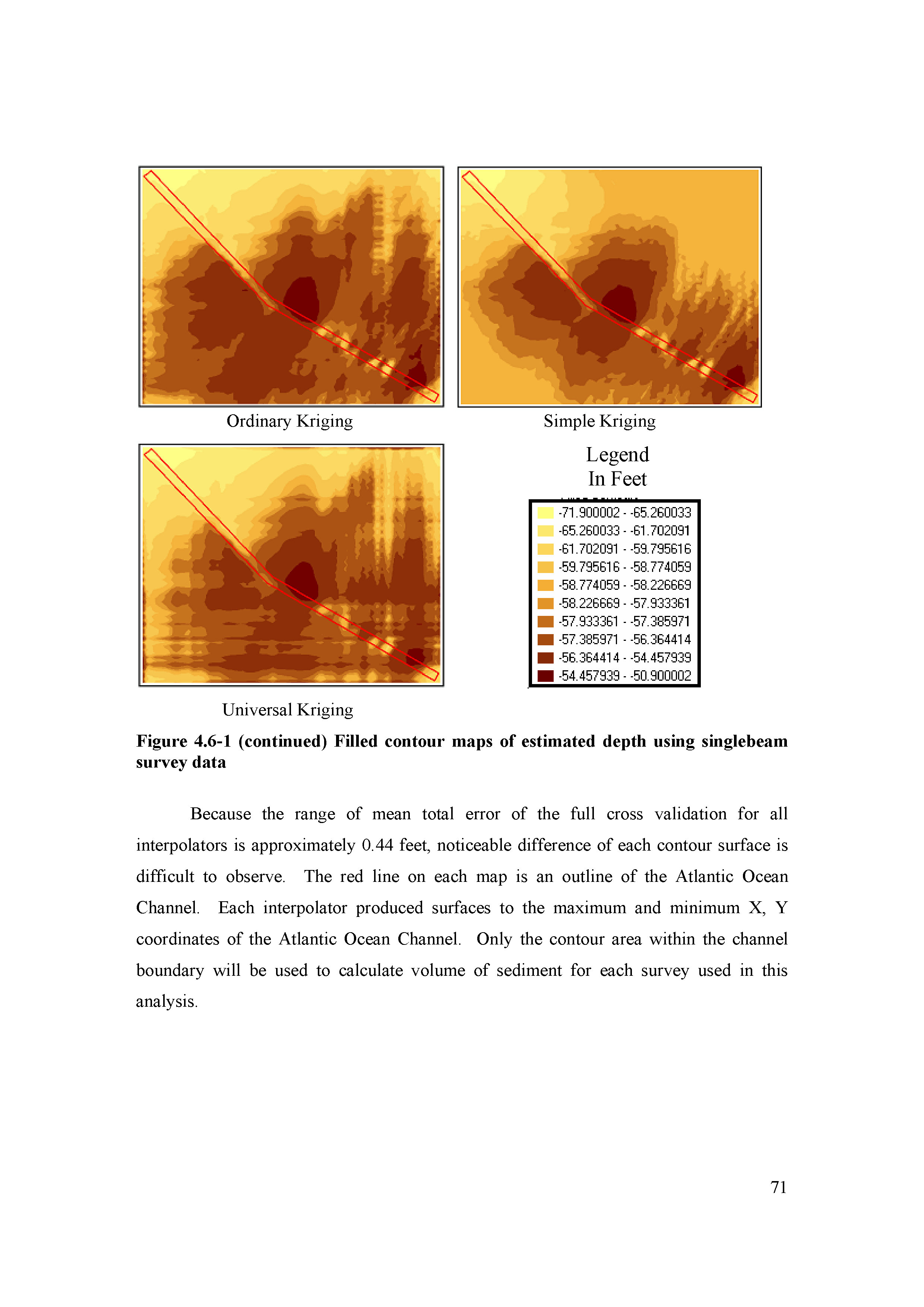
I was particularly amused by the universal kriging version.
This highlights a particular problem with traverse based data like this. High density of sample points along traverse lines, and a large distance between lines (very high aspect ratio). Non of the traditional interpolation techniques are good at making sense of this sort of data.
Perhaps Dan would like to make a separate thread for these sorts of discussions.