- Home
- :
- All Communities
- :
- Products
- :
- ArcGIS Pro
- :
- ArcGIS Pro Questions
- :
- Symbolizing features with multiple attributes
- Subscribe to RSS Feed
- Mark Topic as New
- Mark Topic as Read
- Float this Topic for Current User
- Bookmark
- Subscribe
- Mute
- Printer Friendly Page
Symbolizing features with multiple attributes
- Mark as New
- Bookmark
- Subscribe
- Mute
- Subscribe to RSS Feed
- Permalink
- Report Inappropriate Content
Hello esri community,
I am trying to highlight chemistry sampling data for my organization. Each station point has several "chemistry analytes" that needs to be displayed. Different sampling labs measure different analytes for each station.
I want to display the data in a way so that my organization knows which analyte has NOT been sampled.
My question is, is it possible to display what chemistry parameters are missing using pie / bar chart symbology given the current data table I'm working with? Can I accomplish this using any type of Arcade expression? I just want to understand how to best approach this.
Attached is the data table I'm working with, a screenshot of my work so far, and a screenshot of an ArcMap bart chart symbology that I would like to emulate.
Best,
Mina
Solved! Go to Solution.
Accepted Solutions
- Mark as New
- Bookmark
- Subscribe
- Mute
- Subscribe to RSS Feed
- Permalink
- Report Inappropriate Content
One possible way:
- set the layer's definition query to remove all parameters you don't want to show
- create a symbol that shows text next to a colorable symbol, save to style
- apply that symbol to your layer
- enable symbol property connections
- change to the text element, set the text string to the parameter field
- change to the symbol element, set the color to the Arcade expression


var status = $feature.submissionstatus
if(status == "complete") { return "green" }
if(status == "rejected") { return "red" }
return "grey"
- change to the complete symbol, set the y offset to the Arcade expression


var offsets = {
"Chlorinated Hydrocarbons": 0,
"Inorganics": -10,
"PAH": -20,
"PCB": -30,
"PBDE": -40,
"Pyrethroid": -50,
// and so on
}
return offsets[$feature.parameter]
- apply

Have a great day!
Johannes
- Mark as New
- Bookmark
- Subscribe
- Mute
- Subscribe to RSS Feed
- Permalink
- Report Inappropriate Content
One possible way:
- set the layer's definition query to remove all parameters you don't want to show
- create a symbol that shows text next to a colorable symbol, save to style
- apply that symbol to your layer
- enable symbol property connections
- change to the text element, set the text string to the parameter field
- change to the symbol element, set the color to the Arcade expression
var status = $feature.submissionstatus
if(status == "complete") { return "green" }
if(status == "rejected") { return "red" }
return "grey"
- change to the complete symbol, set the y offset to the Arcade expression
var offsets = {
"Chlorinated Hydrocarbons": 0,
"Inorganics": -10,
"PAH": -20,
"PCB": -30,
"PBDE": -40,
"Pyrethroid": -50,
// and so on
}
return offsets[$feature.parameter]
- apply
Have a great day!
Johannes
- Mark as New
- Bookmark
- Subscribe
- Mute
- Subscribe to RSS Feed
- Permalink
- Report Inappropriate Content
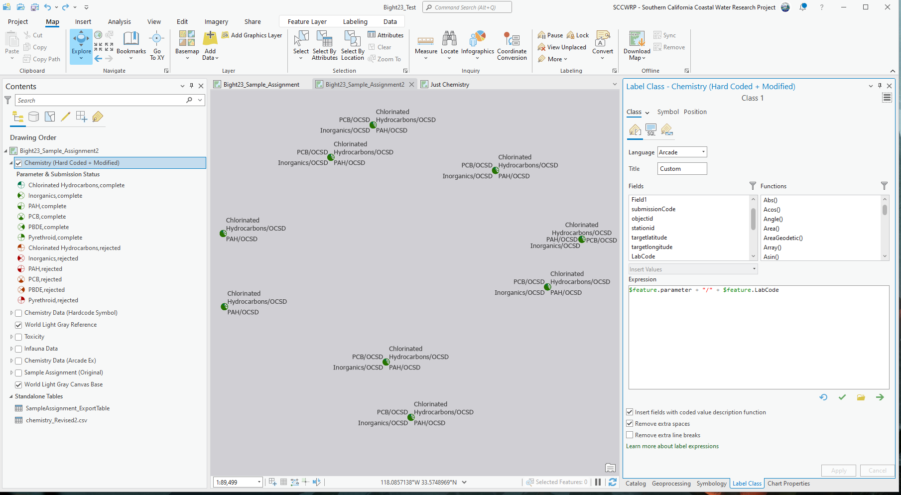
You could of course also include the lab in the text by using your label expression instead of parameter. And you could also color the text by applying the color expression to the whole symbol instead of only to the symbol element:

Have a great day!
Johannes
- Mark as New
- Bookmark
- Subscribe
- Mute
- Subscribe to RSS Feed
- Permalink
- Report Inappropriate Content
Hi @JohannesLindner ,
Your workflow worked great in ArcPro! Yet, when I tried to upload the layer as a web map, the arcade expressions used were not honored. I have worked on revising the web map on both the newer version and map viewer "classic", but I have yet to reach the same symbology.
Attached below is a screenshot of how I'm using your code, for your reference.
Any help or guidance here on how to best approach this would be greatly appreciated!
Best,
Mina
- Mark as New
- Bookmark
- Subscribe
- Mute
- Subscribe to RSS Feed
- Permalink
- Report Inappropriate Content
Huh. Try publishing the layer as web image layer / feature layer. That works for me in both Map Viewer versions. I use Portal, it might be different for AGOL.

As far as I know, the symbol options in Map Viewer are pretty basic, so you probably won't be able to configure that symbology online. I could be wrong though, as I configure everything in Pro before publishing.
Have a great day!
Johannes
- Mark as New
- Bookmark
- Subscribe
- Mute
- Subscribe to RSS Feed
- Permalink
- Report Inappropriate Content
Hi @Johannus ,
This was exactly the type of workflow I was looking for! I found your post to be exceptionally insightful and informative. I definitely learned a few new things along the way. Thanks a ton!
Best,
Mina