- Home
- :
- All Communities
- :
- Products
- :
- ArcGIS Pro
- :
- ArcGIS Pro Ideas
- :
- Make more buttons fit on the ribbon in smaller win...
- Subscribe to RSS Feed
- Mark as New
- Mark as Read
- Bookmark
- Follow this Idea
- Printer Friendly Page
- Report Inappropriate Content
Make more buttons fit on the ribbon in smaller windows
- Mark as New
- Bookmark
- Subscribe
- Mute
- Subscribe to RSS Feed
- Permalink
- Report Inappropriate Content
After years of having a dual-monitor setup, I now primarily use GIS on a 13" laptop, as do many of my students. Eek! Yikes! No! Bad!
Yes, this is not ideal. But much of this pain is artificially induced by Esri, and there is no reason it has to be this bad. For example:
I am working with GIS on one side of the screen and another application on the other. To get to literally any tool or function in Pro, I have to guess which category it lives in, click, -- ope, not that category -- ok, let's try ... nope, hold on, I seem to be on the wrong ribbon tab entirely... click .. click .... ........ click .. click ... click ... ..... ope ... click ... oh there it is!!
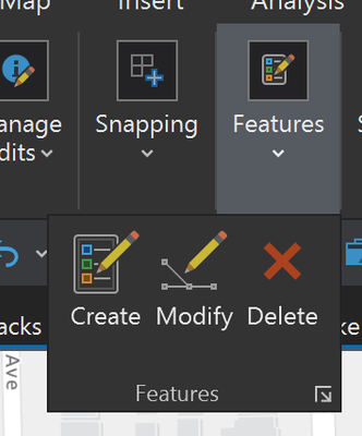
It takes forever because Pro collapsed a bunch of huge buttons into parent huge button menus.
But is there a reason any of the buttons these parent buttons are hiding HAVE TO BE THIS BIG?
Ok -- you usually have the screen real estate and Esri has decided it's more important to organize our icons into arbitrary categories and make them look like a children's toy than to show you more of them at a time and keep them in logical, consistent locations. I disagree, but suppose momentarily I concede this point. Are you telling me that the ribbon had to collapse these buttons because Esri thinks they need to be this big all the time?
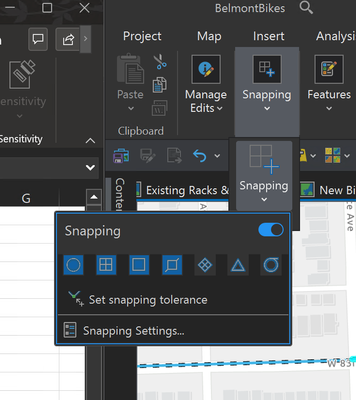
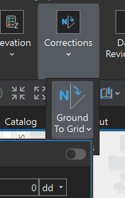
Even if this were justifiable, why are we collapsing single buttons into ANOTHER SINGLE BUTTON?
I have to click the same snapping dropdown twice?
Another:
Who comes up with this logic? Who's testing this for usability? What are we all paying for?
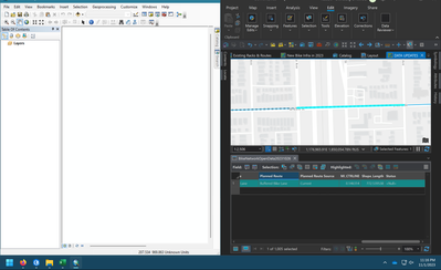
On small windows, why not shrink the buttons to fit right on the ribbon, as if they were on a toolbar? They appear small on the quick action toolbar...and in ArcMap, which works much better on small screens...in fact, toolbars can be extended outside of the application frame. The buttons stay small all the time, and stay where you put them.
In the same window, ArcMap is showing dozens of commands in about half the space that Pro takes to show you only cut, copy, and paste -- and that's only with two toolbars enabled. Granted, you have the QAT, but this is severely limited in its functionality and customizability, and unless you've done what I've done (adding nearly everything you use), it's not even close to comparable.
Better yet, just put the dang toolbars back: ArcGIS Pro: Option to Enable Dockable Toolbars and... - Esri Community
- Mark as Read
- Mark as New
- Bookmark
- Permalink
- Report Inappropriate Content
I agree that ArcGIS Pro's ribbon resizing algorithm needs work, and I hope they do work on it, but you may find more expedient relief by looking into a portable monitor to help you reclaim some screen real estate. They are inexpensive, or at least the ASUS ones I've looked at are, and look good. Just a suggestion to ease eye fatigue and frustration a little.
You must be a registered user to add a comment. If you've already registered, sign in. Otherwise, register and sign in.


