- Home
- :
- All Communities
- :
- Products
- :
- ArcGIS Monitor
- :
- ArcGIS Monitor Questions
- :
- Is Anyone Else Seeing Partial Reports in the Home ...
- Subscribe to RSS Feed
- Mark Topic as New
- Mark Topic as Read
- Float this Topic for Current User
- Bookmark
- Subscribe
- Mute
- Printer Friendly Page
Is Anyone Else Seeing Partial Reports in the Home & Analysis tabs ?
- Mark as New
- Bookmark
- Subscribe
- Mute
- Subscribe to RSS Feed
- Permalink
- Report Inappropriate Content
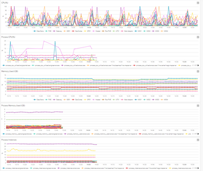
We keep seeing partial reports on the Home & Analysis tabs, these partial reports persist even when we change the windows of time. Is this a bug or just something happening in our environment?
Solved! Go to Solution.
Accepted Solutions
- Mark as New
- Bookmark
- Subscribe
- Mute
- Subscribe to RSS Feed
- Permalink
- Report Inappropriate Content
@SteveMcCarthy , two asks: 1. Can you share the expression for the process cpu, mem, instance? Is the expression the same for all processes? 2. pick one process metric from analysis and go to the individual metric. Is the chart "partial" or not?. In any case, I think the main issue is there are too many series and the charting framework limits the display. We can help you modify the expression to return fewer points.
- Mark as New
- Bookmark
- Subscribe
- Mute
- Subscribe to RSS Feed
- Permalink
- Report Inappropriate Content
Hi @SteveMcCarthy,
I have not seen this behavior. What happens when you refresh the web page - do the charts reload and show all the data? What about the data metrics when the view a component under the Monitoring tab - are those chart showing the same behavior?
If not, I suggest you check that Monitor can access and connect to the component you're monitoring.
Hope this helps,
- Mark as New
- Bookmark
- Subscribe
- Mute
- Subscribe to RSS Feed
- Permalink
- Report Inappropriate Content
Hello Derek,
Neither refresh or changing the time windows shows all the data.
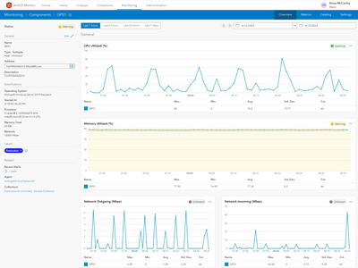
The data metrics when the viewing a component under the Monitoring tab looks normal.
This is not a show stopper just annoying right now.
- Mark as New
- Bookmark
- Subscribe
- Mute
- Subscribe to RSS Feed
- Permalink
- Report Inappropriate Content
@SteveMcCarthy it looks like the "partial" charts are for process metrics. It is expected behavior when processes are not present anymore, e.g. arcgis server restarted, service deleted, etc. You would see the same if go to this process metric using component UI (not analysis). What you showed above is a host metric, not process. Also, it looks like this analysis shows up to 97 processes. Depending on the resolution, the charting might limit it. In the next releases we'll introduce TOP features. In the meantime, you may need to modify the expression to reduce the number of series. I hope it helps.
- Mark as New
- Bookmark
- Subscribe
- Mute
- Subscribe to RSS Feed
- Permalink
- Report Inappropriate Content
The TOP features would be nice option on all of these charts, It would be nice if we could just display the TOP 5, 10 or 20 items.
This our Production environment, processes are starting and stopping all the time. However, we don't stop these process or services all at once in our Production environment. Also if you notice the Process CPU %, Process Mem Usage (GB) and Process Instance are all stopping reporting at different time.
Do you think I should submit a Support Ticket?
Thank you,
Steve
- Mark as New
- Bookmark
- Subscribe
- Mute
- Subscribe to RSS Feed
- Permalink
- Report Inappropriate Content
@SteveMcCarthy , two asks: 1. Can you share the expression for the process cpu, mem, instance? Is the expression the same for all processes? 2. pick one process metric from analysis and go to the individual metric. Is the chart "partial" or not?. In any case, I think the main issue is there are too many series and the charting framework limits the display. We can help you modify the expression to return fewer points.
- Mark as New
- Bookmark
- Subscribe
- Mute
- Subscribe to RSS Feed
- Permalink
- Report Inappropriate Content
We did use the Analysis sample: Mission Critical services
https://arcgismonitor.maps.arcgis.com/home/item.html?id=94a179f3698545ddacc32182f0660200 to create the Analysis where we are experiencing the display issues.
I did find this known issue: Charts series are limited to 10,000 points using alphabetical order.
For example, you want to show all processes for the last 2 hours of data with 1 min resolution. The chart will show 10000/(2*60) =83 series using alphabetical order.
Resolution: If your mission critical process is not showing (you have more than 83 processes), you may modify data expression to limit the series or add processes by name.
You are correct, the main issue is there are too many series, and the charting framework limits the display. We will try to modify the expression to return fewer points.
Thank you,
Steve

