- Home
- :
- All Communities
- :
- Products
- :
- ArcGIS Insights
- :
- ArcGIS Insights Ideas
- :
- Symbolize Chart By...
- Subscribe to RSS Feed
- Mark as New
- Mark as Read
- Bookmark
- Follow this Idea
- Printer Friendly Page
- Report Inappropriate Content
- Mark as New
- Bookmark
- Subscribe
- Mute
- Subscribe to RSS Feed
- Permalink
- Report Inappropriate Content
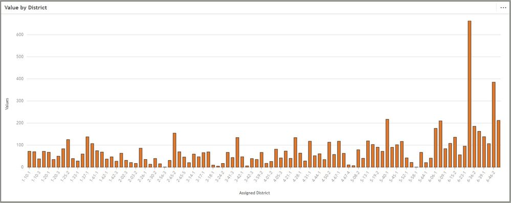
I would like to see more options for symbolizing data in the charts. I have a dataset of districts that I want to symbolize by our 6 regions. Adding region and district to the X axis groups the columns too closely and makes the chart hard to read. I tried to manually edit the symbology, but we have too many districts and the legend won't display them all so I cannot edit all of them.
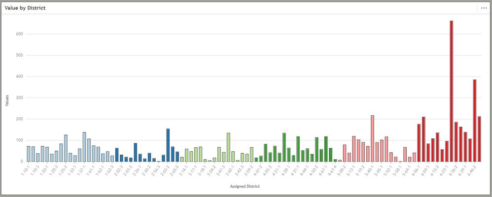
Having an option for a symbology field from the same dataset would be useful. An example of what I am looking for is below:


For this dataset, symbolizing by district is too messy. Breaking out the districts by the 6 regions would make it much easier for the end user to draw conclusions based on the provided dashboard.
- Mark as Read
- Mark as New
- Bookmark
- Permalink
- Report Inappropriate Content
@Eric_Castonguay Thanks for submitting this idea, We will take note of this.
I see that you would like to have a `color by` option on the X-axis instead of a subgroup.
While this is a good idea, I think a column chart might not be the best representation of this data. Maybe a stacked column, Heat Chart, or chord diagram will be a better/more concise representation.
We are working on a new chart type called Alluvial Diagrams which is set to be in the next release (2023.3). Where you can represent more than 2 categories on a single chart.
- Mark as Read
- Mark as New
- Bookmark
- Permalink
- Report Inappropriate Content
Thanks for the response. The data connection isn't quite right on this example for a heat chart or chord diagram, just too many districts. But, the stacked count column chart gave me exactly what I needed. I envisioned it having 6 columns (one for each region) broken up by districts, which would be too hard to interpret. But, by using the flip fields it gave me each district by region.


This gives me the column chart that was requested and allows me to symbolize it for easier interpretation.
- Mark as Read
- Mark as New
- Bookmark
- Permalink
- Report Inappropriate Content
Great! Good to know that Stacked Columns work. Since each district might be in a single region you can utilize that to represent the above. Look how that worked out 😄 !
You must be a registered user to add a comment. If you've already registered, sign in. Otherwise, register and sign in.