- Home
- :
- All Communities
- :
- Products
- :
- ArcGIS Insights
- :
- ArcGIS Insights Ideas
- :
- Include the option to compare percentage of values...
- Subscribe to RSS Feed
- Mark as New
- Mark as Read
- Bookmark
- Follow this Idea
- Printer Friendly Page
- Report Inappropriate Content
Include the option to compare percentage of values in a chart.
- Mark as New
- Bookmark
- Subscribe
- Mute
- Subscribe to RSS Feed
- Permalink
- Report Inappropriate Content
I'd like to create a donut chart showing the percentages of each of the unique values.
It would also be nice to do that with a KPI. You currently can set a target and show how far away how far from the target you are through the number of values in the table, but it would be great to look at that with percentages to the whole. For example, we might have a goal of completing 70% percentage of new cases in a quarter, not a set number of cases each quarter.
- Mark as Read
- Mark as New
- Bookmark
- Permalink
- Report Inappropriate Content
Thank you! This is a great idea and your feedback helps us prioritize development.
I've outlined a possible solution to your situation below but I'll add your comment to our internal ideas board.
Potential Solution
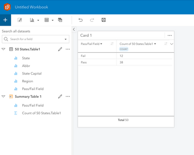
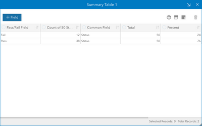
Create a Summary Table with the field you're interested in. For my example, the {Pass/Fail Field} has a value of either "Pass" or "Fail".
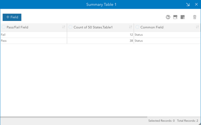
Create a field that has a common value, I'm using "Status"
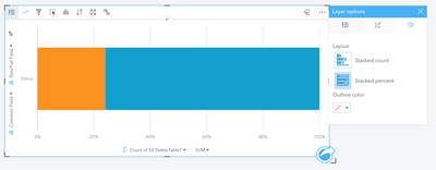
Select {Common Field}, {Pass/Fail Field} and {Count of 50 States.Table1} and create a Stacked Bar Chart. Under Layer options change the Layout to Stacked percent.
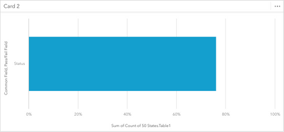
If you wanted to highlight, for example, records with a Passing Grade, you could change the sorting and make the Fail symbology transparent.
I know this isn't a donut chart but it presents the information in a similar way.
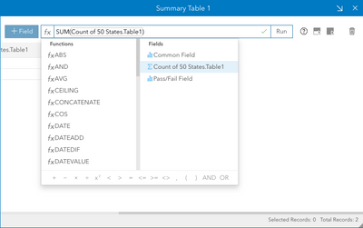
For the KPI card, create a new field that calculates the sum of the variable you created in the Summary Table.
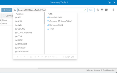
Create one last field that represents the percentage for each category type (you could combine these steps but wanted to separate them for clarity)
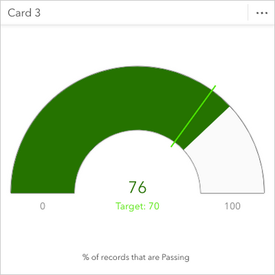
Finally, select {Percent} and create a KPI card. Filter the card to whatever value you want to display ("Pass" in my example). Under Layout options change the Layout to Gauge. Set the Target to whatever you want (70 for me) and the Max value at 100. Change other settings as needed.
- Mark as Read
- Mark as New
- Bookmark
- Permalink
- Report Inappropriate Content
This should work for what I need! I'll try this, thank you!
- Mark as Read
- Mark as New
- Bookmark
- Permalink
- Report Inappropriate Content
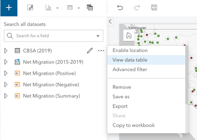
@Scott_Aulen I swear the 'Add Field' option isn't visible on the reference or summary table anymore. Am I not looking in the right place?
You must be a registered user to add a comment. If you've already registered, sign in. Otherwise, register and sign in.
