- Home
- :
- All Communities
- :
- Products
- :
- ArcGIS Dashboards
- :
- ArcGIS Dashboards Questions
- :
- Expression to categorize values, to make a histogr...
- Subscribe to RSS Feed
- Mark Topic as New
- Mark Topic as Read
- Float this Topic for Current User
- Bookmark
- Subscribe
- Mute
- Printer Friendly Page
Expression to categorize values, to make a histogram
- Mark as New
- Bookmark
- Subscribe
- Mute
- Subscribe to RSS Feed
- Permalink
- Report Inappropriate Content
Hello from Sweden
I want to make a histogram of values in a table between null to 500.
I have made an arcade expression earlier to be able to sort by category and I have tried to change that one to this:
It works but I want to se a value range instead then specific. Please help me improve this expression, tank you.
formelltNamn2023 histogram VAR27 AR FID
| "xxkommun, x" | "50-60" | 54 | 2019 | 0 |
| "xxkommun, x" | "70-80" | 79 | 2020 | 1 |
| "xkommun, x" | "20-30" | 29 | 2021 | 2 |
| "xxkommun, x" | "1-10" | 9 | 2022 | 3 |
| "xxkommun, x" | "" | 12 | 2023 | 4 |
| "xxstad, x" | "" | 3 | 2019 | 5 |
| "xxstad, x" | "" | 7 | 2020 | 6 |
| "xxstad, x" | "" | 3 | 2021 | 7 |
- Mark as New
- Bookmark
- Subscribe
- Mute
- Subscribe to RSS Feed
- Permalink
- Report Inappropriate Content
I know I've made a histogram in Arcade in the past, but I can't find my original code. So, we want to group our features into bins, and have these bins show up in a bar chart.
Your expression is pretty close already, but we run into trouble: without a numeric bin number, the bins have to sort by their name, which isn't always right.
I figured out how to include a "bin number" attribute, but when the chart groups by that value, we lose the ability to show the "bin name", the range of values, as the label.
So, the best way to do this is to group the values in the expression. I tried it with the function GroupBy. That way each bin is its own feature, and we can set our chart to be based on features, rather than grouped values. But that brought its own trouble. Suppose one of your bins were empty? The chart omits it!
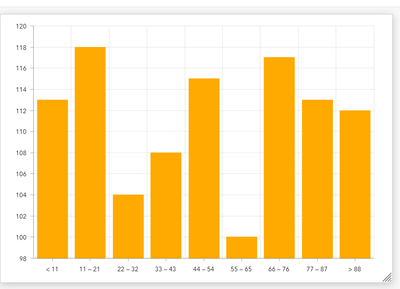
Here's the same histogram, but with values removed from one of the bins. Rather than showing 55 - 66 as an empty bin, it's removed from the chart entirely, which could lead to very misleading histograms.
So, the solution. We will do the grouping in our expression, but with a loop. We initialize the FeatureSet with a feature per bin, set to a value of 0, then add to that value as we go.
I thought that this would actually be a useful tool to bring into other dashboards, so I wrote a custom function, Histogram.
function Histogram(fset, field, bins){
    /*
    Generates a histogram from a FeatureSet

    Parameters:
        - fset: a FeatureSet
        - field: the field name with the numeric values to be binned
        - bins: the desired number of bins

    Returns:
        FeatureSet with one row per bin. Rows include a bin label, bin number, and count.
    */

    // get the upper and lower bounds of the data
    var hmin = Min(fset, field)
    var hmax = Max(fset, field)

    // determine the size of each bin
    var step = Floor((hmax - hmin) / (bins - 1))

    // histogram featureset dictionary to hold values
    var hist_fs = {
        fields: [
            {name: 'bin_num', type: 'esriFieldTypeInteger'},
            {name: 'bin_name', type: 'esriFieldTypeString'},
            {name: 'the_count', type: 'esriFieldTypeInteger'}
        ],
        geometryType: '',
        features: [{attributes:{
            bin_num: 0,
            bin_name: `< ${hmin + step}`,
            the_count: 0
        }}]
    }

    // populate dictionary with empty bins
    var b_idx = 1

    for (var i = hmin + step; i < (hmax - step); i += step) {
        Push(
            hist_fs['features'],
            { attributes: {
                bin_num: b_idx,
                bin_name: `${i} — ${i + (step - 1)}`,
                the_count: 0
            }}
        )

        b_idx += 1
    }

    Push(
        hist_fs['features'],
        { attributes: {
            bin_num: b_idx,
            bin_name: `> ${i}`,
            the_count: 0
        }})

    // loop through input featureset and grab values
    for (var feat in fset) {
        // figure out which bin it falls into
        var bnum = Iif(
            feat['val'] == hmin,
            0,
            Ceil((feat['val'] - hmin)/step) - 1
        )

        // increment count on corresponding bin
        hist_fs['features'][bnum]['attributes']['the_count'] += 1
    }

    return FeatureSet(Text(hist_fs))
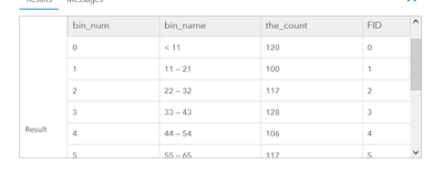
It isn't perfect, sometimes depending on the bin size and min/max values the bin count might be off. But the resulting featureset is good:
To use this, just drop that function into your script and after you define your featureset, call Histogram(fs, 'VAR27', 10).
You can mess with the bin size as you like. I suppose you could hard-code min/max values into the expression, too, but I wanted something that could adjust to the input data.
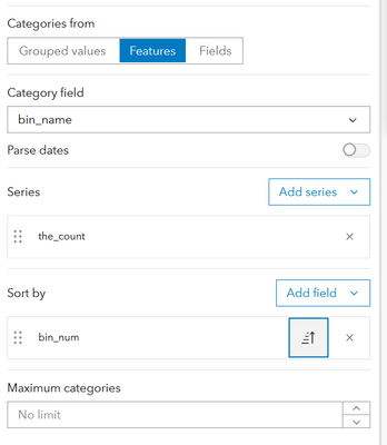
Once you have it, set your chart to "Features", wtih "bin_name" as the category, "the_count" as the series, and sort by "bin_num" just to ensure that the bars show in the proper order.
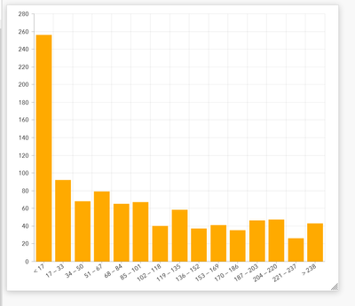
You may wish to set the chart's min value to 0, otherwise the histogram could be misleading. Here's the function with 15 bins and a different set of numeric data.
I hope this helps!
Kendall County GIS


