- Home
- :
- All Communities
- :
- Products
- :
- ArcGIS Business Analyst
- :
- ArcGIS Business Analyst Ideas
- :
- Enhance pie chart color configuration options for ...
- Subscribe to RSS Feed
- Mark as New
- Mark as Read
- Bookmark
- Follow this Idea
- Printer Friendly Page
- Report Inappropriate Content
Enhance pie chart color configuration options for "top five" lists
- Mark as New
- Bookmark
- Subscribe
- Mute
- Subscribe to RSS Feed
- Permalink
- Report Inappropriate Content
We are using the infographics tool in Business Analyst to make custom infographics for each county in our state. (Current products can be seen here: https://maps.kdhe.state.ks.us/ksephtcountyprofiles/). At the bottom of our page, we have three pie charts that list the top five chemicals released to air, water, and land. Currently, the only way we have to set the color scheme on a pie chart is to assign a unique color to each chemical (similar to what you would do in Symbology in a map layer). However, with 100+ possible chemicals, it often happens that the top five for a given county are assigned really similar colors.
We would like to have the ability to set the color scheme so that it is the same five colors regardless of which five chemicals rise to the top for a given county. Perhaps there could be an enhancement for the "top x" functionality that allows you to set the colors at a global level rather than assigning them to a specific attribute value?
- Mark as Read
- Mark as New
- Bookmark
- Permalink
- Report Inappropriate Content
Thanks for the idea @AmyRoust
- Mark as Read
- Mark as New
- Bookmark
- Permalink
- Report Inappropriate Content
This is implemented in the November release.
- Mark as Read
- Mark as New
- Bookmark
- Permalink
- Report Inappropriate Content
Hello @AmyRoust,
With the upcoming November release of Business Analyst App, you will have a new option to apply conditional styling to pie and donut charts that will enable you implement the enhancement you requested above.
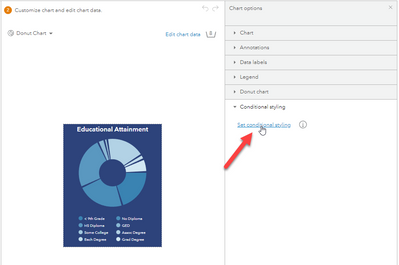
Here are the additional steps you need to follow to get the desired behavior:
1. Edit your chart and enable conditional styling.
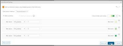
2. Select Top and bottom from the Calculation method dropdown menu.
3. Select Nth greatest from the Bar value dropdown menu.
4. Click + Add condition and add more top N values as desired. Here is an example of top 3 values with a custom color ramp.
5. Customize the colors as needed and click Apply.
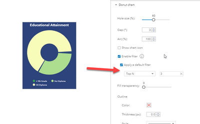
6. Expand the chart option and apply a default filter as follows:
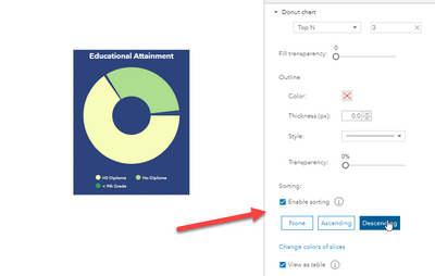
7. Optionally, scroll down and enable sorting.
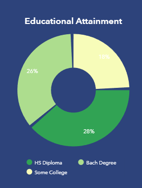
8. Apply and save your template. When you run the infographics, the chart will show the top 3 values with your customized color ramps as follows:
I hope this helps!
Fasil T.
- Mark as Read
- Mark as New
- Bookmark
- Permalink
- Report Inappropriate Content
Fantastic! Thank you!
You must be a registered user to add a comment. If you've already registered, sign in. Otherwise, register and sign in.
