I am Alexandros Pantazis, a project manager who often works with GIS and remote sensing on climate and environmental projects in Greece. A few months ago, while still working in the Research and Development department of Ellinogermaniki Agogi (a private school in Athens, Greece), I built a Web GIS app that lets schools in Greece and Cyprus check the quality of the air their students are breathing, and I entered it into the ADONIS TICKET competition. It is called the Schools Air Quality Observatory. You open it, tap your school on the map, and you get the current European Air Quality Index, a short health tip, a five-day forecast, and a PDF you can save or share. Here is the story of how it came together, including lessons learned.
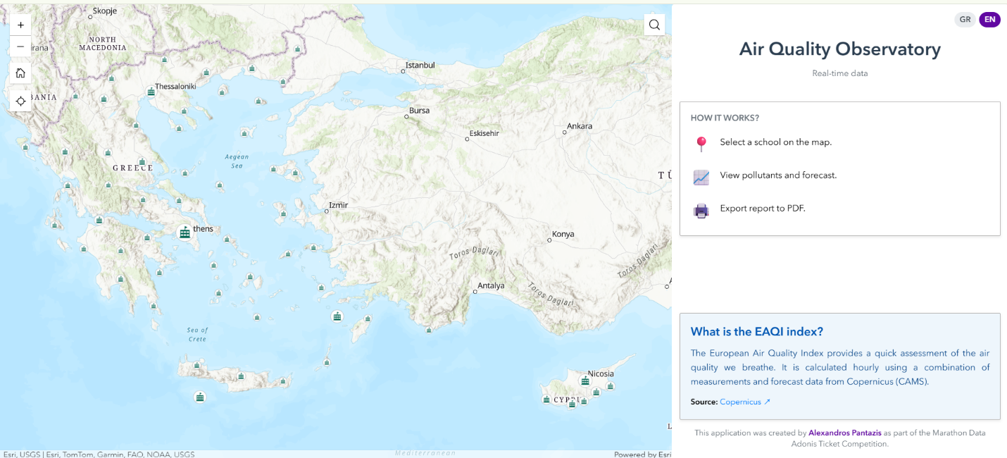
Figure 1. The Schools Air Quality Observatory welcome screen.
The First Roadblock Was the Data
Before any air-quality work, I needed the location for every school in Greece and Cyprus. That turned out to be the hardest part of the whole project, and the two countries could not have been more different.
My initial idea was to search for data via OpenStreetMap, but in our case study countries the school data are not updated, so they are not reliable. I turned instead to the Ministry of Education of each country.
Greece was kind to me. I found the schools in a CSV table that already carried coordinates, along with names and administrative level. The integration into ArcGIS was simple. I used the XY Table To Point tool and had all the Greek schools in my project.
Cyprus was the opposite. The only list I could find arrived as a PDF, with school names and street addresses but no coordinates at all. To turn those addresses into points, I used geocoding. I extracted the addresses from the document, then ran them through ArcGIS geocoding. It still needed manual checking, because an address-only list always produces a handful of points that land on the wrong street, but in the end Cyprus joined Greece on the same map.
If there is one thing I underestimated, it is this part. Building the live air-quality features on top was satisfying and fast. Obtaining trustworthy locations for two countries, from two completely different source formats, is where the real hours went.
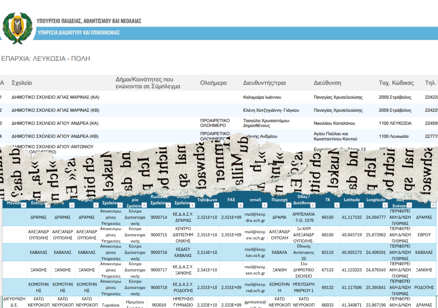
Figure 2. Two countries, two problems. Greece arrived with coordinates, Cyprus only with addresses.
Staging the Data in ArcGIS Pro
With all of my data in ArcGIS Pro, I fine-tuned the labels so they were polished and legible, and I enabled clustering on the layers. In dense city areas the individual markers overlap into a useless blob, and clustering collapses them into a single bubble with a count until you zoom in. This looked like a purely cosmetic decision at the time. It came back to bite me later. Finally, I published the layers to ArcGIS Online as hosted feature layers.
The Data Behind the Dots
With the schools mapped, I connected the air-quality data. The numbers come from two public and authoritative sources: the Copernicus Atmosphere Monitoring Service (CAMS) and the Open-Meteo Air Quality API. Raw pollutant values of PM2.5, PM10, NO2 and O3 mean very little to a parent or a teacher, so everything is translated into the European Air Quality Index, the color-coded scale that runs from good to extremely poor. One number, one color, one short sentence of advice. I formatted the map pop-ups with Arcade so the labels and colors respond to each school's index automatically.
Level EAQI Color
| Good | 0-20 | #50F0E6 |
| Fair | 21-40 | #50CCAA |
| Moderate | 41-60 | #F0E641 |
| Poor | 61-80 | #FF5050 |
| Very Poor | 81-100 | #960032 |
| Extremely Poor | >100 | #7D2181 |
Table 1. The European Air Quality Index and its color scale.
Why I Needed the Developer Edition
I built the map and the overall layout in ArcGIS Experience Builder, and for a while that was enough. Then I hit the real technical problem.
I did not want a generic dashboard. I wanted a custom panel that calls the air-quality API live, draws its own forecast chart, exports a formatted PDF report, and controls how the map behaves when you tap a school or a cluster. The standard online Experience Builder cannot do that. For a fully custom widget you need the ArcGIS Experience Builder Developer Edition, which you download and run on your own machine, and where you write the widget yourself in React and TypeScript.
Setting it up is its own small adventure. The Developer Edition runs as two separate Node.js processes that you launch side by side, a server in one terminal and the client in another, each started with npm start. Once the client finishes compiling, you open the studio at https://localhost:3001, click past the self-signed certificate warning, and authenticate with an ArcGIS Client ID so your local widget can reach the hosted feature layers. I did all of my actual coding in VS Code, with the builder running in the browser next to it.
This is the point where the project stopped being a configuration exercise and became real development.

Figure 3. Experience Builder Developer Edition running locally, with the custom widget written in React and TypeScript in VS Code.
The Bug That Caused a Week's Delay
Writing your own widget means you own every rough edge. The one that cost me the most time appeared only on touch devices. On a phone, tapping a cluster of schools kept opening the map's native pop-up instead of smoothly zooming in, and that native pop-up collided with my custom panel. The app felt stuck in exactly the place it should have felt fluid.
The fix came down to three suspects, and they are worth naming, because anyone building custom map interactions in Experience Builder will meet at least one of them.
- First, the click event itself. The ordinary click event fires late enough that default behaviors can slip in ahead of you. Switching to view.on('immediate-click', ...) lets you intercept the tap the instant it lands and call stopPropagation() before the default pop-up can even start.
- Second, the cluster's own pop-up. Even with the feature layer's pop-up disabled, the clustering layer generates its own graphics for the aggregate counts, and those carry their own pop-up. You have to set popupEnabled = false in two places, on the FeatureLayer and inside the featureReduction configuration block. Miss the second one and the cluster keeps talking back.
- Third, Experience Builder's own message actions. The framework can dispatch selection messages between widgets asynchronously, and those can re-trigger a pop-up from outside your JavaScript. That one is solved in the builder interface rather than in code, by auditing which data actions are actually wired up.
I want to be honest about how this app got built. My own coding background includes Python fundamentals and some HTML, but not React or TypeScript, so writing a custom Experience Builder widget was well outside my own capabilities. I leaned on Claude Code inside VS Code to turn my idea into a working app. I would describe what I wanted the widget to do and the exact conflict I was hitting, like this cluster-on-touch bug, and we worked through the fix together. I still had to follow each change, test it on the device, and decide whether it belonged in the app, but the honest picture is that Claude did a lot of the heavy lifting on the parts of the stack I had never touched. For a one-person entry on a deadline, that is what made the whole thing possible.
The Result
The finished app is live, and the source is on GitHub:
Tap any school in Greece or Cyprus and you get its real-time index, the pollutants behind it, a five-day history and forecast, and an export button that produces a clean PDF the school can keep or share. The whole interface works in Greek and English, since it serves both countries. It is not a finished product, but it does the thing I set out to build. It takes an abstract environmental number and turns it into something a school community can actually read and act on.
A Thank You
None of this would have happened without Marathon Data Systems, the local Esri distributor. They organize the ADONIS TICKET competition, held in memory of Adonis Kontos, the founder of Marathon Data Systems, and they gave me a free account so I could take part. That access, with no cost barrier, is the reason a solo entrant could build and publish something at this scale. Thank you for opening the door wide enough to walk through. I also want to thank Michael Gould, who encouraged me to write this article in the first place and made room for it on the education blog, and Rosemary Boone, whose review made it a considerably better read than the draft I sent her.
About the Author
Alexandros Pantazis is an environmental engineer based in Greece, with an MSc in Climate Crisis and ICT. He works with GIS and remote sensing on climate and environmental projects, including EU-funded research and education programs, with a particular interest in urban heat, heat vulnerability mapping, and climate resilience. You can connect with him on LinkedIn, and find his work at his portfolio website.