The Challenge: We Had the Data, But Not the Story
When I first started in my role as the Associate Director for Employer Relations, I knew one thing: we were doing great work. Every day, we were helping students reach important milestones, build career readiness, secure internships, and launch meaningful careers. We had the data to prove it and the success stories to bring it to life. What we didn't have was a compelling way to connect those pieces into a story that others could easily see and understand.
My name is Zo Sediqi, and in this blog, I will discuss how I use ArcGIS in my current position at the USC's Career Center to connect with my stakeholders and showcase our impact.
An Unexpected Introduction to GIS
The inspiration came from an unexpected place. A family member of mine, who happens to be a GIS expert, started telling me about ArcGIS StoryMaps and ArcGIS Dashboards. I remember asking him, "I have all of this employer data, student outcomes, and success stories. Can I use ArcGIS for career services?" His answer was simple: "Absolutely."
That conversation changed the way I think about communicating impact.
Turning Spreadsheets into Strategic Insights
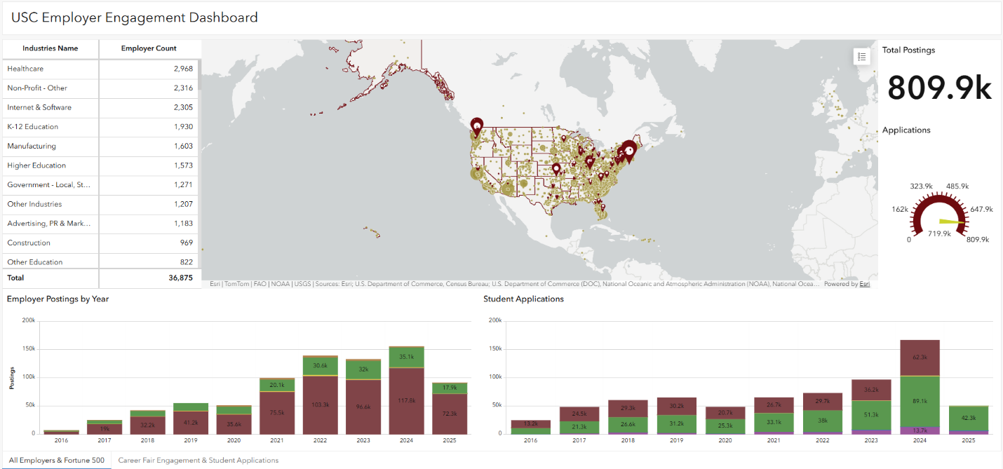
I created my first ArcGIS account and began combining data from multiple reports and spreadsheets. Instead of looking at fragmented data points, I was able to connect everything into a single interactive dashboard. Suddenly, I could visualize the geographic distribution of our employer partners, see where students were applying, identify our most engaged employers, and uncover patterns we hadn't noticed before.
The dashboard quickly became a planning tool. For our employer relations team, it highlighted opportunities for outreach and revealed gaps in our employer network. For university leadership and campus stakeholders, it provided a clear visual representation of our impact.
Bringing Our Impact to Life with ArcGIS StoryMaps
After seeing the value of dashboards, I created my first StoryMap.
StoryMaps allowed me to move beyond data visualization and into storytelling. Instead of simply presenting numbers, I could weave together maps, student success stories, employer partnerships, images, and interactive content into a narrative that was easy to explore.
Today, I use our StoryMap in almost every employer conversation for two reasons.
First, it helps employers see the impact they are making. Every internship, every job offer, and every student success story represents an investment they have made in our students. Showing those stories visually creates a much stronger connection than simply sharing statistics.
Second, the StoryMap serves as an interactive guide for employer engagement. Rather than handing employers a brochure or directing them to multiple webpages, I can share one resource that showcases the many ways employers can recruit Gamecocks, build their brand on campus, engage with students, and strengthen their partnership with the university.
A Surprise
Perhaps the most surprising part of this journey was realizing that career services and student affairs have only begun to explore the possibilities of GIS technology. While StoryMaps are widely used to communicate geographic information, they are also incredibly powerful tools for telling the story of student success, institutional impact, and community partnerships. I am not aware of any other school using ArcGIS in this way.
That's an opportunity.
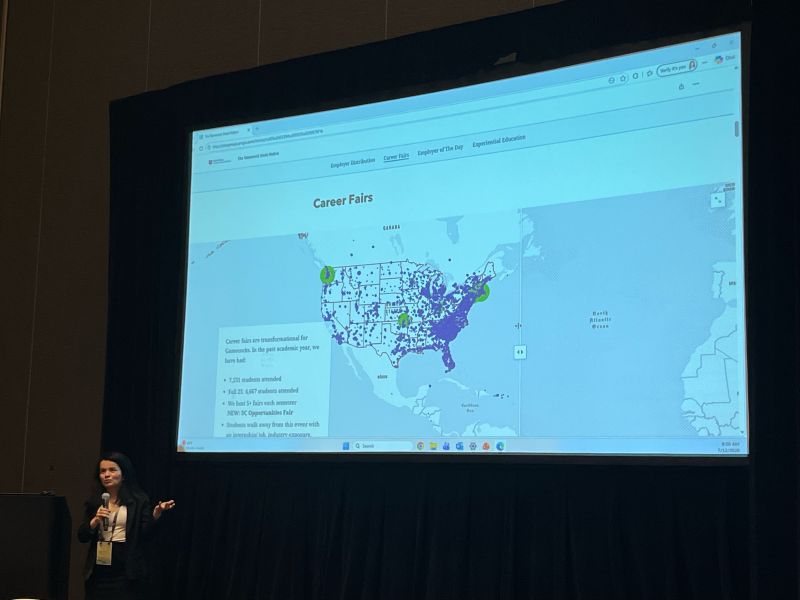
As student affairs professionals, we often collect incredible amounts of data. The challenge is helping people understand what it means. StoryMaps and Dashboards allow us to transform data into stories that inspire action, strengthen partnerships, and clearly demonstrate our value to students, employers, and institutional leaders. I presented my use of ArcGIS at the education Summit in 2025 and 2026. Each year I have received incredible feedback. This year, I had some student affairs audiences that were inspired to see our use of GIS and the work we have been doing at the USC Career Center.
Looking Ahead
One of the unexpected outcomes of this work has been seeing how GIS can bridge the gap between analytics and storytelling. We no longer have to choose between data and narrative; we can use both together to create experiences that are engaging, interactive, and meaningful.
Sometimes, all it takes is asking a simple question: Can ArcGIS do this? You may be surprised by the answer. If you have the same question, I invite you to reach out to Esri or experts on your campus.
I would love to connect through LinkedIn if you would like to chat further.

