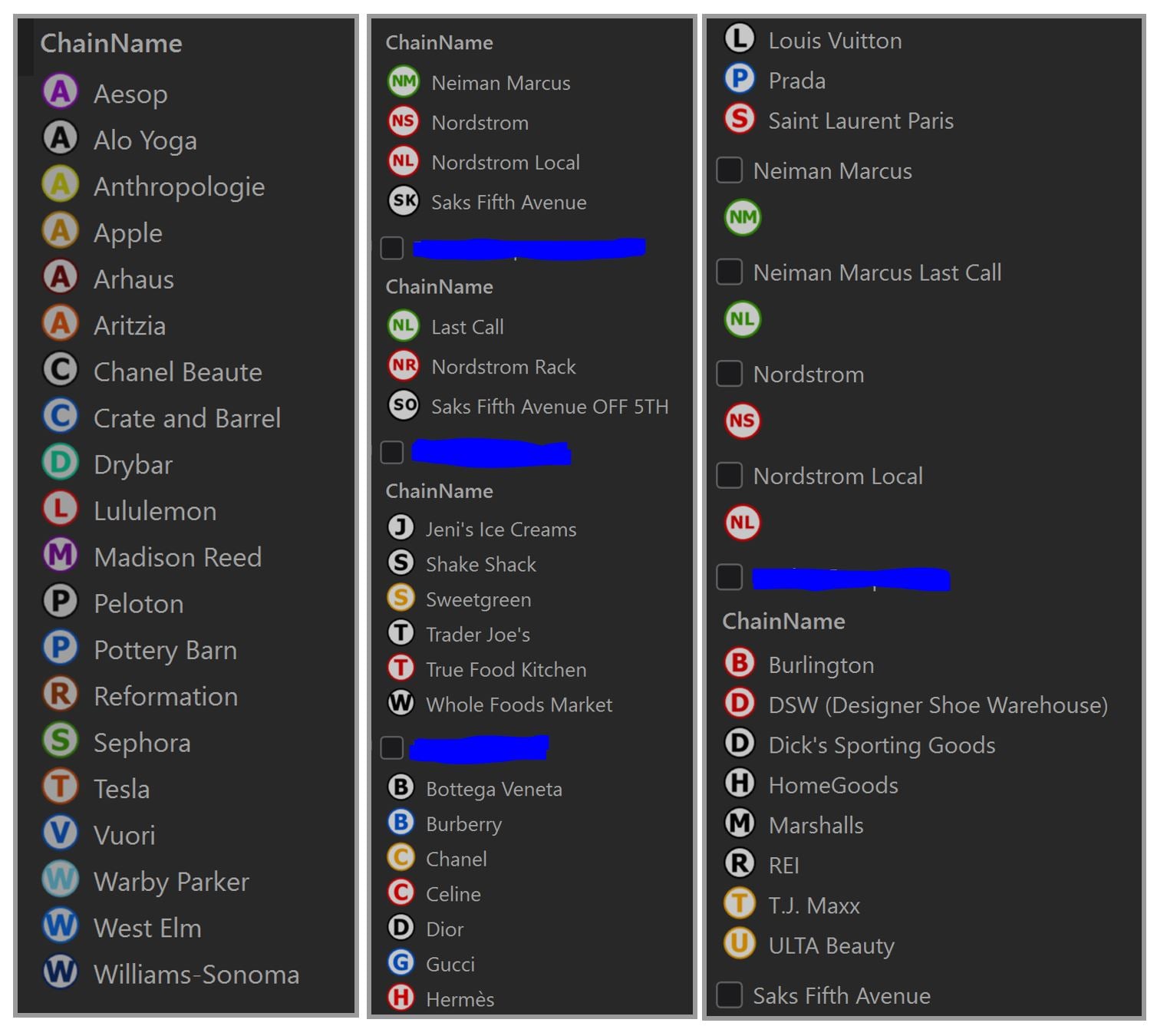
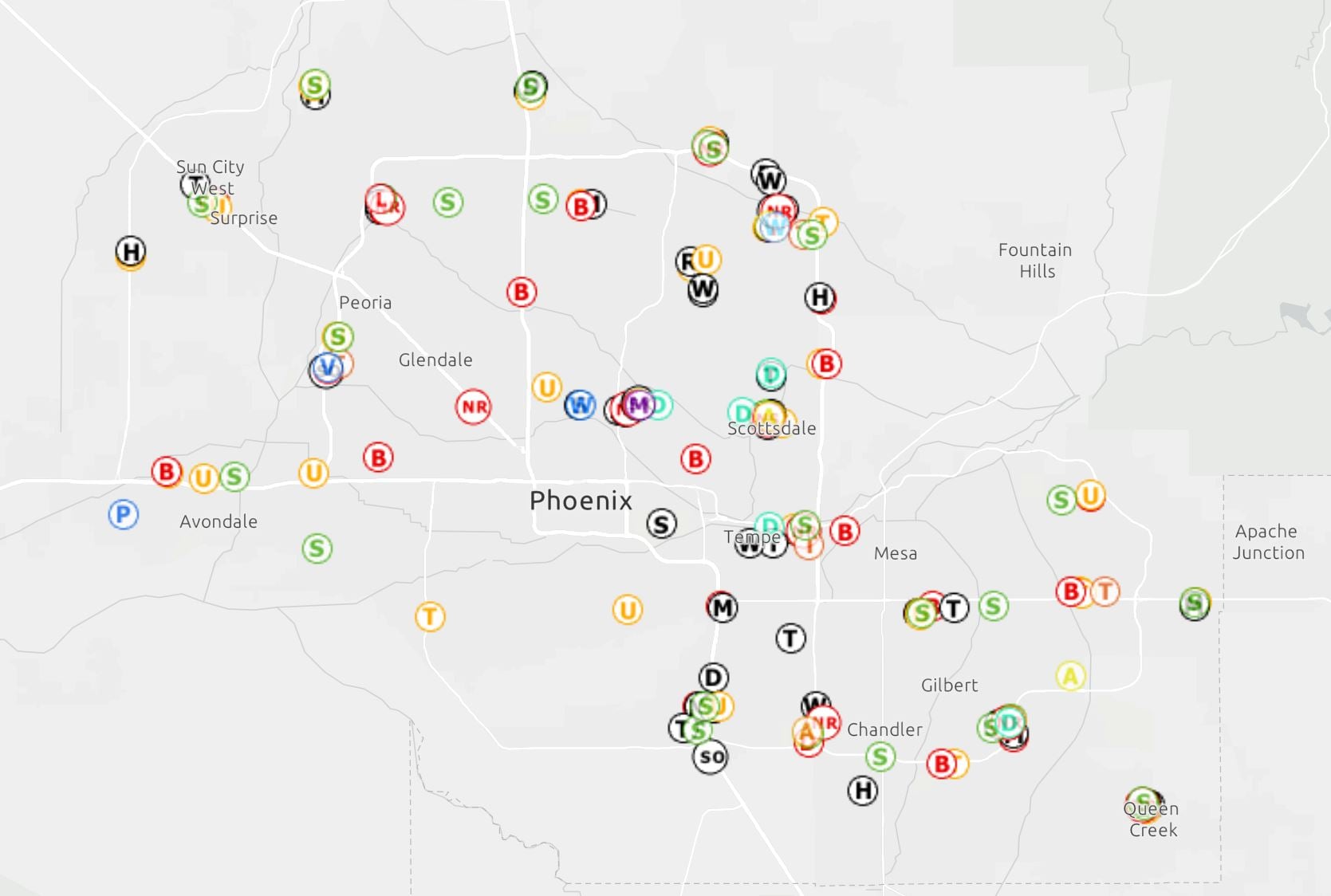
Hello all. We are trying to determine an efficient and aesthetic way of symbolizing retail chains in which we have dozens of unique chains, in addition to our store locations, and this is cumbersome. We are currently using the first letter of the chain name within a circle, but users are confused by that and they don't want to have to click on point to view the popup. They are reluctant as well to take the time to open the Legend. Some may only use this once a week or monthly, so its hard for them to recall what symbol represents what chain. Generally, the map is used for visual reference only and placement of the same in PPTs, etc. We don't want to use the actual chain's public logo as that is nearly impossible to render properly due to pixelation, size of the logo text or image, etc. Below are examples. Any suggestions would be greatly appreciated.