- Home
- :
- All Communities
- :
- Products
- :
- ArcGIS Pro
- :
- ArcGIS Pro Ideas
- :
- Smarter Chart Axis Labels in ArcGIS Pro
- Subscribe to RSS Feed
- Mark as New
- Mark as Read
- Bookmark
- Follow this Idea
- Printer Friendly Page
- Report Inappropriate Content
- Mark as New
- Bookmark
- Subscribe
- Mute
- Subscribe to RSS Feed
- Permalink
- Report Inappropriate Content
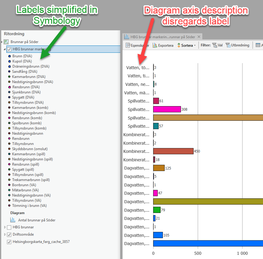
I love the ease of creating diagrams in ArcGIS Pro, it's fast and simple!
However the charts will not display the labels you give your data, only the value. 
I discovered while working with geopoints with very long categorial names. I made my labels short and easy to understand in the Symbology pane, then created a bar chart and noticed that the labels I created didn't display, and the only way to see the name of the category was to hover over the Y-axis description or the bar.
When I couldn't configure the diagram to show the label, I at least wanted to expand the field so that when I saved the graph I could read the whole value. But there was no way to do this either! This rendered the whole diagram useless as I was supposed to share it with non GIS colleagues.
The Swedish Esri support informed me that there will be a function for expanding the amount of characters showing the categories on the axis in version 2.5 of ArcGIS Pro (now 11 characters is standard). But isn't it silly not to make it standard or at least an option to show the labels instead of the value?!
Vote please!
Thanks
/Sofia
- Mark as Read
- Mark as New
- Bookmark
- Permalink
- Report Inappropriate Content
It would be handy if you had the option base your chart on values OR symbology classes which could honour symbology labels.
You must be a registered user to add a comment. If you've already registered, sign in. Otherwise, register and sign in.