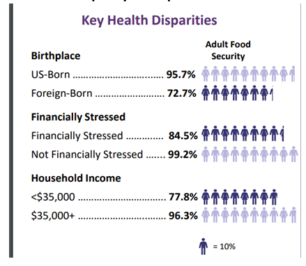
I have a client that would like to build some graphs that use icons to represent filling in a bar graph, where each icon represents 10% and is filling out the gauge. Like in the image here. Any ideas or suggestions on how to start? Think this is something that could be accomplished with arcade and data expressions??