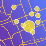
Please add the ability for ArcGIS Online layers to be displayed as Hub content using their default symbology. Currently all hosted feature layers displayed in a Hub site's content is given a default blue symbology. Many GIS staff create default symbology for ArcGIS Online layers especially when for data that relies on some categorization to make sense. Of course someone can change that default after they add it to a map or download it, but often there is a common symbology for a layer that staff in an organization like to use as a "one size fits most" when adding data to applications. It would be helpful to have these datasets displayed to the public in the same way, rather than the symbology going back to generic colors. For some datasets this simple color scheme makes it hard to communicate the value of a particular dataset to the public when they first glance at the data from a Hub content explore page.