- Home
- :
- All Communities
- :
- Products
- :
- ArcGIS for Office
- :
- ArcGIS for Office Blog
- :
- What’s new in ArcGIS for Office 2022.1 (March)
What’s new in ArcGIS for Office 2022.1 (March)
- Subscribe to RSS Feed
- Mark as New
- Mark as Read
- Bookmark
- Subscribe
- Printer Friendly Page
- Report Inappropriate Content
ArcGIS for Office, an add-in for Microsoft Office brings mapping capabilities from ArcGIS into Microsoft Excel. With ArcGIS for Office, you can create a geospatial view of your data by creating an interactive map that includes data from Excel and ArcGIS services—all without leaving the Excel environment.
Don’t have an ArcGIS account? See Create an ArcGIS Account.
The March 2022 update includes new functionality and enhancements in ArcGIS for Office, the highlights of which are as follows:
Measure
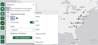
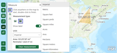
Part of the Analysis tools family, you will need to sign into ArcGIS to access the newest analysis tool. The measure widget leverages linear and perimeter distance using an ellipsoid-based geodesic calculation.
Measure pane and tool with Measure distance, and Imperial Unit chosen:
Measure pane and tool with Measure area, and Imperial Unit chosen:
Color and Size
Explore your data in different ways through a variety of smart mapping styles. When you style map layers, the type of data determines the default styling options. You can experiment with color ramps, line weights, transparency, symbols, and other graphic elements, and see your choices reflected immediately on the map.
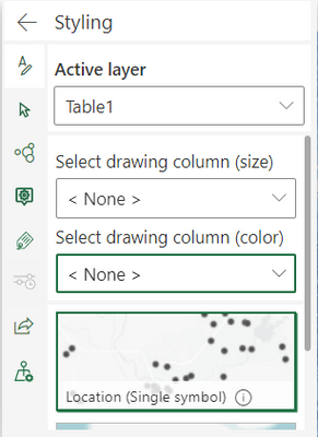
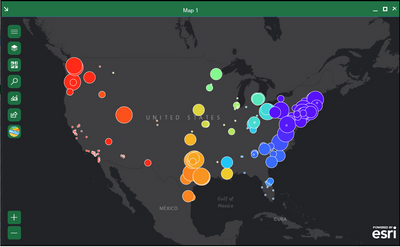
In the Styling pane when you style with two variables (by size and/ or color), you can study this association through a table or visualize it in a graph. You now have this where you can establish relationships and see that colors gradually change to show a pattern.
For example, in the image below two data attributes on a map that study the relationship between an area’s population and the sea level rise (SLR) that affects its migration and density are shown.
Learn more about this enhancement and the workflow steps to see the visualization on a map here.
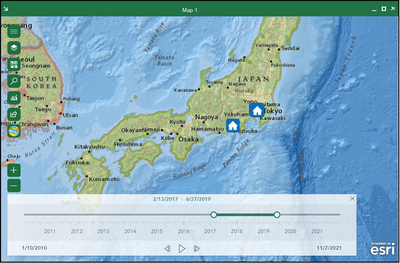
- Earlier when you enabled the time slider on, while working in the Time pane, there was no way to close the slider pane. We now have a x button on the slider itself, for an easy exit.
Pro tip: Love all the basemaps in this blog? Get more information on changing and adding basemaps here.
- No more hovering the pointer over the ellipsis to view the full text of long attributes or property names. You can now adjust the width and height of widgets to view the full text!
- When checking the Use traffic check box to determine Driving time, Trucking time, and Rural driving time, you can now use the 12-hour or the 24-hour time clock when calculating Traffic based on typical conditions! The Buffer/Drive time analysis capability creates areas around input point, line, or polygon features to a specified distance or uses Esri service areas to calculate the area that can be reached within a specified travel time or travel distance of point features along a street network based on a travel mode.
- Want to know where your data is coming from? The Layers pane now has icons for data sources and type of layer. ArcGIS for Office also has specific icons for data source that has date-time fields.
How to get it, product documentation, and Esri Community
The Download page guides you through the steps to set up and configure ArcGIS for Office.
To learn more about the product—such as system requirements, full descriptions of capabilities, and more—head over to the ArcGIS for Office documentation site.
Read our blogs, interact with experts, take a survey, or just connect. Join us in the Esri Community to ask questions, share ideas, and let us know about your experiences with ArcGIS for Office.
If you have an idea for a new ArcGIS for Office feature, submit it on the ArcGIS Ideas site.
You must be a registered user to add a comment. If you've already registered, sign in. Otherwise, register and sign in.
