- Home
- :
- All Communities
- :
- Products
- :
- ArcGIS Experience Builder
- :
- ArcGIS Experience Builder Questions
- :
- ArcGIS Experience Builder and embedded Survey123 f...
- Subscribe to RSS Feed
- Mark Topic as New
- Mark Topic as Read
- Float this Topic for Current User
- Bookmark
- Subscribe
- Mute
- Printer Friendly Page
ArcGIS Experience Builder and embedded Survey123 form 'Large Map' - how do we keep the map responsive?
- Mark as New
- Bookmark
- Subscribe
- Mute
- Subscribe to RSS Feed
- Permalink
Hi ArcGIS Experience Builder Community,
I'm building an Experience with many Survey123 forms included as widgets.
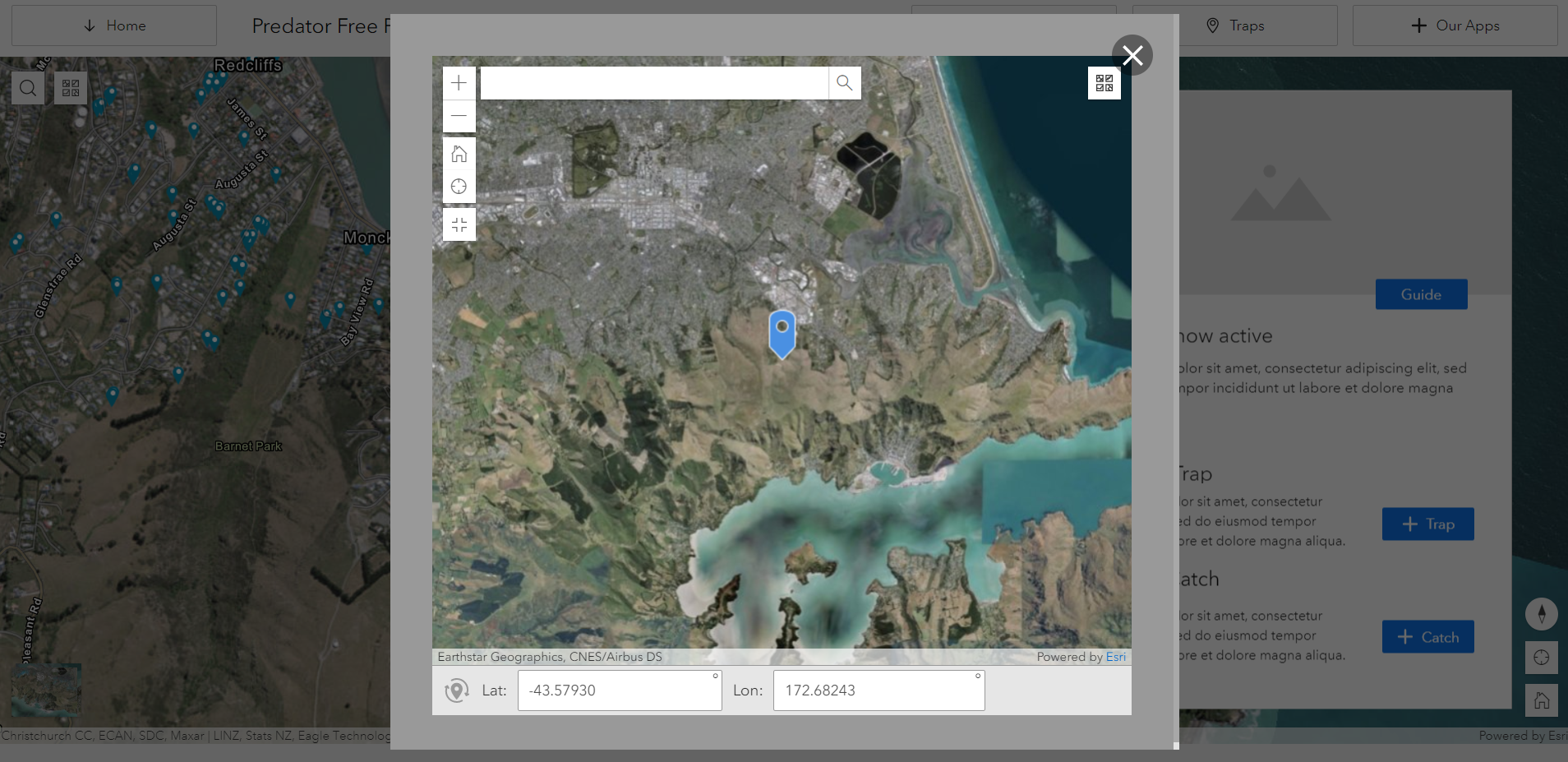
Im struggling to configure my Survey123 widgets in Experience Builder so that that Geopoint question is responsive to the size of the widget when I toggle the Geopoint/map into 'Large Map' mode. I've added some screenshots and recordings of what happens to the map in the Live experience.
To configure my Experiences, I've been using Fullscreen app templates, and then adding the Survey123 widgets into the fullscreen app. I style the Survey123 app to use the full size of the page/container or set the height/width to be 100% of the page/container. I'm using existing Survey123 forms I've previously published with Survey123 Connect.
What seems to happen is the Survey123 web form loads to a height so that all questions can appear in a scrolling page, and the map when toggle into Large Map takes up that full height of the web form. This leads to situations where a user can get stuck in a large map in the screen and cant scroll beyond the map because they're just panning the map. Its a tricky one because I can understand why the full form will load beyond the page size (so I can scroll through the questions) but I only want the Map to load to my screen size.
This also happens when building sites with ArcGIS Hub. While its probably not a problem that resides solely with Survey123 or Experience Builder, it will be good to ensure that the expected capability is seamless.
Related GeoNet posts:
- Survey Geopoint Item on iPhone Experience Builder WebApp drawing improperly
- Survey in Experience Builder does not show thank you screen on submittal
Will appreciate any assistance on this, or when this capability will be supported in the future.
cc James Tedrick ArcGIS Survey123
Cheers,
Sam
- Mark as New
- Bookmark
- Subscribe
- Mute
- Subscribe to RSS Feed
- Permalink
Hi Sam,
Thanks for raising this as an issue. The screenshot you supplied is 1913x931 px - That is the actual size on the screen?
- Mark as New
- Bookmark
- Subscribe
- Mute
- Subscribe to RSS Feed
- Permalink
Hey James,
That was just a freehand snip of my browser on Windows 10 Desktop.
Cheers,
Sam
- Mark as New
- Bookmark
- Subscribe
- Mute
- Subscribe to RSS Feed
- Permalink
I am experiencing the same problem as the OP. I have a survey widget in an Experience app with a map that is designed to take geotrace input, either by sketching on the map or sending data from a selected feature in another map. All works fine on large screen, but on iPhone 11, using both Chrome and Safari, tapping the map to sketch enlarges it so the sketch tool is outside of the frame. The same process works fine in the Survey123 web app on the iPhone. I have tried resizing the survey widget and keeping it within its parent container, but no luck.
Thanks for any suggestions!
Matt
- Mark as New
- Bookmark
- Subscribe
- Mute
- Subscribe to RSS Feed
- Permalink
Hello,
Is there a way to avoid this behavior?
Are there settings in the Experience Builder or page types that allow to set the size of the map for mobile screen sizes?
- Mark as New
- Bookmark
- Subscribe
- Mute
- Subscribe to RSS Feed
- Permalink
I am also having this issue with embedded Survey123 geopoint questions. When accessing the Experience Builder on a smartphone, the maps are not functional as described above. They either do not open when you press/tap, reload the entire page when pressed/tapped, or the map opens too large to see the draw tool. Are there any updates on this issue?