Today is the big day: the Esri Nederland GIS Conference is starting! A guest speaker from Esri (America) who will be present here today is John Nelson. At quarter to three, he will give a session about Texture, Reality, and Fakeness in ArcGIS Pro Cartography<\/A>. Yesterday he was already in the Netherlands for a Preconference workshop<\/A>: 'A Pro in Mapdesign in one day'. My colleagues Jeske van der Velden<\/A> and Willem Jan Vierbergen<\/A> and I were the lucky ones who could attend.<\/P><\/P>John Nelson is part of the content team at Esri. He makes many maps and works among other things on improving the user experience of the software. John writes many blogs<\/A> and creates beautiful StoryMaps, including this one<\/A> which you can view if you want to know more about John.<\/P><\/P>John Nelson has developed many beautiful cartography styles by playing with the symbology in ArcGIS Pro. In the workshop, we worked with some styles he created. In this blog, I will discuss these styles and explain how you can make such a map yourself using the ArcGIS Content from Esri Nederland.<\/SPAN><\/P><\/P>Never underestimate the power of a good looking map! (John Nelson)<\/EM><\/P><\/BLOCKQUOTE><\/P>Beer vs Wine<\/SPAN><\/P>In symbology it is possible to combine different variables. One of the most important questions in the world is also this: where is more beer bought and where more wine? Two variables you could use here are the amount of beer and wine purchased and the amount spent on them. By combining this kind of data, you can highlight a phenomenon more or less. One of the biggest tips came up in this section: Format color scheme: the Gateway to Awesome Magic!<\/STRONG> In this<\/A> blog you can read how to do this.<\/SPAN><\/P>Currently, within Esri Demographics there is already consumer data<\/A> from Michael Bauer Research available, with which you could request this kind of information. Soon data from 4orange<\/A> will also be added here, so you could make similar analyses for the Netherlands.<\/SPAN><\/LI>You can then combine this data with your own data or use already available ArcGIS Content, for example:Borders from the CBS Neighborhood and District Map: <\/> Municipalities<\/> , Districts<\/> , <\/> Neighborhoods<\/>
<\/P>
John Nelson is part of the content team at Esri. He makes many maps and works among other things on improving the user experience of the software. John writes many
John Nelson has developed many beautiful cartography styles by playing with the symbology in ArcGIS Pro. In the workshop, we worked with some styles he created. In this blog, I will discuss these styles and explain how you can make such a map yourself using the ArcGIS Content from Esri Nederland.<\/SPAN><\/P><\/P>Never underestimate the power of a good looking map! (John Nelson)<\/EM><\/P><\/BLOCKQUOTE><\/P>Beer vs Wine<\/SPAN><\/P>In symbology it is possible to combine different variables. One of the most important questions in the world is also this: where is more beer bought and where more wine? Two variables you could use here are the amount of beer and wine purchased and the amount spent on them. By combining this kind of data, you can highlight a phenomenon more or less. One of the biggest tips came up in this section: Format color scheme: the Gateway to Awesome Magic!<\/STRONG> In
Image 1: amount of beer (yellow) and wine (purple) and the spending on them (the higher, the less transparency).<\/><\/><\/><\/><\/><\/><\/><\/><\/><\/><\/><\/><\/><\/><\/><\/><\/><\/><\/><\/><\/><\/><\/><\/><\/>
Watercolor<\/>
One of my favorite styles: the Watercolor<\/>-style. John explains in his blog how this style is constructed. It is also possible to extend this style to images and texts that you place in a layout, so that the map is uniform. Depending on the scale, you could apply the watercolor style for example to:<\/>
Image 2: Watercolor-style applied to the Netherlands.<\/>
Firefly<\/>
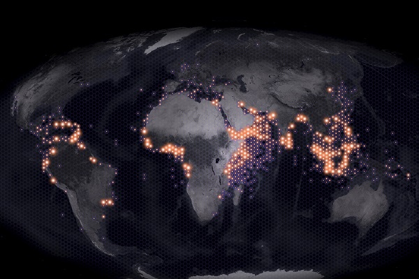
There is a base map available from Esri with the <\/>Firefly<\/> <\/>style. This map offers a beautiful background for making maps. In <\/>this<\/> blog John discusses among other things the use of hexagons combined with firefly symbology for a nice representation of phenomena.<\/>
Image 3: Firefly base map showing piracy per hexagon of 50,000 km2.
Imhof-Like Topography
Eduard Imhof was a well-known cartographer from Switzerland that worked a lot with relief. Since we also live in a mountainous country with an openly available elevation map of the Netherlands, this style can of course also be well applied in the Netherlands. In <\/SPAN>this<\/A> <\/SPAN>blog John creates several layers based on one Digital Elevation Model (DEM), which gives a nice result when you combine these layers. We ourselves already have layers from the AHN with various raster functions in ArcGIS. In his blog John mentions a number of "ingredients", here are the "ingredients" with a Dutch twist:<\/SPAN><\/P>Imagery base<\/A><\/LI>Traditional Hillshade<\/A><\/LI>Multi-directional Hillshade<\/A><\/LI>Elevation Mist<\/A><\/LI><\/UL><\/P>Image 4: Elevation in the Municipality of Heemskerk where a Hillshade, Hillshade (multidirectional) and Mist layer based on the Imhof style are combined. By adding municipal boundaries and using filters you can better highlight a municipality.<\/EM><\/SPAN><\/P><\/P>This was the last style we applied during the workshop. It was fun and inspiring to work with these styles. We will take the knowledge gained into account when releasing new content A group photo with our fellow content team member from America of course could not be missed after this day.<\/P><\/P>Willem Jan Vierbergen<\/A>\u200c, John Nelson, Jeske van der Velden<\/A>\u200c and Ellen van den Berg<\/A>\u200c<\/P><\/P>At the preconference we worked with these examples, but John Nelson has many other blogs with styles that you could also apply to Dutch data. Also take a look at these blogs:<\/P>Old maps in the style of <\/><\/><\/><\/><\/><\/><\/><\/><\/><\/><\/><\/><\/><\/><\/><\/><\/><\/><\/><\/><\/><\/><\/><\/><\/><\/>
Image 4: Elevation in the Municipality of Heemskerk where a Hillshade, Hillshade (multidirectional) and Mist layer based on the Imhof style are combined. By adding municipal boundaries and using filters you can better highlight a municipality.<\/EM><\/SPAN><\/P><\/P>This was the last style we applied during the workshop. It was fun and inspiring to work with these styles. We will take the knowledge gained into account when releasing new content A group photo with our fellow content team member from America of course could not be missed after this day.<\/P><\/P>
At the preconference we worked with these examples, but John Nelson has many other blogs with styles that you could also apply to Dutch data. Also take a look at these blogs:<\/P>
Signed in members can post, follow updates, and more. New here? Register a free account.
Find useful guides, FAQs, and documents to help you navigate and make the most of Esri Community.