Version 2026.2.992
Release Date:06/10/2026
New features:
Advanced Symbology support
ArcGIS for Power BI now includes powerful new rendering options to help visualize complex spatial data patterns:
- Pie (Donut) chart: Represents categorical proportions at each location (e.g., breakdown of land cover types, or product sales by store location).
- Dot density: Displays numeric attributes as quantities (e.g., population count per county) using dot distribution.
- Predominant category: Maps the highest-value attribute among multiple related fields to highlight the leading category in a feature.
- Relationship style: Visualizes the dynamic interaction and correlation between two numeric attributes.
Feature and Demographic Layer Styling: Advanced visualization styles are now fully supported for standard ArcGIS feature layers and demographic data layers.
Join Layer Integration: Advanced renderers (like dot density and pie charts) are now automatically carried over to joined layers, while still allowing you to adjust the styling afterward.
Learn more about Symbol types
Multi-Label Class Support
You can now display multiple label classes simultaneously, combining data from different attributes to show up as labels. Additionally, enhanced label formatting gives you more control over how text appears when using Power BI data—such as formatting date and time values.
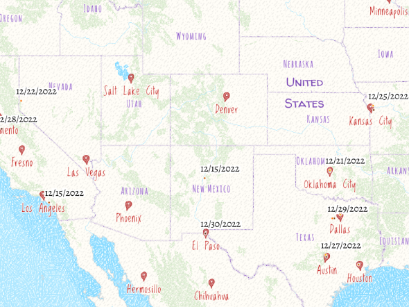
(ArcGIS for Power BI – custom date label)
To learn more, visit Configure labels in ArcGIS for Power BI.
Quality of life updates:
Redesign Analysis pane
The Analysis pane has been redesigned to provide a more intuitive and streamlined workflow. Enhancements include a modernized layout with improved spacing and typography. Identifying and selecting analysis tools is now more efficient, supported by updated visual elements and consistent feedback mechanisms that enhance interface responsiveness.
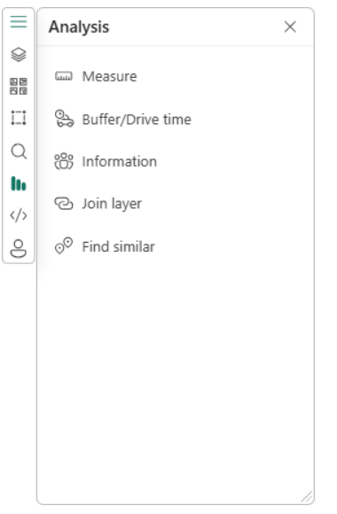
(ArcGIS for Power BI – Analysis pane)
Learn more about this Redesign
Data Formatting for Labels and Consistency
Feature labels are now fully integrated with the formatting applied to the Power BI data. Labels will now correctly reflect:
- Numeric Formatting: Currency, percentages, scientific notation, and custom numeric format codes now sync automatically with the user's Power BI model settings.
- Date & Time Formatting: Labels now display dates and times based on the formatting configured in Power BI, including custom date strings and column-level format settings.
Visual-level and column-level formatting inconsistencies have been resolved to ensure uniform label rendering across reports.
Learn more about Label Formatting
Bug fixes:
- Improved Join Layer Messaging: Enhanced error notifications with clearer, more informative messages in toast alerts when join layers are removed due to field updates or data changes, helping you quickly identify and resolve issues.
- Enhanced View Stability for ArcGIS Viewers: Resolved an issue where join layers failed to load correctly for users with an ArcGIS "Viewer" role, ensuring consistent and reliable map performance across all user permissions.
- Optimized Zoom Behavior: Refined multi-layer zoom when PBI filters are applied. The map now prioritizes the PBI data layer extent and ensures a smooth, single-action transition when interacting with both data and join layers, significantly improving the overall navigation experience.
- Refactored Join Layer Architecture: Performed internal code refactoring to improve the synchronization of key fields during analysis, ensuring more stable behavior when handling multiple joins or filtering operations.
As always, we value your feedback and are committed to making ArcGIS for Power BI better with each release. Your suggestions help guide our improvements, and we are excited to bring you these updates to enhance your mapping experience. Please feel free to share your ideas or if you find anything broken or does not make sense.
Stay tuned for future updates, and we look forward to hearing more from you!