Hi! I’m Rachael Andrew, a GIS postgraduate student and an aspiring geospatial professional. GIS is powerful, but too often maps are beautiful visuals that don’t tell the full story. Whether you’re a student, early-career professional, or a seasoned GIS expert, the challenge is the same: how do you turn raw data into maps that communicate real insights?
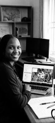
In this post, I’ll share strategies and lessons from my own GIS projects on population distribution, healthcare accessibility, and land use, so you can make your maps more meaningful.
1. Start with the Right Questions
- A map without purpose is just a picture. Before plotting data, ask:
- What story do I want this map to tell?
- Who is the audience, and what do they need to know?
- Which insights are hidden in the data that can drive decisions?
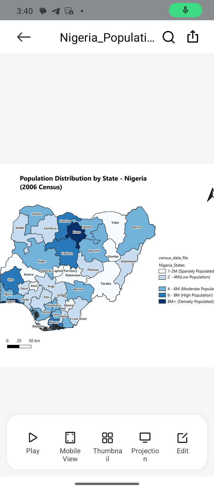
In my population distribution map, I didn’t just color states by population. I highlighted areas that were densely vs. sparsely populated. This helped to clearly show regional disparities and possible areas for development.
2. Don’t Rely Solely on Default Visuals
Many beginners stick to default symbology, which can oversimplify or even hide important insights.
Instead:
- Use graduated colors, proportional symbols, or heatmaps to show intensity or density
- Choose layouts with clear legends, titles, and scale bars
Pay attention to colors and symbols, using the wrong color for features can confuse your audience. Imagine using blue for vegetation or yellow for water. It immediately disrupts understanding and makes the map misleading.
In my healthcare accessibility project for Keffi, I combined road networks with health facility locations to show actual travel paths instead of straight-line distances. This revealed underserved areas that a simple point map would not show.
3. Think Critically About Data Quality and Coverage
Even accurate datasets can give the wrong impression if they are not used carefully. Always ask:
- Are there missing data points?
- Are the boundaries accurate?
- Does the dataset reflect reality for my area of interest?
4. Add Context, Storytelling, and Visuals
A map becomes meaningful when the data connects to real-world context. You can do this by adding:
- Reference layers (roads, rivers, administrative boundaries)
- Clear labels and annotations
- Visual examples from your projects (map screenshots, charts, or diagrams)
- Short insights explaining the patterns
- Hyperlinks to helpful Esri resources or tutorials
This makes your work easier for non-GIS professionals to understand — and that is something organizations like Esri really value.
Conclusion
Creating a map is not just about plotting data or choosing nice colors. It’s about revealing patterns, showing relationships, and telling a story that matters.
By asking the right questions, using the right visuals, checking your data carefully, and adding context, your GIS projects can stand out and make real impact.
I’d really love to hear how others approach their mapping projects.
Feel free to share your thoughts in the comments.
🔗Connect with me on LinkedIn:
https://www.linkedin.com/in/rachael-andrew-09043b248
:envelope_with_arrow:Email:
rachaelandrew805@gmail.com