Since the most recent ArcGIS Maps for Power BI update, we have been experiencing an issue visualising multiple records at the same location. The issue is that the symbols now stack on top of one another with just one of them being visible, and no ability to toggle between records on the tooltip. Previously, records at the same location had a count of the number of records at the location (e.g. 1 of 4) and a left and right arrow to toggle between the different records and symbols.
Below is a sample dataset used to illustrate the issue.
Both Customer A (red) and Customer B (blue) are at the same location, and when no filters are applied the symbol for Customer A is showing (a red circle), but the tooltip information displays the name of Customer B. There is nothing visible on the symbology or the tooltip to denote that more than one record exists at this location.
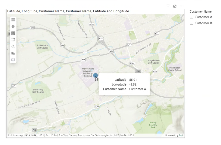
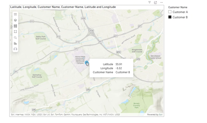
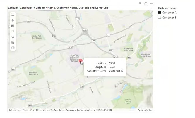
When slicers or filters are applied, the individual customers (and their associated symbols) are visualised as expected.
We are looking for a solution that allows users to identify that more than one record exists at the same location, and ideally the ability for the user to toggle from one record to the next without needing to apply a filter (as per previous releases of ArcGIS Maps for Power BI).
Below is a screenshot of how this used to appear