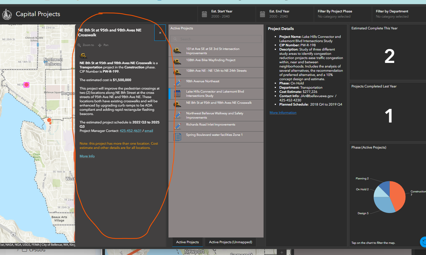
Hi. My dashboard has a map, configured with a popup. The way that popup is displayed has changed recently. It used to look similar to how the popup looks in the map viewer, with the popup pinned in a corner of the map. Now the popup displays as a column on the right side of the map taking up the entire vertical space of the map (see screenshot - the popup is circled with orange graphic).
Does anyone know why\how this changed? Nothing about this is documented in release notes for the November update to AGOL... When editing the dashboard, there is no configuration for how popups display. I don't see this as an improvement.
Thanks