Hi guys,
I want to integrate a chart (like gantt chart) to visualize for one company (corporation) the open and closed date of all of his establishment (physical structure) like this :
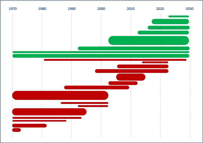
In green you have the current opened establishments, and in red the closed establishments. So with this representation you can see the company comportment by the time (how much establishment he’s opened, how much was closed, during which time ?, etc).
I'm working on experience builder, but the Chart widget can't do anything like that.
So I want to know if I can exploit Arcade with the pop-up to make a graph like the screen above ? maybe using an api chart (quickchart.io ?) or anything else ?