Trying to build a Serial Chart with three Axis --
The vertical Axis is Temperature in degrees F. The horizontal is Time and there are five stations reporting, so five colored lines..
I have read this a few times, https://doc.arcgis.com/en/dashboards/latest/get-started/serial-chart.htm specifically the Group Chart section but not having any luck getting something like this to appear..
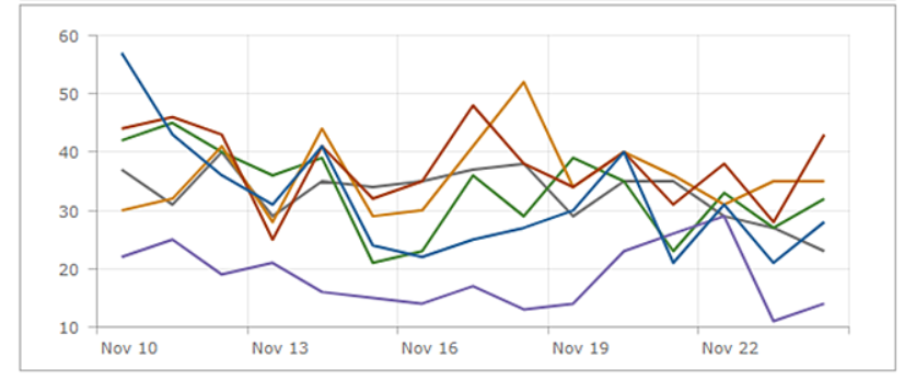
Does anyone have any better examples /documentation on how to get this result?
.