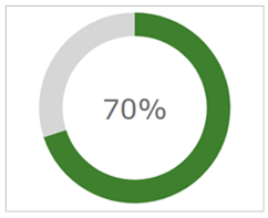
You see how in this gauge the 70% progress is shown in green vs the 100% total that is in grey? It looks as if the green is "covering" the grey, yes?
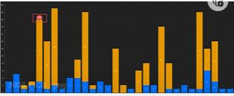
How can I do this in a bar chart like this image below, where orange is the total and blue is the percent completed so far?