Sym... Mo... Lab... Geo... Ele...
With many functions now living in panes, it's not uncommon to have several open at a time as you map. One pain point here is that if you have them all stacked like this, as I prefer to have them, they become really hard to distinguish. Not impossible, but I believe this could be better handled.


The '...' used to truncate is wasted, indistinguishable space. The point of the tab labels is to help you distinguish between them, and by having the same ... on each of them, it defeats the purpose. One solution, as is done in Firefox, would be to fade the text into the end of the tab, reveal just a bit more of it:
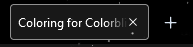
A few more characters can make a difference when you're trying to quickly identify the tab you're looking for. Firefox also limits how narrow a tab can get, implementing a horizontal scroll mechanism that works very well. I know Pro's icon set gets a ton of hate, but it might not be bad to have an optional 'Icon tabs' setting that would replace the tab name with an icon. In that case, it may be better to move the tabs to the side, as they are in 'unpinned' tabs, to avoid taking up even more vertical space than the Pro UI already does -- kind of how toolboxes in Adobe products are handled -- when they're text, they're on top, and when they're icons, they go to the side.