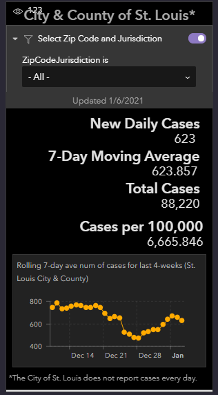
I created a Experience Builder app with a text widget displaying some key indicators which can be filtered by zip code and jurisdiction and embedded a graph from a dashboard at the bottom. Screen shot is below.
When I use the drop down filter to select a specific zip code the indicator numbers change accordingly. This is amazing how this works as I just added the filter widget to the text widget and the filtering started working without any other setup. Kudos to the developers.
I would like to get the graph to change also. What is the best approach? I can think of 3 possible ways to go but not sure what is the easiest or possible.
1. Use the Code option in the Embed Widget and add HTML and javascript code. Would the filter work on this? I would be starting from scratch on how to code javascript which I'm okay with.
2. Learn how to create a new Widget. Esri has provided teaching materials on this. I would be starting from scratch but willing to learn.
3. Send a request to the Dashboard to do the filtering.
Any suggestion on which way to go and any tips on getting started?
FYI. The City of St. Louis and St. Louis County report their COVID cases separately and to their own dashboards. I created this app to combine the data. With zip codes split by the City border, this app in some cases reports the same zip code by county and city (the data is not combined but displayed individually by what they report). I'm doing this on my own as I have a college student at Washington University that is in St. Louis County right on the border with the City.