- Home
- :
- All Communities
- :
- Products
- :
- ArcGIS Dashboards
- :
- ArcGIS Dashboards Questions
- :
- Getting map classifications to reflect dashboard s...
- Subscribe to RSS Feed
- Mark Topic as New
- Mark Topic as Read
- Float this Topic for Current User
- Bookmark
- Subscribe
- Mute
- Printer Friendly Page
Getting map classifications to reflect dashboard selector filters
- Mark as New
- Bookmark
- Subscribe
- Mute
- Subscribe to RSS Feed
- Permalink
- Report Inappropriate Content
I have a dashboard with a category selector that filters what symbols display on a map.
But I can't find a way to make it so that the symbol size and legend classes in the map update to reflect the values of the category being filtered by the dashboard selector. Regardless of what's selected in the dashboard, the symbol size and legend never change. That hampers the user experience.
For example:
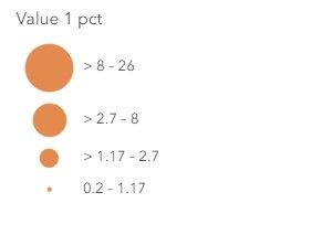
Working in Map Viewer, using 4 classes and Natural Breaks, and setting a filter on category 1, I get these classes.
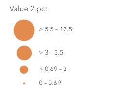
Doing the same with category 2, I get these classes. The classes update to reflect the new values being filtered in the map.
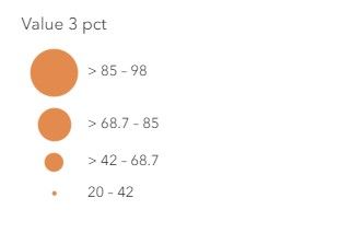
And filtering on category 3 in the map also updates the classes.
But no matter what category I filter on in the dashboard, the symbol size classes in the map remain unchanged. They seemingly reflect the lowest and highest values of the data among all the categories, and they never change to reflect the data being filtered on in the dashboard.
Is there a step I need to take, or a workaround? I saw a similar post dealing with a selector updating a Heat Map style, but my map style is Counts and Amounts. Thanks.


