- Home
- :
- All Communities
- :
- Products
- :
- ArcGIS Experience Builder
- :
- ArcGIS Experience Builder Questions
- :
- Experience Builder screen size issues
- Subscribe to RSS Feed
- Mark Topic as New
- Mark Topic as Read
- Float this Topic for Current User
- Bookmark
- Subscribe
- Mute
- Printer Friendly Page
Experience Builder screen size issues
- Mark as New
- Bookmark
- Subscribe
- Mute
- Subscribe to RSS Feed
- Permalink
- Report Inappropriate Content
 Hi,
Hi,
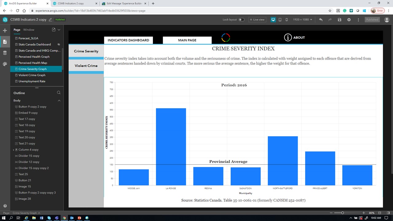
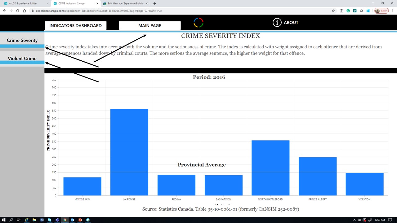
I have created a series of pages using experience builder. All the pages are set up in 1920x1080 , and they look fine when using the live view. However, when I hit preview all the elements inserted appear out of place.
The only way to make it look like the way it was created is by using the browser full-screen option. The monitor resolution is exactly the same as the experience builder (1920x1080).
Can somebody explain why this happens?
Regards
Jose Pablo
- Mark as New
- Bookmark
- Subscribe
- Mute
- Subscribe to RSS Feed
- Permalink
- Report Inappropriate Content
- Mark as New
- Bookmark
- Subscribe
- Mute
- Subscribe to RSS Feed
- Permalink
- Report Inappropriate Content
Is there an answer to this question? I am having same issue. My page looks fine in the edit and live views inside Experience Builder, but when I preview it in a web browser, all of the elements resize and get cut off.
.png "DavidMartinez")
- Mark as New
- Bookmark
- Subscribe
- Mute
- Subscribe to RSS Feed
- Permalink
- Report Inappropriate Content
I would first start with how your widgets are sized, positioned, and aligned. Are you using absolute positions or %? If you change the size layout in experience builder design mode you will be able to see the difference when changing from 1536 x 864 to 1024 x 768. If you're still having issues, maybe we can take a look at your experience.
David
- Mark as New
- Bookmark
- Subscribe
- Mute
- Subscribe to RSS Feed
- Permalink
- Report Inappropriate Content
Hi,
I have been working this past week trying to configure the widgets in the EB I have and I'm struggling to get the EB to look good at all the resolutions that are shown. I am using a custom full page layout and I honestly feel like it would be so much better to be able to configure for the different desktop, tablet, and phone options. For example for the desktop there is a very big different in resolution between 1920 and 1024 and I would rather configure widgets for 1920 and then 1024 then try to make them work for the entire desktop range. This was actually my understanding at first, but then a coworker explained that's not how it works. I have went back and forth on using % and px getting rather frustrated. I have a menu, text, and embed widget and I would like them to stay aligned. Currently I'm not using a column or row layout widget but maybe that is the solution for them maintaining alignment on different screen sizes? Some examples or more documentation for this would be great on the resources tab.
Thanks,
Kathy
- Mark as New
- Bookmark
- Subscribe
- Mute
- Subscribe to RSS Feed
- Permalink
- Report Inappropriate Content
Hi, I had the same problem with my views. The layout was completely off in preview but fine in live view. The problem was fixed after I reset the size and position of my elements from absolute values to percentages.
- Mark as New
- Bookmark
- Subscribe
- Mute
- Subscribe to RSS Feed
- Permalink
- Report Inappropriate Content
I agree that some more documentation on how to use the "Change Screen Size" in Experience Builder would be really helpful. I thought I could adjust the size of the widgets at each screen size to be different so they fit on the screen better at a particular resolution but that doesn't seem to be the case. When I change it at a particular resolution it changes it globally.
- Mark as New
- Bookmark
- Subscribe
- Mute
- Subscribe to RSS Feed
- Permalink
- Report Inappropriate Content
Hi Leila,
I did find this link from ESRI that was pretty useful!
"ArcGIS Experience Builder widget size and position do not adjust according to the screen size"
- Mark as New
- Bookmark
- Subscribe
- Mute
- Subscribe to RSS Feed
- Permalink
- Report Inappropriate Content
Hi Jose,
I see your post is roughly 3-years old, but it looks like this is still a prevalent issue today. I was having the same issue and during my troubleshooting I continually stumbled upon the importance of using % vs px.
I was also able to find this useful technical support link from ESRI that seems to confirm what I had discovered: https://support.esri.com/en-us/knowledge-base/problem-the-arcgis-experience-builder-widget-size-and-...
- Mark as New
- Bookmark
- Subscribe
- Mute
- Subscribe to RSS Feed
- Permalink
- Report Inappropriate Content
Hi Y'all,
I am having relatively similar issue. In my laptop with 15 inches screen size everything is fine in different modes. However, my widgets become tangled and twisted and misplaced when the screen size gets a bit smaller (13 inches screen size). I read these comments about changing values to %. I did that. I am also using column and block widgets to place my image, map, texts widgets. But none doesn't help. Currently I am designing my dashboards in 1280*800. Does changing it to a larger one helps?!