- Home
- :
- All Communities
- :
- Products
- :
- ArcGIS Living Atlas of the World
- :
- Living Atlas Questions
- :
- Bivariate simbol map
- Subscribe to RSS Feed
- Mark Topic as New
- Mark Topic as Read
- Float this Topic for Current User
- Bookmark
- Subscribe
- Mute
- Printer Friendly Page
- Mark as New
- Bookmark
- Subscribe
- Mute
- Subscribe to RSS Feed
- Permalink
- Report Inappropriate Content
Quiero hacer un mapa que muestre dos variables con symbols graduates similar al que adjunto en imagen
Que metodos usan
Uno es simbolos graduates y el otro metodo.
Quiero presentar population y porcentajes de bamboo.
Solved! Go to Solution.
Accepted Solutions
- Mark as New
- Bookmark
- Subscribe
- Mute
- Subscribe to RSS Feed
- Permalink
- Report Inappropriate Content
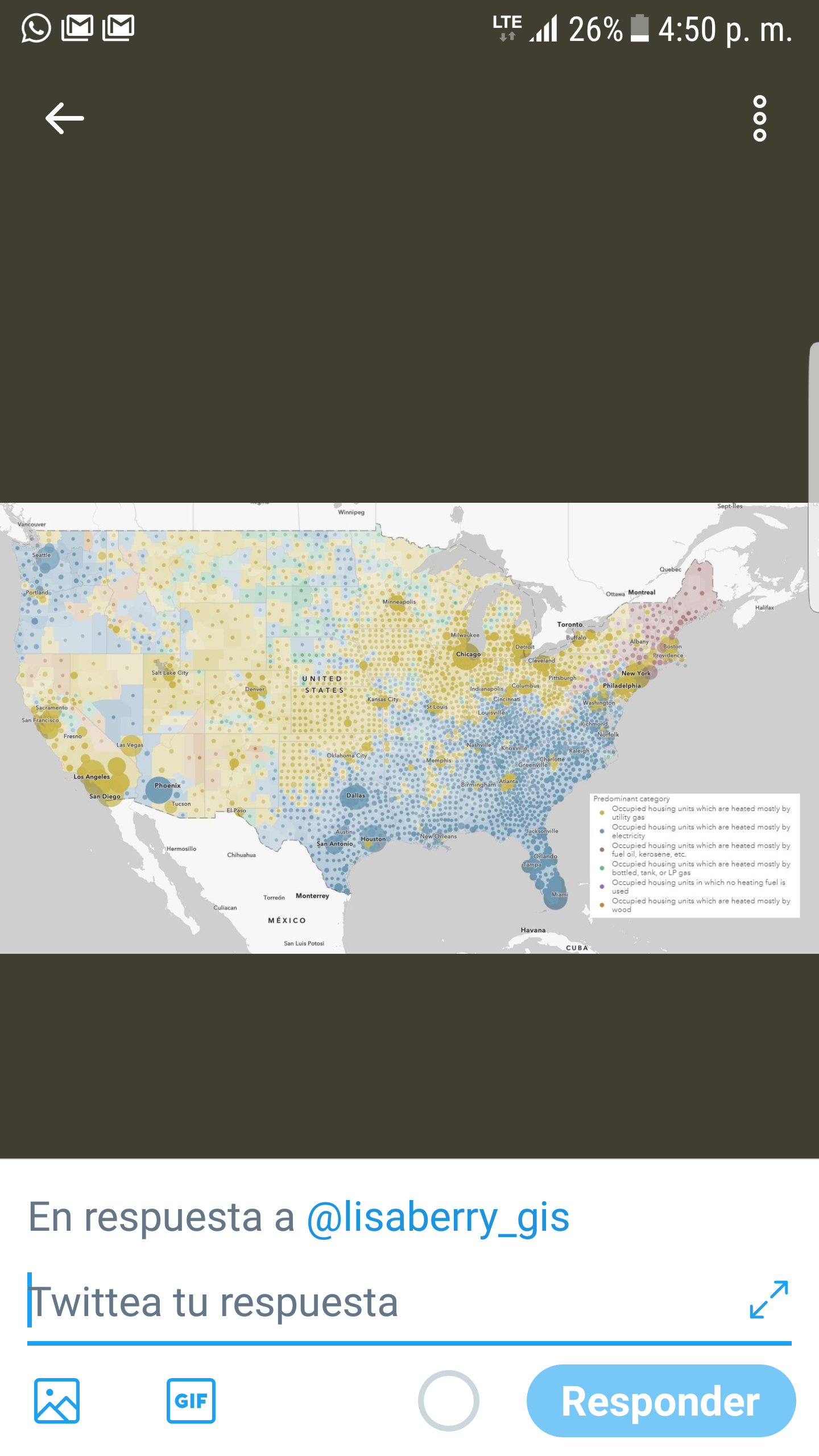
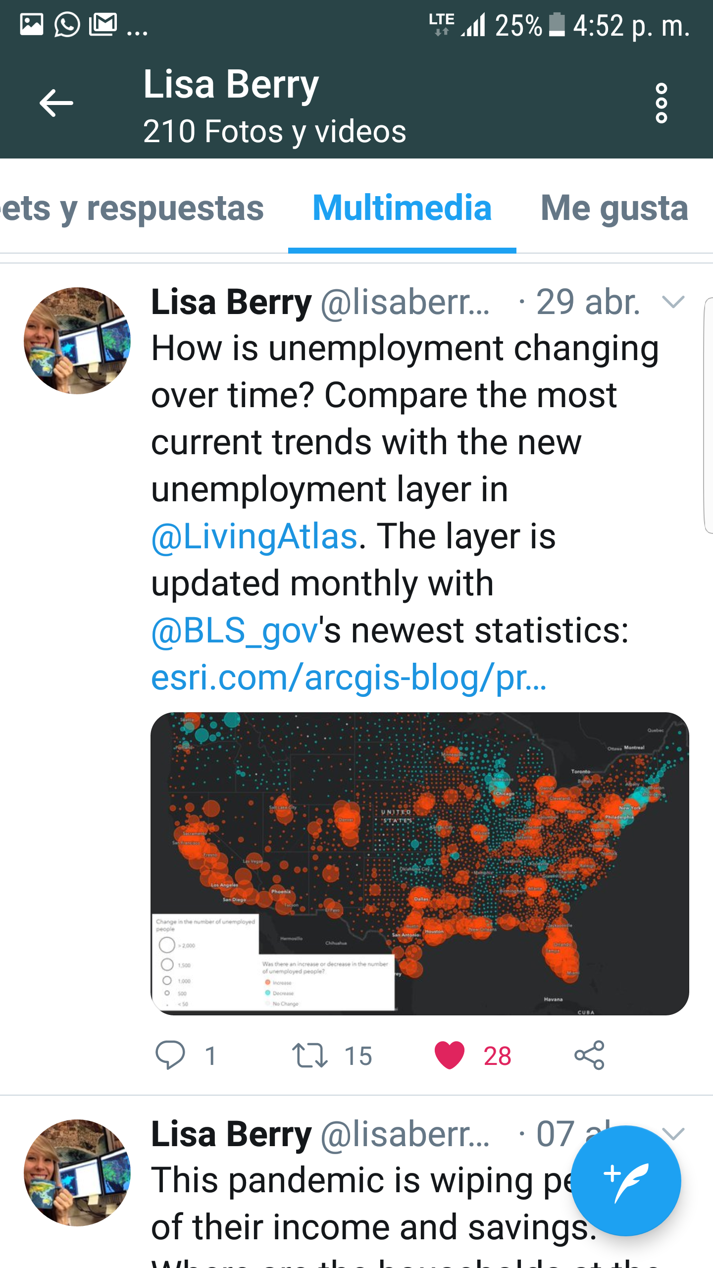
Hi Onel,
Both of these maps were made in ArcGIS Online using Smart Mapping functionality.
For the home heating type map, we use a "predominance" style for the polygon data, turn the transparency up. Then copy the layer, and use "predominance and size" style with the same attributes & colors right on top of it. Here's some tips on predominance mapping: https://www.esri.com/arcgis-blog/products/arcgis-online/mapping/whats-new-in-predominance-mapping-ap...
For the unemployment map, we used "above and below" symbology with proportional symbols. Above and below allows you to center your color ramp on a critical value. This blog post has some good info about it in the "Above and Below Theme" section: https://www.esri.com/arcgis-blog/products/arcgis-online/mapping/better-breaks-define-your-maps-purpo...
Best of luck with your bamboo map!
-Diana
- Mark as New
- Bookmark
- Subscribe
- Mute
- Subscribe to RSS Feed
- Permalink
- Report Inappropriate Content
this post may be helpful
https://community.esri.com/message/928111-re-how-to-symbolize-by-type-and-size-in-pro?
you could also mix it with a bivariate choropleth to show 3 factors.
- Mark as New
- Bookmark
- Subscribe
- Mute
- Subscribe to RSS Feed
- Permalink
- Report Inappropriate Content
Hi Onel,
Both of these maps were made in ArcGIS Online using Smart Mapping functionality.
For the home heating type map, we use a "predominance" style for the polygon data, turn the transparency up. Then copy the layer, and use "predominance and size" style with the same attributes & colors right on top of it. Here's some tips on predominance mapping: https://www.esri.com/arcgis-blog/products/arcgis-online/mapping/whats-new-in-predominance-mapping-ap...
For the unemployment map, we used "above and below" symbology with proportional symbols. Above and below allows you to center your color ramp on a critical value. This blog post has some good info about it in the "Above and Below Theme" section: https://www.esri.com/arcgis-blog/products/arcgis-online/mapping/better-breaks-define-your-maps-purpo...
Best of luck with your bamboo map!
-Diana