Turn on suggestions
Auto-suggest helps you quickly narrow down your search results by suggesting possible matches as you type.
Cancel
- Home
- :
- All Communities
- :
- Products
- :
- ArcGIS Dashboards
- :
- ArcGIS Dashboards Questions
- :
- COVID-19 7 day rolling average serial chart in Das...
Options
- Subscribe to RSS Feed
- Mark Topic as New
- Mark Topic as Read
- Float this Topic for Current User
- Bookmark
- Subscribe
- Mute
- Printer Friendly Page
COVID-19 7 day rolling average serial chart in Dashboard
Subscribe
04-01-2020
01:56 PM
- Mark as New
- Bookmark
- Subscribe
- Mute
- Subscribe to RSS Feed
- Permalink
- Report Inappropriate Content
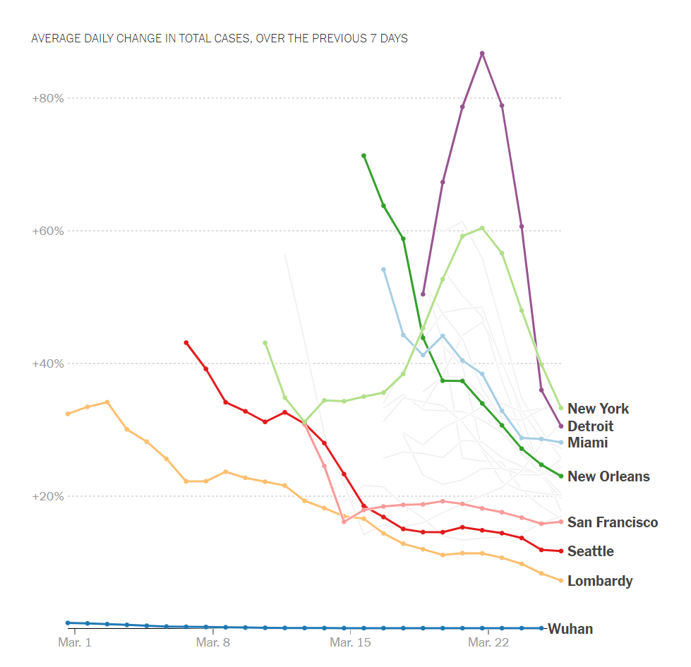
I'd like to create a serial chart in Dashboard that shows a rolling average - showing the average change in the total COVID-19 cases over the past 7 days. Is there any way to do this from a simple table of cases, where each row in the table contains the date and a case count?
Here is an example of the result I'd like to end up with (this is from NY Times):
Jay
Washoe County GIS
Washoe County GIS
Solved! Go to Solution.
1 Solution
Accepted Solutions
08-04-2020
10:07 AM
- Mark as New
- Bookmark
- Subscribe
- Mute
- Subscribe to RSS Feed
- Permalink
- Report Inappropriate Content
Doesn't seem like this is possible. So we are pre-processing the data to get the moving average.
Jay
Washoe County GIS
Washoe County GIS
1 Reply
08-04-2020
10:07 AM
- Mark as New
- Bookmark
- Subscribe
- Mute
- Subscribe to RSS Feed
- Permalink
- Report Inappropriate Content
Doesn't seem like this is possible. So we are pre-processing the data to get the moving average.
Jay
Washoe County GIS
Washoe County GIS