- Home
- :
- All Communities
- :
- Products
- :
- ArcGIS Pro
- :
- ArcGIS Pro Questions
- :
- Scatter Plot Matrix Chart Giving Wrong Answer?
- Subscribe to RSS Feed
- Mark Topic as New
- Mark Topic as Read
- Float this Topic for Current User
- Bookmark
- Subscribe
- Mute
- Printer Friendly Page
Scatter Plot Matrix Chart Giving Wrong Answer?
- Mark as New
- Bookmark
- Subscribe
- Mute
- Subscribe to RSS Feed
- Permalink
- Report Inappropriate Content
I assume the result of the scatter plot matrix chart in Argis Pro represent correlation coefficient between two variables. If this is true, I noticed two things I think another person may verify:
1. The result R2 (coefficient values) returned by the chart is not consistent with R2 result values obtained from Correlation in Microsft Excel. Can someone use any data to try to very that I am not doing something wrong from here?
2. Is there any way to add the direction of the relationship in the scatter plot matrix? Noticed that all the values are positive even when some of the relationships are negative really.
You may wish to try with this data as pasted below.
| LONG | LONG | A | B | C | D |
| 8.80642 | 9.5468 | 12 | 45 | 2 | 7.67 |
| 8.80642 | 9.5468 | 6.94 | 87 | 2 | 35 |
| 8.80642 | 9.5468 | 7.6 | 56 | 1.5 | 45 |
| 8.80642 | 9.5468 | 16.41 | 234.96 | 4 | 8 |
| 8.80642 | 9.5468 | 21.89 | 332.8 | 2.2 | 20.8 |
| 8.80642 | 9.5468 | 19.3 | 322.53 | 1.02 | 31.75 |
| 8.80642 | 9.5468 | 16.7 | 492.18 | 0.97 | 20.13 |
| 8.80642 | 9.5468 | 10.33 | 376.97 | 0.34 | 12.42 |
| 8.80642 | 9.5468 | 5.15 | 534.67 | 0.59 | 17.5 |
| 8.80642 | 9.5468 | 23.92 | 926.33 | 0.87 | 24.42 |
| 8.80642 | 9.5468 | 25.04 | 748.99 | 2.16 | 11.06 |
| 8.80642 | 9.5468 | 21.46 | 1161.61 | 0.62 | 12.07 |
| 8.80642 | 9.5468 | 46.63 | 767.54 | 1.83 | 26.86 |
| 8.80642 | 9.5468 | 34.49 | 379.98 | 1.02 | 24.69 |
| 8.80642 | 9.5468 | 35.71 | 722.07 | 1.25 | 16.65 |
| 8.80642 | 9.5468 | 49.06 | 626.86 | 3.22 | 20.13 |
| 8.80642 | 9.5468 | 23.68 | 512.88 | 3.29 | 70.2 |
- Mark as New
- Bookmark
- Subscribe
- Mute
- Subscribe to RSS Feed
- Permalink
- Report Inappropriate Content
could be that the coefficients you are seeing are adjusted correlation coefficients, is that what excel is using?
- Mark as New
- Bookmark
- Subscribe
- Mute
- Subscribe to RSS Feed
- Permalink
- Report Inappropriate Content
Hi Dan,
Thanks for your response. Excel values are not adjusted neither are those from the scatter plot matrix hence I assume they should be same if rounded to same decimals. I ran same values again, just to double check, and I continue to get this differences. Excel values seem to confirm perceptible trend of the variables though. Nevertheless, this discrepancy shouldn't be. Am just a little curious what's going on. This two processes (both Excel and ArcGIS) are fairly simple to handle!! Or what could make things go wrong in ArcGIS when using scatter plot chart; must the data be projected, etc? I will love to know
Thanks.
- Mark as New
- Bookmark
- Subscribe
- Mute
- Subscribe to RSS Feed
- Permalink
- Report Inappropriate Content
Andy, I didn't look in detail, but I think Pro is reporting adjusted values. and are you doing simple correlations or multivariate etc?
- Mark as New
- Bookmark
- Subscribe
- Mute
- Subscribe to RSS Feed
- Permalink
- Report Inappropriate Content
Thanks again Dan.
Good to know that Pro's values are adjusted R2. However, this doesn't seem to be the issue. See attached a comparison of values from Excel with Pro. They are distance apart.
Yes, am considering multiple variables same time (multivariate) . Does that have any impact or is it handled anyway differently? I am aware I can only chart a minimum of 3 variables. Meanwhile, can we get the direction relationship (- minus sign, etc)
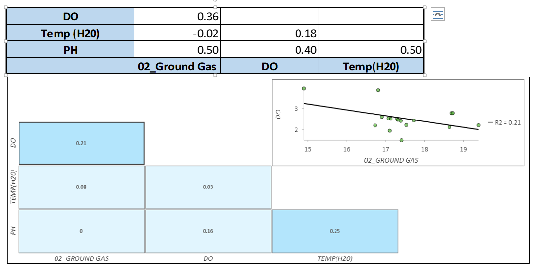
Please, look at the attached and possibly advise.
Thanks
- Mark as New
- Bookmark
- Subscribe
- Mute
- Subscribe to RSS Feed
- Permalink
- Report Inappropriate Content
Hi @Elijah ,
Thanks for the question! It appears that the results you’ve posted from Excel might be the Pearson’s r correlation coefficient values, while the results you’ve posted from Pro are the r-squared values. This is based on the observation that squaring the values from Excel yields the values that are displayed in Pro.
In Pro version 2.7 and above, you can view the Pearson’s r values in a scatter plot matrix by selecting the appropriate option in the Data tab of the Chart Properties pane:

Thanks!
Chris