- Home
- :
- All Communities
- :
- Products
- :
- ArcGIS Online
- :
- ArcGIS Online Questions
- :
- Any Kind of Service from a Dot Density Map: Sugges...
- Subscribe to RSS Feed
- Mark Topic as New
- Mark Topic as Read
- Float this Topic for Current User
- Bookmark
- Subscribe
- Mute
- Printer Friendly Page
Any Kind of Service from a Dot Density Map: Suggestions Needed!
- Mark as New
- Bookmark
- Subscribe
- Mute
- Subscribe to RSS Feed
- Permalink
- Report Inappropriate Content
Hi -
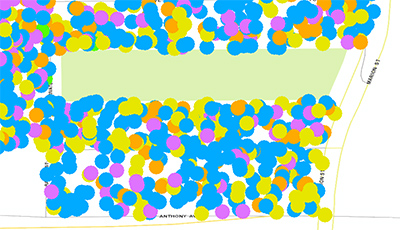
I'm trying to turn a dot density map in ArcMap 10.5 into tiles (or any kind of service to show dot density) for use in ArcGIS Online. I'm starting with polygons that are symbolized with the dot density symbology, using several different colors of dots.
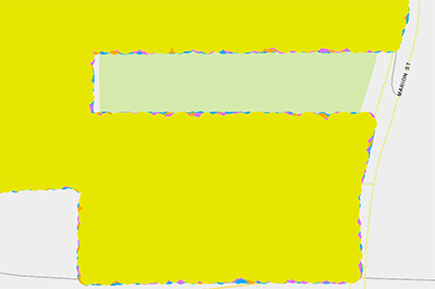
When I go to File > Service in ArcMap 10.5, and create a map tile service from the layer on top in ArcGIS Online, and look at it at the same scale in ArcGIS Online (1:2,257), it turns into the bottom. On the Properties > Display Tab, I have checked the check box to "Scale symbols when a reference scale is set". A reference scale of 1:55,871 is set in "General" tab of the the Data Frame Properties dialog box.
There are two problems/inconsistencies I see:
- On the top, yellow showed in dots that were dispersed with lots of space in between. That's what I want. On the bottom, the yellow is pretty much everywhere.
- On the top, the yellow randomly was on top of or below other dots. That's what I want. On the bottom, it's uniformly on the top.
So. Suggestions on how to make a dot density map like the one shown on top into some sort of service that I can use with ArcGIS Online?
ArcMap 10.5 Dot Density Symbolized Polygon Feature Class:
ArcGIS Online Map Tile Service:
- Mark as New
- Bookmark
- Subscribe
- Mute
- Subscribe to RSS Feed
- Permalink
- Report Inappropriate Content
So we did solve this eventually. For those wanting to create (for example) a dot map by race and ethnicity for their area off of either American Community Survey data or the upcoming 2020 decennial Census, here's the overview of how.
We first tried to create this map tile service off of an ArcMap 10.X layer representing each block group, symbolized using the "Dot Density" symbology. However, when exported as a service, we found that what were randomly ordered dots in ArcMap became dots where one color (in this case representing white people) covered up everyone else. Certainly not what we were wanting to show! Additionally, while the scale of the dots remained consistent in our map, even after setting and adhering to a reference scale in ArcMap 10.X, the dots became so large at closer-in scale that the color of dot on "top" of the others covered most everything else up. Again, not what we had intended.
To rectify these issues, we used the “Create Random Points” tool one race/ethnicity at a time, porportioning the dots numerically according to the numbers of that race/ethnicity in each block group. Then we used the append tool to combine the resulting feature classes. And then we found a method to assign a random number to each record in ArcMap, and used these numbers with the "Sort" tool to re-sort the feature class with the re-combined dots so one race/ethnicity doesn’t end up “on top of” another when drawn on the map. There may be ways to do this in ArcGIS, or you can explore ways to export the table temporarily to Excel, calculate a random number in a column, join that back into ArcGIS. We then exported this as a tile service to ArcGIS online.
The result, if you're interested, is here:
Race & Ethnicity in Saint Paul