- Home
- :
- All Communities
- :
- Products
- :
- ArcGIS StoryMaps
- :
- Classic Esri Story Maps Questions
- :
- HTML Table not formatting on mobile
- Subscribe to RSS Feed
- Mark Topic as New
- Mark Topic as Read
- Float this Topic for Current User
- Bookmark
- Subscribe
- Mute
- Printer Friendly Page
- Mark as New
- Bookmark
- Subscribe
- Mute
- Subscribe to RSS Feed
- Permalink
- Report Inappropriate Content
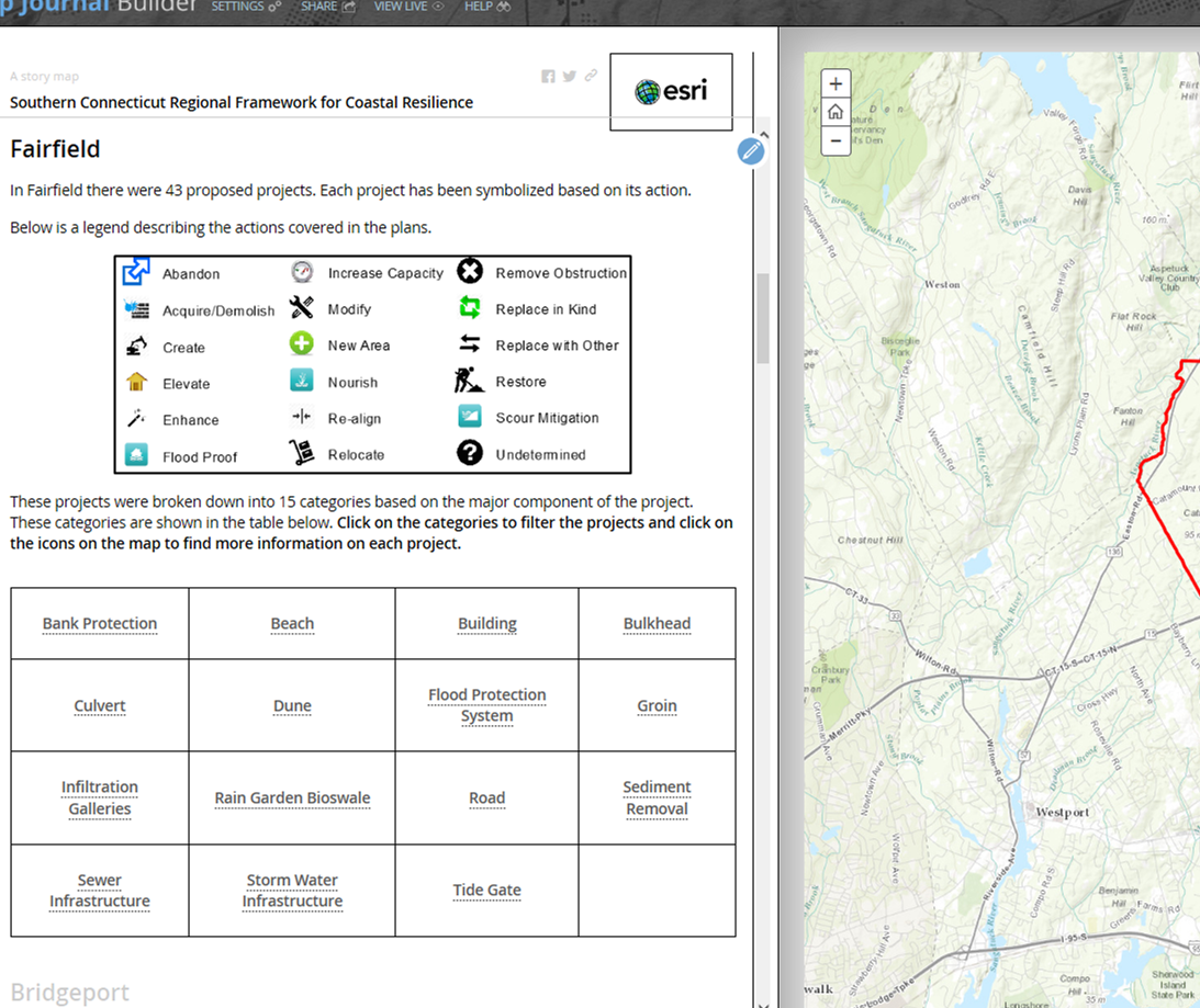
I recently created a story map journal to showcase some projects I am working on with The Nature Concervancy. I wanted to have pages for each town involved and then be able to click on project types on the side panel to turn projects on and off in the main stage.
I discovered on GeoNet that you cannot leave spaces between words on the side panel (it just automatically sets it to 1 space) so I followed the advice of another user and created an HTML table .
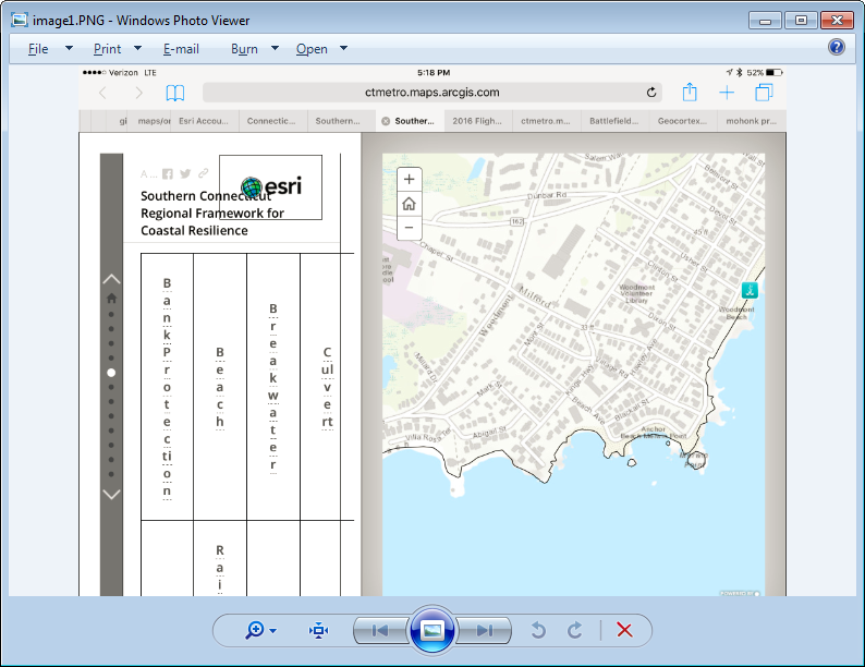
It worked fine but the table does not adjust when displayed on different screens. It looked fine on my larger work computer but when on my laptop it displays as follows:
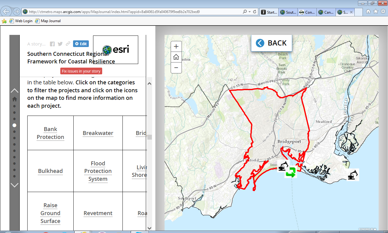
It is even worse on an Ipad.
I am new to HTML and pretty much just copied and pasted code in and adjusted to make it work but I am wondering if there is some code I am missing that will get the table to adjust size depending on the screen. Below is how I formatted my table in HTML. Any advice would be greatly appreciated, thanks!
<style type="text/css">table, th, td {
border: 1px solid black;
padding: 30px;
}
</style>
<table>
<tbody>
<tr>
<td style="text-align: center;"><strong><span style="font-size:18px"><a data-storymaps="MJ-ACTION-1453219985018" data-storymaps-type="media">Bank Protection</a></span></strong></td>
<td style="text-align: center;"><span style="font-size:18px"><strong><a data-storymaps="MJ-ACTION-1453220000213" data-storymaps-type="media">Beach</a></strong></span></td>
<td style="text-align: center;"><span style="font-size:18px"><strong><a data-storymaps="MJ-ACTION-1453220020242" data-storymaps-type="media">Building</a></strong></span></td>
<td style="text-align: center;"><strong><span style="font-size:18px"><a data-storymaps="MJ-ACTION-1453220035002" data-storymaps-type="media">Bulkhead</a></span></strong></td>
</tr>
<tr>
<td style="text-align: center;"><span style="font-size:18px"><strong><a data-storymaps="MJ-ACTION-1453220055343" data-storymaps-type="media">Culvert</a></strong></span></td>
<td style="text-align: center;"><span style="font-size:18px"><strong><a data-storymaps="MJ-ACTION-1453220072792" data-storymaps-type="media">Dune</a></strong></span></td>
<td style="text-align: center;"><span style="font-size:18px"><strong><a data-storymaps="MJ-ACTION-1453220088321" data-storymaps-type="media">Flood Protection System</a></strong></span></td>
<td style="text-align: center;"><span style="font-size:18px"><strong><a data-storymaps="MJ-ACTION-1453220101187" data-storymaps-type="media">Groin</a></strong></span></td>
</tr>
<tr>
<td style="text-align: center;"><span style="font-size:18px"><strong><a data-storymaps="MJ-ACTION-1453220116983" data-storymaps-type="media">Infiltration Galleries</a></strong></span></td>
<td style="text-align: center;"><span style="font-size:18px"><strong><a data-storymaps="MJ-ACTION-1453220129548" data-storymaps-type="media">Rain Garden Bioswale</a></strong></span></td>
<td style="text-align: center;"><span style="font-size:18px"><strong><a data-storymaps="MJ-ACTION-1453220143714" data-storymaps-type="media">Road</a></strong></span></td>
<td style="text-align: center;"><span style="font-size:18px"><strong><a data-storymaps="MJ-ACTION-1453220155461" data-storymaps-type="media">Sediment Removal</a></strong></span></td>
</tr>
<tr>
<td style="text-align: center;"><span style="font-size:18px"><strong><a data-storymaps="MJ-ACTION-1453220170065" data-storymaps-type="media">Sewer Infrastructure</a></strong></span></td>
<td style="text-align: center;"><span style="font-size:18px"><strong><a data-storymaps="MJ-ACTION-1453220184134" data-storymaps-type="media">Storm Water Infrastructure</a></strong></span></td>
<td style="text-align: center;"><strong><span style="font-size:18px"><a data-storymaps="MJ-ACTION-1453220198041" data-storymaps-type="media">Tide Gate</a></span></strong></td>
<td style="text-align: center;"> </td>
</tr>
</tbody>
</table>
Solved! Go to Solution.
Accepted Solutions
- Mark as New
- Bookmark
- Subscribe
- Mute
- Subscribe to RSS Feed
- Permalink
- Report Inappropriate Content
You are welcome. I am sorry but I should have done some testing yesterday. As Map Journal is already built with Bootstrap, you should not have to include anything to use it but in fact the grid part that you are interested in is not included in the app (the app use a custom built of Bootstrap to save bandwidth).
So to use Bootstrap in Map Journal you have to download the application and replace bootstrap with the default version from getbootstrap.com (replace lib-app/bootstrap and follow that guide GitHub - Esri/map-journal-storytelling-template-js: The Story Map Journal is ideal when you want to ... ). It's not simple but if you can do that it should work fine.
Otherwise I would recommend that you find some example code online that does what you want and don't require any dependencies (i.e. you can just copy paste the style tag in editor source mode). Like maybe that one https://css-tricks.com/examples/ResponsiveTables/responsive.php
Hope you will figure it out.
- Mark as New
- Bookmark
- Subscribe
- Mute
- Subscribe to RSS Feed
- Permalink
- Report Inappropriate Content
Can you elaborate more on: "It worked fine but the table does not adjust when displayed on different screens." For example, with your screenshots above, what do you expect the table to look like? Do you simply expect the table to shrink/scale down to the point where the text is illegible?
It would be helpful to GeoNet users if you could publish the Story Map for people to load into their browsers to see exactly what is going on. Since HTML styling cascades from multiple levels, hence the "C" is CSS, there are lots of settings from above the table that affect how the table displays. In short, just looking at the table HTML itself doesn't give the whole story. That said, there are a few things that can be said about the table HTML.
Hard coding the table padding at 30px isn't helping your cause. The padding can be set in many ways, including as a scale. I would read up on the padding setting and experiment with some other options besides hard coding 30px. Similarly, your font size is also hard coded at 18px, which is fairly large, but the real issue is hard coding it in px instead of scaling it.
Even with exploring scaling options for padding and font size, as I mentioned earlier, some of your table styling will come down from higher styling elements. I encourage you to use the developer mode in whatever browser you are using to explore the styling elements of your table and where they are be set in various layers of HTML.
- Mark as New
- Bookmark
- Subscribe
- Mute
- Subscribe to RSS Feed
- Permalink
- Report Inappropriate Content
Hi Josh,
Thanks for the reply. Basically what I mean by work fine is that I set it up on my larger screen and created the padding and pixel size so that the entire table fit on the screen with the largest possible text. (See below)
What I hoped would happen was as I switched to different screen sizes the table would adjust like the other texts and images so that the user would be able to see the entire table on the side panel no matter what the screen size.
I will look into scaling the padding and pixel size to see if that helps. I cannot share the map at this time as some of the content is not ready for public consumption without further review but I will try to look into the styling as well to see what I can find and post.
As you can tell I am new to programming so all the advice is very helpful, thanks.
- Mark as New
- Bookmark
- Subscribe
- Mute
- Subscribe to RSS Feed
- Permalink
- Report Inappropriate Content
What you are experiencing is the expected behavior of a table. The table will use all the available width and divide the space for each column equally, you can also specify specific width for each column in pixel or % but I don't think it will help. When the space is limited, the space for the column will be really small. If you want to change the layout depending on the browser size, you have to use the technique called responsive design. Basically instead of using column your data will be on multiple rows. We are using the following framework in the app http://getbootstrap.com/css/#grid . I haven't tested but you should be able to use it directly in the side panel.
- Mark as New
- Bookmark
- Subscribe
- Mute
- Subscribe to RSS Feed
- Permalink
- Report Inappropriate Content
Thanks Greg,
I have come across bootstrap and it looks like it the grid is exactly what I need. Just being new to programming I am still lost as to where to insert the code to get it to on my app. I found the ESRI Bootstrap github so will look more into that but if anyone has any examples of bootstrap in an ESRI app it would be greatly appreciated.
Thanks
- Mark as New
- Bookmark
- Subscribe
- Mute
- Subscribe to RSS Feed
- Permalink
- Report Inappropriate Content
You are welcome. I am sorry but I should have done some testing yesterday. As Map Journal is already built with Bootstrap, you should not have to include anything to use it but in fact the grid part that you are interested in is not included in the app (the app use a custom built of Bootstrap to save bandwidth).
So to use Bootstrap in Map Journal you have to download the application and replace bootstrap with the default version from getbootstrap.com (replace lib-app/bootstrap and follow that guide GitHub - Esri/map-journal-storytelling-template-js: The Story Map Journal is ideal when you want to ... ). It's not simple but if you can do that it should work fine.
Otherwise I would recommend that you find some example code online that does what you want and don't require any dependencies (i.e. you can just copy paste the style tag in editor source mode). Like maybe that one https://css-tricks.com/examples/ResponsiveTables/responsive.php
Hope you will figure it out.
- Mark as New
- Bookmark
- Subscribe
- Mute
- Subscribe to RSS Feed
- Permalink
- Report Inappropriate Content
Thanks for your response. After some basic HTML and CSS training I was able to wrap my head around things and implement the bootstrap grid. I downloaded the story map configurable app, pushed it up to my web server and added a reference to the bootstrap CSS
<link rel="stylesheet" href="http://maxcdn.bootstrapcdn.com/bootstrap/3.3.6/css/bootstrap.min.css">
Then in the application side panel I was able to put in the grid along with a parameter for padding between rows, which created two columns on large screes and one column on everything else.
<style type="text/css">.rows {
margin-bottom: 20px}
</style>
<div class="container-fluid">
<div class="row">
<div class="col-lg-6 rows">Building</div>
<div class="col-lg-6 rows">Beach</div>
<div class="col-lg-6 rows">Breakwater</div>
<div class="col-lg-6 rows">Dune</div>
<div class="col-lg-6 rows">Stormwater</div>
Thanks for all your help.