- Home
- :
- All Communities
- :
- Developers
- :
- JavaScript Maps SDK
- :
- JavaScript Maps SDK Questions
- :
- Mobile Popup Behind Buttons
- Subscribe to RSS Feed
- Mark Topic as New
- Mark Topic as Read
- Float this Topic for Current User
- Bookmark
- Subscribe
- Mute
- Printer Friendly Page
- Mark as New
- Bookmark
- Subscribe
- Mute
- Subscribe to RSS Feed
- Permalink
- Report Inappropriate Content
JavaScript noob so pardon my ignorance.
I'm building a app that is to be mainly used on mobile devices.
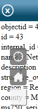
The issue i am hoping you all can help me with is that when opened the MobilePopup is behind the home, locate, and additional button i have added. Note the navigation buttons are properly behind the the Popup.
I'm using the 3,11comnpact API
// set up geolocator
                    geoLocate = new LocateButton({
                        map: map
                    }, "LocateButton");
                    geoLocate.startup();
                    //set up geolocator and home buttons
                    var home = new HomeButton({
                        map: map
                    }, "HomeButton");
                    home.startup();

                    //info window and info Template
                    var infoWindow = new PopupMobile(null, DomConstruct.create("div"));
                    map.setInfoWindow(infoWindow);
                    var infoWindowTemplate = new InfoTemplate();
                    infoWindowTemplate.setTitle("<b>${name}</b>");

    <style>
        html, body, #mapDiv{
            padding: 0;
            margin: 0;
            height: 100%;
        }
        #LocateButton {
            position: absolute;
            top: 95px;
            left: 20px;
            z-index: 50;
        }
        #HomeButton {
            position: absolute;
            top: 135px;
            left: 20px;
            z-index: 50;
        }
        #nearButton {
             position: absolute;
             top: 175px;
             left: 20px;
             height:35px;
             width: 35px;
             border-radius: 5px;
             opacity: 0.75;
             z-index: 50;
         }
    </style>
<body>
    <div id="mapDiv">
        <div id="HomeButton"></div>
        <div id="LocateButton"></div>
        <button id="nearButton" data-dojo-type="dijit/form/Button"></button>
    </div>
</body>
Solved! Go to Solution.
Accepted Solutions
- Mark as New
- Bookmark
- Subscribe
- Mute
- Subscribe to RSS Feed
- Permalink
- Report Inappropriate Content
Changing the z-index for the home and locate button will fix the issue with the popup appearing behind the home and locate button. Elements with z-index values that are larger will cover those with lower z-values. More info can be found here: z-index - CSS | MDN
And here's an example of your updated css that sets the z-index to 30.
    #LocateButton {
        position: absolute;
        top: 95px;
        left: 20px;
        z-index: 30;
    }
    #HomeButton {
        position: absolute;
        top: 155px;
        left: 20px;
        z-index: 30;
    }
To modify the width and height of the buttons you can set the width and height using css like this:
    #HomeButton .home, #LocateButton .zoomLocateButton{
        width:42px;
        height:42px;
    }
- Mark as New
- Bookmark
- Subscribe
- Mute
- Subscribe to RSS Feed
- Permalink
- Report Inappropriate Content
Also sizing the home and locate button would be cool. in a mobile app they are quite small
- Mark as New
- Bookmark
- Subscribe
- Mute
- Subscribe to RSS Feed
- Permalink
- Report Inappropriate Content
Changing the z-index for the home and locate button will fix the issue with the popup appearing behind the home and locate button. Elements with z-index values that are larger will cover those with lower z-values. More info can be found here: z-index - CSS | MDN
And here's an example of your updated css that sets the z-index to 30.
    #LocateButton {
        position: absolute;
        top: 95px;
        left: 20px;
        z-index: 30;
    }
    #HomeButton {
        position: absolute;
        top: 155px;
        left: 20px;
        z-index: 30;
    }
To modify the width and height of the buttons you can set the width and height using css like this:
    #HomeButton .home, #LocateButton .zoomLocateButton{
        width:42px;
        height:42px;
    }
- Mark as New
- Bookmark
- Subscribe
- Mute
- Subscribe to RSS Feed
- Permalink
- Report Inappropriate Content
Awesome on the z index Kelly Hutchins that resolved my overlap issue in short order.
I ended up linking to the css for the home and locate button to achieve the resize.
This works well enough but i think i'm doing something wrong bc i can not use percentage to size the button effectively. When i do, the button goes all pear shaped, figuratively that is.
- Mark as New
- Bookmark
- Subscribe
- Mute
- Subscribe to RSS Feed
- Permalink
- Report Inappropriate Content
Can you post the css you are using? Or modify this test app to show the problem you are experiencing:
<!DOCTYPE html>
  <html>
  <head>
  <title>Create a Web Map</title>
  <meta http-equiv="Content-Type" content="text/html; charset=utf-8">
  <meta name="viewport" content="initial-scale=1, maximum-scale=1,user-scalable=no">


  <link rel="stylesheet" type="text/css" href="http://js.arcgis.com/3.11/esri/css/esri.css">
  <style>
    html,body,#mapDiv,.map.container{
      padding:0;
      margin:0;
      height:100%;
    }
    #LocateButton {
        position: absolute;
        top: 95px;
        left: 20px;
        z-index: 30;
    }
    #HomeButton {
        position: absolute;
        top: 155px;
        left: 20px;
        z-index: 30;
    }
    #HomeButton .home, #LocateButton .zoomLocateButton{
        width:42px;
        height:42px;
    }
  </style>


  <script>var dojoConfig = { parseOnLoad: true };</script>
  <script src="http://js.arcgis.com/3.11compact/"></script>
  <script>
    var map,
        webmapId = "1a40fa5cc1ab4569b79f45444d728067";

    require([
      "esri/map",
      "esri/arcgis/utils",
      "esri/dijit/HomeButton",
      "esri/dijit/LocateButton",
      "dojo/domReady!"
      ], function (Map, arcgisUtils, HomeButton, LocateButton) {
        arcgisUtils.createMap(webmapId, "mapDiv").then(function (response) {
        map = response.map;


        geoLocate = new LocateButton({
            map: map
        }, "LocateButton");
        geoLocate.startup();
        //set up geolocator and home buttons
        var home = new HomeButton({
            map: map
        }, "HomeButton");
        home.startup();


    });
    });
  </script>


  </head>


  <body>
    <div id="mapDiv">
        <div id="HomeButton"></div>
        <div id="LocateButton"></div>


    </div>
  </body>
  </html>
- Mark as New
- Bookmark
- Subscribe
- Mute
- Subscribe to RSS Feed
- Permalink
- Report Inappropriate Content
i am using the locate and home css available on github :https://github.com/Esri/arcgis-dijit-locate-button-js/blob/master/css/LocateButton.css
locate: arcgis-dijit-locate-button-js/LocateButton.css at master
home: arcgis-dijit-home-button-js/HomeButton.css at master
many thanks for all of your help thus far 
- Mark as New
- Bookmark
- Subscribe
- Mute
- Subscribe to RSS Feed
- Permalink
- Report Inappropriate Content
Both the home and locate button provided via github are now available as part of the javascript api. Both widgets already use the css on the github site so no need to include it again. If you want to modify the look of some component of the widget you can modify just that value. For example to change the background-color you could do something like this:
.LocateButton .zoomLocateButton{
background-color: rgba(255, 0, 0, 0.80);
}
You mentioned something about percentages - are you using them for the width and height? If so can you post the modified css you are using?
- Mark as New
- Bookmark
- Subscribe
- Mute
- Subscribe to RSS Feed
- Permalink
- Report Inappropriate Content
the only modifications i made to the CSS are
.HomeButton .home {
padding:2px;
width:30%;
height:30%;
background-color: #666;
background-color: rgba(102,102,102,0.80);
-webkit-user-select:none;
-moz-user-select:none;
-ms-user-select:none;
user-select:none;
cursor:pointer;
-webkit-border-radius:5px;
-moz-border-radius:5px;
-o-border-radius:5px;
border-radius:5px;background-size: 80px 80px;
background-image:url(../images/home_white.png);
background-position:center center;
background-repeat:no-repeat;
}
- Mark as New
- Bookmark
- Subscribe
- Mute
- Subscribe to RSS Feed
- Permalink
- Report Inappropriate Content
Not sure percentage based width/height are the best choices in this situation. When using percentages the parent element must have an explicit height set. Was there a reason you wanted to use percentage values? If not then specifying the value in em or px should work just fine. More details on setting the height and how percentages work can be found here:
- Mark as New
- Bookmark
- Subscribe
- Mute
- Subscribe to RSS Feed
- Permalink
- Report Inappropriate Content
I was looking to use percentage mainly bc the app is going to be used on a variety of mobile platforms (tablets, phones and some new trimble stuff) with varying sizes and resolutions and i was hoping to have a consistent button size. is there a best practice i need to look at to achieve this goal?
many thanks for all of your great feed back Kelly Hutchins