- Home
- :
- All Communities
- :
- User Groups
- :
- Web AppBuilder Custom Widgets
- :
- Questions
- :
- Re: Onscreen Widget Customization for Cellular
- Subscribe to RSS Feed
- Mark Topic as New
- Mark Topic as Read
- Float this Topic for Current User
- Bookmark
- Subscribe
- Mute
- Printer Friendly Page
- Mark as New
- Bookmark
- Subscribe
- Mute
- Subscribe to RSS Feed
- Permalink
- Report Inappropriate Content
Hello,
I would like to change the onscreen widgets for the mobile only. The desktop version has a bookmark and a near me widget. I would like to remove the near me entirely and then reduce the icon size and placement of the bookmark widget. I am using the tabbed theme. Is this easy to do?
Thanks,
Brandon
https://community.esri.com/groups/web-appbuilder-custom-themes?sr=search&searchId=bf141f67-89d3-4e25..., https://community.esri.com/community/gis/web-gis/web-appbuilder, /blogs/myAlaskaGIS/2016/03/09/web-appbuilder-developer-edition-customization-resource-list
Solved! Go to Solution.
- Mark as New
- Bookmark
- Subscribe
- Mute
- Subscribe to RSS Feed
- Permalink
- Report Inappropriate Content
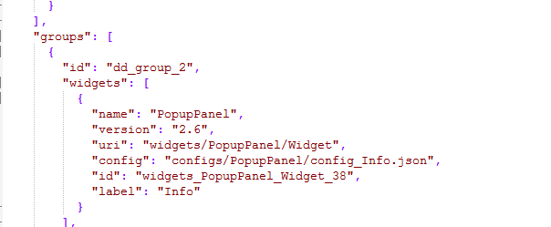
I was basing it off of this here:
- Mark as New
- Bookmark
- Subscribe
- Mute
- Subscribe to RSS Feed
- Permalink
- Report Inappropriate Content
The visible false property would go in that snippet. But Like I said I have not tested the Dashboard theme so this might not work.
- Mark as New
- Bookmark
- Subscribe
- Mute
- Subscribe to RSS Feed
- Permalink
- Report Inappropriate Content
That works, but not well.
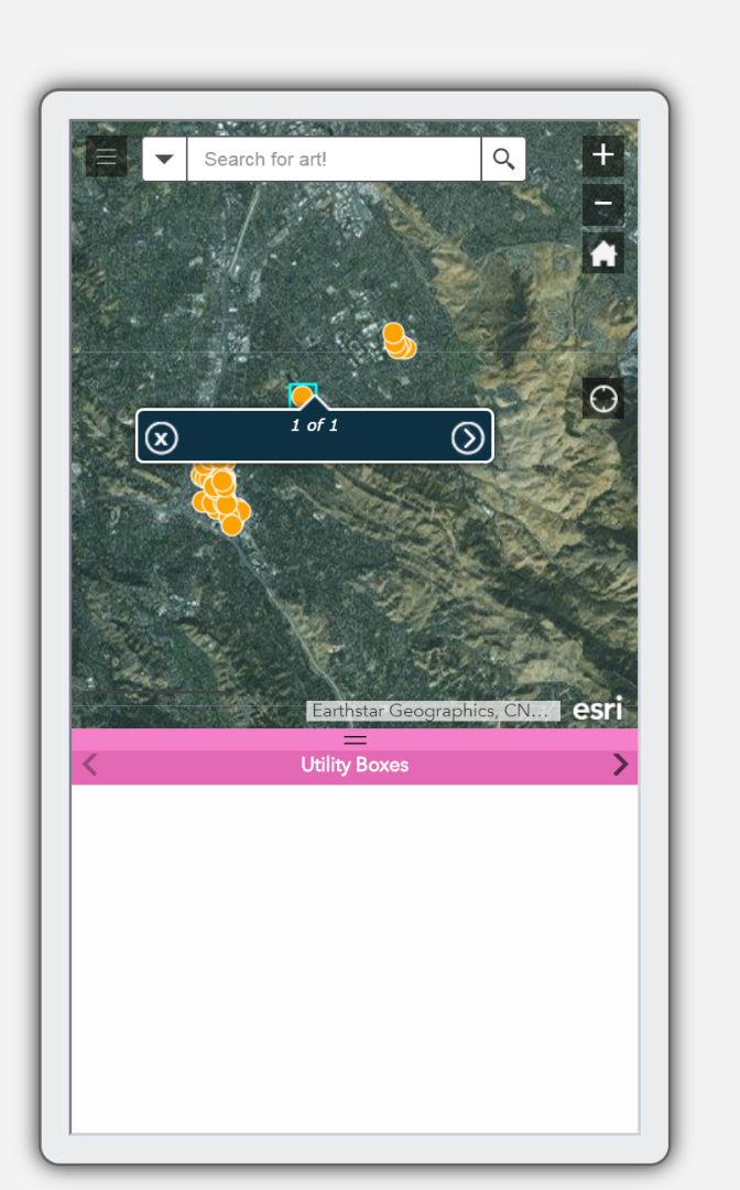
It leaves a blank panel at the bottom with the wrong name. The popup can be found when you click on the ">" but it's just very clunky feeling.
Don't worry about it if you don't have time. It's not that important.
- Mark as New
- Bookmark
- Subscribe
- Mute
- Subscribe to RSS Feed
- Permalink
- Report Inappropriate Content
Bug logged with ESRI.
BUG-000110220 : Changes to "mobileLayout" object in config.json file does not reflect in application
- Mark as New
- Bookmark
- Subscribe
- Mute
- Subscribe to RSS Feed
- Permalink
- Report Inappropriate Content
Happy Thursday David Treering Robert Scheitlin, GISP and everyone,
Apparently this bug is a still a bug in the current WAB to 2.10. Esri TS confirmed. Property isn't used. Oddly, they have logged it as Not In Product Plan. It would be really nice. I prefer to use the official method of doing things vs a hack, whenever possible. We could do this a variety of ways like media queries but those add performance impact (I have read they can if there are many queries) and also it can have cascading impacts and as we all know, you don't want to get a complicated web of CSS and get unexpected conflicts when you use some weirdo screen size or something.
However I decided a semi-clean way to do this is to use the 'mobile' CSS flag from WAB and then target the unique selector id (#) when it's in mobile.
So for me on an app I have for example, it's this one line of CSS:
.jimu-ismobile #widgets_ExtentNavigate_Widget_57
{
display: none !important;
}
Hope this helps. I recommend considering adding it for WAB DE & non-DE 2.11.
- « Previous
- Next »
- « Previous
- Next »