- Home
- :
- All Communities
- :
- Events
- :
- User Conference
- :
- User Conference Questions
- :
- Re: Online UC Agenda falls short for me - let's br...
- Subscribe to RSS Feed
- Mark Topic as New
- Mark Topic as Read
- Float this Topic for Current User
- Bookmark
- Subscribe
- Mute
- Printer Friendly Page
Online UC Agenda falls short for me - let's brainstorm improvements
- Mark as New
- Bookmark
- Subscribe
- Mute
- Subscribe to RSS Feed
- Permalink
- Report Inappropriate Content
The toughest thing for me at the Esri User Conference is making sure I'm using my time as best as possible, and hitting as many sessions as I can. Having easy access to the Agenda is key to this. I always go over it ahead of time, and mark a bunch of "possibles", but there are always multiple sessions in many timeslots that I'd like to attend, and it often comes down to other factors, like who I end up bumping into, and the conversations that ensue. I like to have some potentials marked, but I also like to have live access to the information so last minute choices can be made.
The current online Agenda is certainly better than no online Agenda, which was true only a few years back, but I think it has the potential to be much more useful without too much work. I'm not sure if this online version was new this year or not, but I don't recall it being available 2 years back when I last attended.
I'd like to have folks comment on if they liked it or not, and what ideas they have to make it work better for them. Hopefully, with some thought out discussion, Esri folks will then re-work it a bit.
My criticism is that this version is not very easy to use on either my desktop for pre-planning or on my iPhone for live access.
For one, they included a map widget in the agenda. We're all map geeks, so it's cool to have a map of the convention center room locations, but it shouldn't be an always-there part of the Agenda web page. For the most part, as you are going through the sessions and decided which to go to, location of a particular session is irrelevant as there is ample time between sessions to get from end-to-end. Maximize screen real-estate for the Sessions grid, and make the map an optional window to pop up.
Additionally, it has a scrollable area inside the main page. On the iPhone, this creates dual vertical scrolling, which is difficult to navigate. I think a single page list would work much better. There could be collapsable areas for the days, and then also for the time-slots. Then additionally, the full info for the session could be a collapsable area. This way, all content is on a single web page. No dual content areas, no popups, etc.
The Pocket Agenda is useful, and I'm glad they stopped printing the large Full Agenda to save trees, but the Pocket Agenda doesn't have the details on each session, which is critical for the paper sessions especially, since the session title offers little in the way of really understanding what the 3 presentations will cover.
An easy Search function is critical, and the existing site did fairly well here, but could be better.
What other ideas are out there?
California Department of Fish and Wildlife
- Mark as New
- Bookmark
- Subscribe
- Mute
- Subscribe to RSS Feed
- Permalink
- Report Inappropriate Content
It's very easy to use provides and provides general info, schedule, list of presenters, maps, to-do, schedule, inbox and attendees...
- Mark as New
- Bookmark
- Subscribe
- Mute
- Subscribe to RSS Feed
- Permalink
- Report Inappropriate Content
thanks for sharing!
- Mark as New
- Bookmark
- Subscribe
- Mute
- Subscribe to RSS Feed
- Permalink
- Report Inappropriate Content
Hated the waste of space in the session planner this year. It was designed for a touch screen with only I think 5 sessions titles on screen at a time. But I don't have a touch screen so all it was a big waste of space. On my iPhone 4 it kept crashing.
I had a problem adding to my session planner and contacted ESRI. I heard back that there were problems with IE but they were fixing them. Unfortunately, they didn't mention that on the site. Some how I sessions I never tagged started showing up. I contacted ESRI again the asked for my useridbut I never heard bad from them. THis was like 2 weeks before the conference.
- Mark as New
- Bookmark
- Subscribe
- Mute
- Subscribe to RSS Feed
- Permalink
- Report Inappropriate Content
FYI - Jennifer Ortiz Frank Garofalo
- Mark as New
- Bookmark
- Subscribe
- Mute
- Subscribe to RSS Feed
- Permalink
- Report Inappropriate Content
Thanks for starting this thread, Steve, and for doing so in a generous spirit.
Above you say,
Additionally, it has a scrollable area inside the main page. On the iPhone, this creates dual vertical scrolling, which is difficult to navigate. I think a single page list would work much better. There could be collapsable areas for the days, and then also for the time-slots. Then additionally, the full info for the session could be a collapsable area. This way, all content is on a single web page. No dual content areas, no popups, etc.
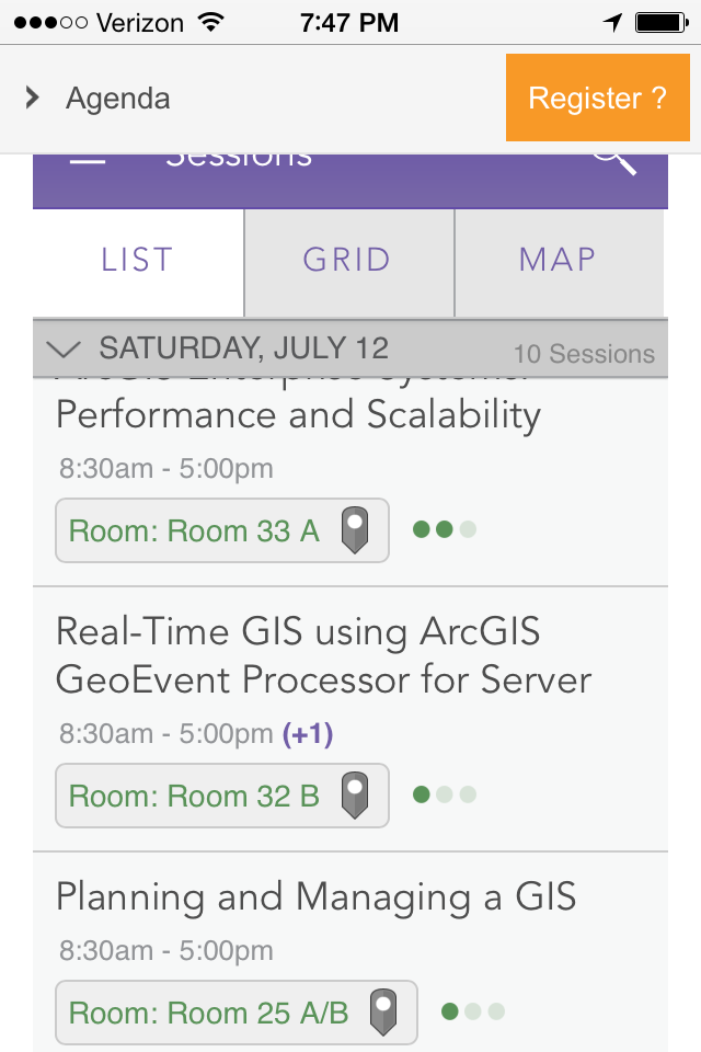
Could you maybe post a screenshot of the area you are referring to as the "main page"? Especially as it relates to scrolling.
- Mark as New
- Bookmark
- Subscribe
- Mute
- Subscribe to RSS Feed
- Permalink
- Report Inappropriate Content
Steven Nelson,
First, thanks for engaging on this in a positive way. It is much appreciated to have the conversation acknowledged.
Below is a screen shot from my iPhone showing the dual-scrolling. The purple "Sessions" header is the bigger container and as shown here is partially scrolled up. The list with the "Saturday" header is the inner container, which is also shown partially scrolled up within it's container. To manage this, once I figure it out, I had to try to differentiate scrolling from the extreme edge of the screen (for the outer container), or from a point close to the edge, but not all the way (for the inner container).
I will say that playing with this now, I accidentally hit the "Full Screen" button (which I had previously just dismissed as not likely to be helpful on my phone), and it actually provides a pretty good experience and solves this dual-scrolling issues. Wish I had seen that while at the UC.
Additionally, after reading it from the comments here, I wasn't even aware that there was an actual mobile APP that I could be trying out. I did once or twice see a booth labeled "Esri Event App" or something similar, and that title just didn't strike me as being an Agenda App for the UC.
So, I can't speak to the App, as I haven't tried it, but it does seem like you guys have the technology mostly in place, and it's possibly a matter of some tweaks, and more importantly, better marketing. For instance, if there is a mobile app, why isn't there mention of it on the regular web Agenda page? Wouldn't that be the obvious place to mention it? And why is it called the Esri Event App? Why not Esri UC Agenda App? Additionally, if you could better label the "Full Screen" option to be more like "Mobile/Tablet Optimized" or something like that, there would likely be more usage and happier users.
Thanks.
-Steve
California Department of Fish and Wildlife
- Mark as New
- Bookmark
- Subscribe
- Mute
- Subscribe to RSS Feed
- Permalink
- Report Inappropriate Content
It's called the Events App since it has information for multiple events in one app. For example, there were six Esri Events in San Diego last week including the Business Summit and Education GIS Conference. The agenda for each can be accessed from the same app. Cheers!
- Mark as New
- Bookmark
- Subscribe
- Mute
- Subscribe to RSS Feed
- Permalink
- Report Inappropriate Content
great, thanks for the added feedback and clarity Steve Goldman. There are a few quick wins here that I can take back to the team.
Best Regards,
Steven
- Mark as New
- Bookmark
- Subscribe
- Mute
- Subscribe to RSS Feed
- Permalink
- Report Inappropriate Content
The application didn't work that well on the iPads at the UC that were sitting out for attendences to use. What I found the best were the hard copies of topic specific tech sessions that the ESRI employees had at the different islands. There where no details but at least all the sessions for a topic were layed out in a easy to scan fashion The ESRI folks gave me copies whenever I spotted one of the lists at an island it would have been great to have had access to them on line in the same format.
- Mark as New
- Bookmark
- Subscribe
- Mute
- Subscribe to RSS Feed
- Permalink
- Report Inappropriate Content
You mentioned the Search could be better. We're always looking to improve it. Do you have any specific suggestions? I have a few questions that may foster some.
- Did you realize that Search is contextual? If you are on the Events screen, it searches Events. If you are in the Activities tab of an Event, it only searches Activities. And so on.
- Did you realize the Search filters are also contextual? For example, the Search filters for Sessions are different than Activities.
- Was the feedback adequate on selected Search filters?
Thanks,
--Dave