Turn on suggestions
Auto-suggest helps you quickly narrow down your search results by suggesting possible matches as you type.
Cancel
- Home
- :
- All Communities
- :
- Products
- :
- Spatial Statistics
- :
- Spatial Statistics Questions
- :
- Re: Hot Spot Analysis Edge Effect?
Options
- Subscribe to RSS Feed
- Mark Topic as New
- Mark Topic as Read
- Float this Topic for Current User
- Bookmark
- Subscribe
- Mute
- Printer Friendly Page
Hot Spot Analysis Edge Effect?
Subscribe
4247
5
11-20-2011 12:35 AM
11-20-2011
12:35 AM
- Mark as New
- Bookmark
- Subscribe
- Mute
- Subscribe to RSS Feed
- Permalink
- Report Inappropriate Content
Hello,
I have a question about the hot spot analysis. I (still) have an island as a study area. So I created a fishnet over the study area and used the Intersect-tool to "cut the edges" to the size of the study area. Then I used the Spatial Join-Tool to see how many point features are in each cell and performed the Hot Spot Analysis. At the edges of the island, I now have cells that are smaller than others. Does this change the result of the Hot Spot Analysis, or does Hot Spot Analysis just calculate within one cell, and the size of the cell does not matter? If I would use the Intersect after performing the Hot Spot Analysis, would I get a right result? Because then, the Hot Spot Analysis was analysing some areas that are not within the study area and where points could not have been located?
My results seem to be right, still I want to know whether there is such thing as an edge effect here (maybe the effect is very small?)
Thanks for your answers,
Mareike
5 Replies
12-05-2011
10:17 AM
- Mark as New
- Bookmark
- Subscribe
- Mute
- Subscribe to RSS Feed
- Permalink
- Report Inappropriate Content
Hi Mareike,
Good questions!
First, I would recommend the following steps:
1) overlay your island with the fishnet grid.
2) do the spatial join
3) remove any grid cells that fall off the island, or where it would be impossible to have points. You remove these becasue the Gi* statistic conceptually compares the local mean to the global mean, then decides if the difference is significant... when you have cells that fall outside the study area (so that lots of cells have zero values), it brings the global mean down ... With a "sea of zeros" in your dataset, you tend to see anything that is non-zero appearing as a hot spot.
4) If you have a good distance (scale of analysis) for the Distance Band or Threshold Distance parameter in mind (based on your knowledge of what you are studying), great!!! If not, then if you are using ArcGIS 10.0 you will find the Incremental Spatial Autocorrelation sample script (www.esriurl.com/spatialstats ... find "Supplementary Spatial Statistics" for the download) helpful. If you don't have ArcGIS 10.0, you can get the same results by running the Spatial Autocorrelation tool for increasing distances and looking for a peak value (I can give you more information about that if you need me to).
5) Run Hot Spot Analysis on your remaining fishnet grid cells, using the distance you discovered in (4).
Next, to answer your questions about the fishnet grid area (how much of the cell falls into the ocean vs how much falls on the island... I think that's what you are asking): for any of the Distance Conceptualizations (Fixed Distance, for example), the Hot Spot Analysis tool "sees" and treats polygons as point centroids. Does this help?
Please let me know if I didn't answer your question and I am happy to try again 🙂
Lauren
Lauren M Scott, PhD
Esri
Geoprocessing, Spatial Statistics
12-12-2012
01:57 AM
- Mark as New
- Bookmark
- Subscribe
- Mute
- Subscribe to RSS Feed
- Permalink
- Report Inappropriate Content
Dear Lauren,
I�??ve 2 queries I hope you can help me on:
Query 1:
This is similar to Mareike's except that I've used the approach outlined in this ESRI Video and the spatial Statistics tools:
http://video.arcgis.com/watch/903/spatial-statistics-best-practices
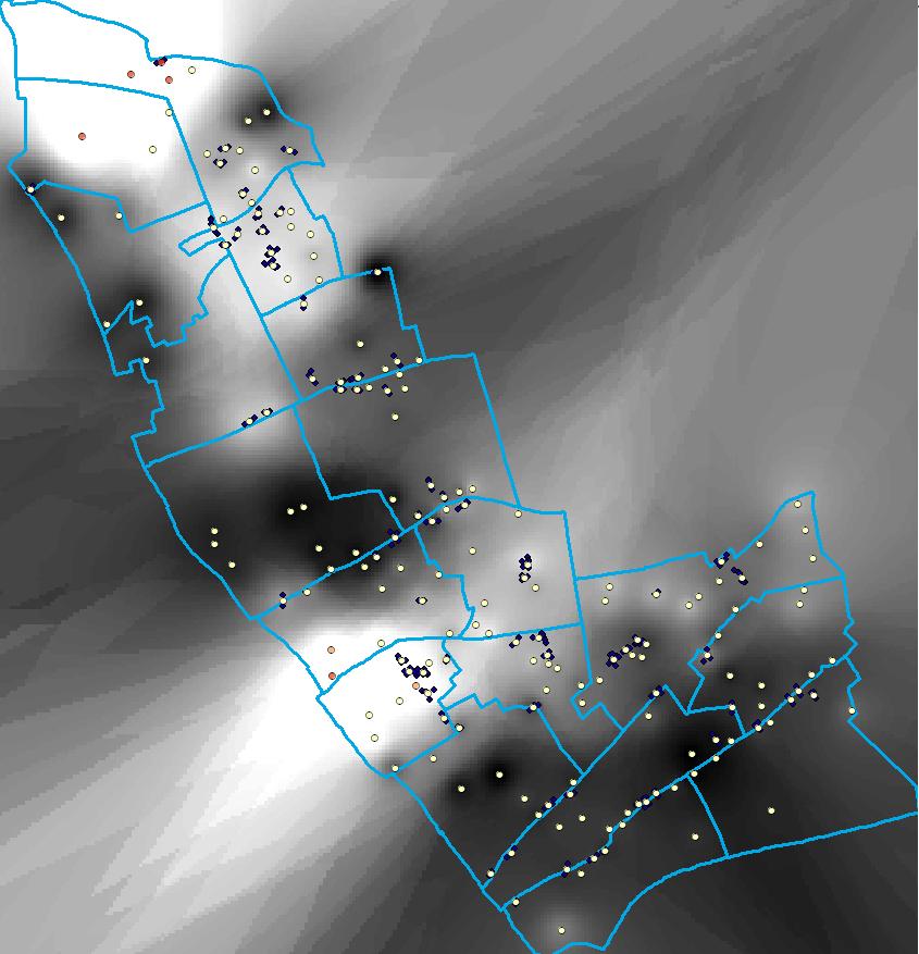
It uses the �??integrate-collate�?? method to aggregate event data instead of the fishnet. My concern is that the London Borough I work for has an odd shape and that if the hotspot tools - specifically these "Calculate Distance Band from Neighbour Count", "Incremental Spatial Autocorrelation", and "Getis Ord Gi*" - create a minimum bounding box during the analysis it'll result in large areas of 'dead space', or "sea of zeros", that might skew the results. I've included a screenshot of the raw output of my IDW surface of my hotspot analysis to illustrate my point. I've tried to mitigate this by setting the analysis environment of the geoprocessing tool I'm using to polygon of the Borough - but I fear that it�??s still defaulting to the minimum bounding box.
Therefore the question is; How do I ensure that the tools mentioned do not get influenced by the 'dead space' when using aggregated point feature class input (i.e. non-raster) to a hotspot analysis?
Query 2:
Can you suggest, or suggest where I might find good methods of accounting for typical types of bias in event data in a city or built up area. For example, the 2nd screenshot provided shows shops that have had complaints - naturally this will exhibit some clustering in town centres which needs to be accounted for.
Also, can the Manhattan Distance method be applied to mitigate street bias in event data on non regular street patterns which are common in countries like the UK? Or should they only be applied to regular grid-like streets of US cities?
Many Thanks
Peter
I�??ve 2 queries I hope you can help me on:
Query 1:
This is similar to Mareike's except that I've used the approach outlined in this ESRI Video and the spatial Statistics tools:
http://video.arcgis.com/watch/903/spatial-statistics-best-practices
It uses the �??integrate-collate�?? method to aggregate event data instead of the fishnet. My concern is that the London Borough I work for has an odd shape and that if the hotspot tools - specifically these "Calculate Distance Band from Neighbour Count", "Incremental Spatial Autocorrelation", and "Getis Ord Gi*" - create a minimum bounding box during the analysis it'll result in large areas of 'dead space', or "sea of zeros", that might skew the results. I've included a screenshot of the raw output of my IDW surface of my hotspot analysis to illustrate my point. I've tried to mitigate this by setting the analysis environment of the geoprocessing tool I'm using to polygon of the Borough - but I fear that it�??s still defaulting to the minimum bounding box.
Therefore the question is; How do I ensure that the tools mentioned do not get influenced by the 'dead space' when using aggregated point feature class input (i.e. non-raster) to a hotspot analysis?
Query 2:
Can you suggest, or suggest where I might find good methods of accounting for typical types of bias in event data in a city or built up area. For example, the 2nd screenshot provided shows shops that have had complaints - naturally this will exhibit some clustering in town centres which needs to be accounted for.
Also, can the Manhattan Distance method be applied to mitigate street bias in event data on non regular street patterns which are common in countries like the UK? Or should they only be applied to regular grid-like streets of US cities?
Many Thanks
Peter
12-12-2012
10:59 AM
- Mark as New
- Bookmark
- Subscribe
- Mute
- Subscribe to RSS Feed
- Permalink
- Report Inappropriate Content
Hi Peter,
Bounding Geometry: If you are using Integrate and Collect Events to create weighted points from incident data, there is no minimum bounding geometry. (The only two tools in the Spatial Statistics toolbox that use a bounding geometry are K Function and Average Nearest Neighbor). Because Hot Spot Analysis requires weighted points, you need to aggregate incident data. When you run Integrate (after you make a backup copy of your original input dataset), features within the distance you specify are snapped together. The input feature geometry is modified so instead of clusters of nearby features, you get stacks of coincident features. When you run collect events, you replace those stacks with a single point attributed with the number of incidents on the stack... so you get wieghted points. With the fishnet aggregation scheme the fishnet itself imposes a bounding geometry so you DO have to worry about zero cells (dead space); with Integrate/Collect Events you do not.
Edge Effects: Hot Spot Analysis visits each weighted point and computes a local mean (based on the target feature and its nearby neighbors) and compares it to the global mean (based on all features in the dataset). You will specify a fixed distance band to indicate which features to consider "neighbors". You can think of this distance band as a circular window that moves around the study area, stopping at each weighted point to compute the local mean for the features that fall within the window. Some weighted points will have lots of neighbors, others will have few neighbors but this does not impact the result. If the global average number of incidents (based on all of the weighted points in your study area) is 3, then the expectation is that the average number of incidents anywhere on the map is 3. Compute the average number of incidents per point for just the points in the north, or for just the points in the center, or just the bottom... the expectation is that the average number of incidents per weighted point feature will be 3 everywhere in the study area. It doesn't matter if a feature has 10 or 20 neighboring features because in the end we are comparing the local *average* to the global average. When we get local mean values that are much higher than expected, we have a hot spot. When the local mean is much lower, we have a cold spot.
The edge effect for the Gi* statistic (hot spot analysis), then, is not an undercount problem at all. The only bias is that when a feature has very few neighbors the local mean that gets computed is based on less information than for a feature with lots of neighbors. I hope that makes sense.
Street Network: If you have a street map for your study area, you can create distance relationships based on your road network. You would:
1) Create a spatial weights matrix file (.swm) using the Generate Network Spatial Weights tool
2) Select Get Spatial Weights From File for the Hot Spot Analysis Conceptualization of Spatial Relationships parameter
3) Specify the .swm created in step 1 for the Hot Spot Analysis Spatial Weights Matrix File parameter.
If you don't have a street feature class, using Manhattan Distance should still provide a better solution than Euclidean Distance for your urban study area.
Typical biases: You can account for typical biases associated with incident data by running hot spot analysis on rate values rather than count values. If you run hot spot analysis on the raw aggregated incidents you are asking the question: "where do we have lots of incidents?"
If you run hot spot analysis on a rate (like incidents per person or incidents this week per incidents all year) you are asking: "where do we have a more than expected number of incidents given <some bias like population or typical patterns represented by yearly incidents>.
In order to get the denominator for the rate values, you will need to aggregate the incidents to a consistent set of polygon boundaries like administration units (census blocks). You would use Spatial Join to count the number of incidents within each polygon, then calculate the rate as the number of incidents divided by population, yearly incident rates, etc.
I hope this is helpful.
Best wishes,
Lauren
Lauren M Scott, PhD
Esri
Geoprocessing, Spatial Statistics
01-04-2013
03:35 AM
- Mark as New
- Bookmark
- Subscribe
- Mute
- Subscribe to RSS Feed
- Permalink
- Report Inappropriate Content
Thank you Dr. Scott!
For your very helpful, detailed and quick reply to my queries, apologies I've only just seen it! Its very usual too as its given me a clearer picture of how things 'hang together'.
Query 1
The 'edge-effects' were therefore just a product of the IDW analysis used and not the Hotspot. As such I've added a clip step into my model that clips to Borough boundary.
Query 2
It'll be interesting to see how the two methods for mitigating bias have on data.
Thanks again and happy New Year!
Best Regards
Peter Kohler
01-07-2013
07:38 AM
- Mark as New
- Bookmark
- Subscribe
- Mute
- Subscribe to RSS Feed
- Permalink
- Report Inappropriate Content
Dr. Scott,
My apologies, it must be obvious but I can't determine how to start a new thread. So I am jumping in to this discussion.
I am working with survey and sea sampling data to identify aggregations of organisms of a certain size. I am trying to run a hotspot analysis following the steps outlined in the ESRI videos. I am getting hung up when I try to determine an appropriate distance band/threshold distance to use in the Hotspot Analysis tool. Using the Global Morans I Spatial Auto correlation tool, I generated a distribution of Z scores over various distances for my study area. However, the resulting Z-score plot shows no peaks, only a nearly monotonic decline in Z-score with distance.
Is there a step I am forgetting. Any suggestions on ways I should treat my data prior to running the Morans I to help determine the threshold distance?
Sincerely,
Scott