- Home
- :
- All Communities
- :
- Developers
- :
- Python
- :
- Python Questions
- :
- set color in MatrixHeat chart
- Subscribe to RSS Feed
- Mark Topic as New
- Mark Topic as Read
- Float this Topic for Current User
- Bookmark
- Subscribe
- Mute
- Printer Friendly Page
set color in MatrixHeat chart
- Mark as New
- Bookmark
- Subscribe
- Mute
- Subscribe to RSS Feed
- Permalink
I am using the arcpy.charts module to create some MatrixHeat charts for a set of data. I can't figure out how to change the color from the default color. Setting the color property
my_chart.color = ['#FF3333']Doe not change the color. The documentation on this is vague bordering on nonexistent. Checking the docstring
my_chart.color?comes back with <no docstring>
- Mark as New
- Bookmark
- Subscribe
- Mute
- Subscribe to RSS Feed
- Permalink
Greetings,
I little digging on this and came across this blog article https://www.esri.com/arcgis-blog/products/arcgis-pro/analytics/using-arcgis-notebooks-and-arcpy-char... and it looks like it is possible to change colors however, looks like it is only for line chart.
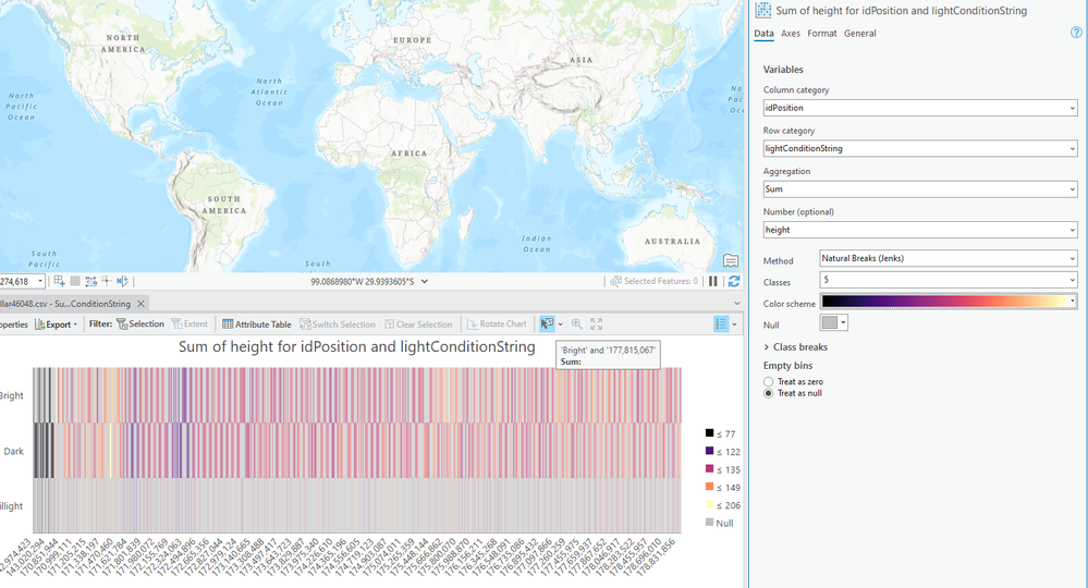
Additionally, I also tried creating a matrix heat chart in arcgis pro itself and in the UI we do have the option to change the color scheme. Attaching a screenshot for your reference
I know in open source libraries like seaborn we do have a parameter of cmap to change colors. (https://seaborn.pydata.org/generated/seaborn.heatmap.html).
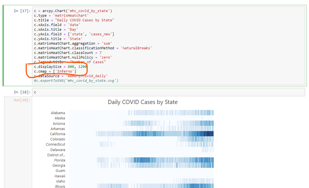
Hence, I also tried using parameters like cmap or name of a color scheme as mentioned in pro in the jupyter notebook to see if that changes color in the chart however, it still shows the default color.
At this point of time I believe if possible you can check with ESRI Technical Support to confirm if this functionality is available in arcpy.
As a workaround and if possible you can leverage open source libraries.
Hope this helps.
- Mark as New
- Bookmark
- Subscribe
- Mute
- Subscribe to RSS Feed
- Permalink
Thanks. I have already explored the options shown in this response. I even tried using a color ramp name also in trying to set the color scheme.
I have had ESRI staff pop in on other threads, maybe one will read this and respond to this post.

