- Home
- :
- All Communities
- :
- Industries
- :
- Nonprofit Program
- :
- Nonprofit Program Blog
- :
- ArcGIS Online: Providing Insights for a Food Rescu...
ArcGIS Online: Providing Insights for a Food Rescue Organization
- Subscribe to RSS Feed
- Mark as New
- Mark as Read
- Bookmark
- Subscribe
- Printer Friendly Page
- Report Inappropriate Content
It all started with a Tweet:

A GIS call-to-action! I was curious how I could help, so I quickly Googled 412 Food Rescue (hint: they partner with food retailers, wholesalers, restaurants, etc. and redirect perfectly good food that would otherwise go to waste to community members in need) to learn a little more, and then responded to the Tweet. A few days later, I had a phone call with Jennifer England, Director of Operations at 412 Food Rescue; she explained to me that they had spreadsheets listing their donors and recipients and had dabbled with mapping those datasets before, but wanted to further explore how GIS could help her organization.
As Jennifer and I were talking, it wasn't hard to come up with ideas of how GIS could provide new insights. We agreed that she would send me data on their food donors and recipients, and I'd spend a little time working on some ideas that we could review together.
Based on what Jennifer wanted to achieve and the fact that they were new to GIS, I wanted to do this work in ArcGIS Online. I had a few reasons why ArcGIS Online was a great fit for this project:
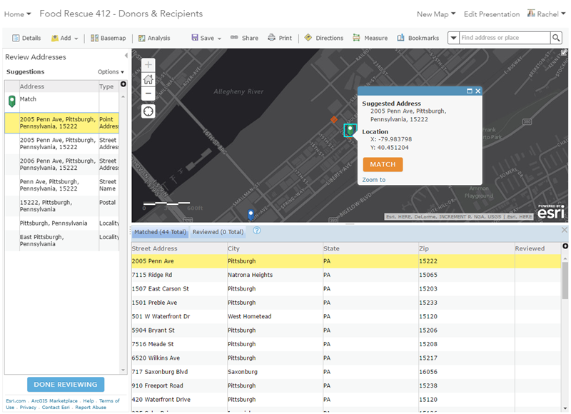
- Ease of working with tabular data: Jennifer's donor and recipient lists were simple Excel spreadsheets with address information. Publishing a CSV file as a hosted feature layer provides geocoding and address review capabilities , which meant I could very quickly and easily covert her tabular data into accurate points on the map in a web-friendly format. Also, using this method means that I only need to geocode/upload the data once, and then it's available for re-use for other maps and projects. As an aside - I find that many people are not aware of the ability to review/match addresses when batch geocoding in ArcGIS Online - the interface shows candidates and match types, making it easy to select the right location:
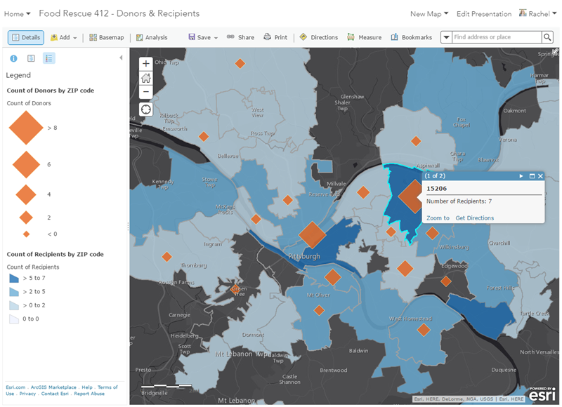
- Tools for simple spatial analysis: Getting the points on the map was just the first step - but we needed to go further in order to answer questions like how is the data distributed, or what gaps in coverage exist. A first step was a spatial join - aggregating the donors and recipients to a common geography (ZIP codes, in this case). That's a standard operation for those who know their way around GIS software - but again Jennifer's organization was new to GIS and doesn't have access to ArcGIS Desktop or other tools. One of the great things about ArcGIS Online is that it takes some of the most common GIS operations and makes them accessible to anyone. From the ArcGIS Online web map, I used the Summarize Data: Aggregate Points tool to create a new layer of ZIP codes with donor and recipient counts - now, Jennifer and her staff have a clearer view of the spatial distribution of their data:
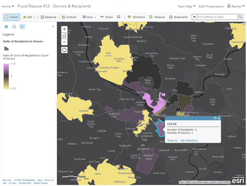
- Smart Mapping: Prior to us working together, Jennifer had seen her data as points on a map - but she had not been able to style the data in ways that allow for further exploration of the relationships in the data. Once the spatial joins were done, we could really dive in and see what the data was telling us. A simple way to do this is with symoblogy. Smart Mapping make it easy for those like Jennifer who are new to GIS apply fairly sophisticated cartographic techniques that can tell you so much about your data. For example, by selecting two variables and the 'Compare A to B' option, we could easily see ZIP codes where there was not a balanced number of recipients and donors:
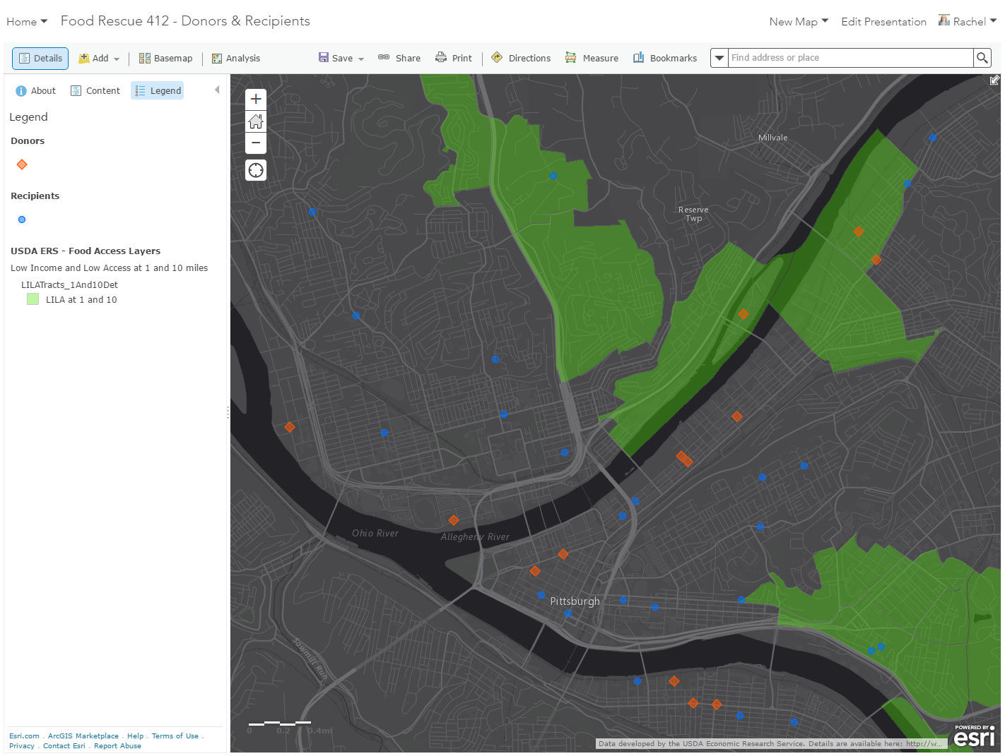
- Ability to add external data to your map: There are some great web maps that show food access and scarcity (like this example from Jim Herries), and a lot of work went into collecting and creating data that show poverty rates, distance to supermarkets and food spending. Jennifer asked was if we could add some of these already-existing layers to provide additional context that would help drive more informed decision-making in her organization. One data source that Jennifer wanted to use was the USDA Food Environment Atlas - they have dozens of map services pulled into a web app that gives a spatial overview of many food environment factors. These map services can easily be added into any ArcGIS Online map using the Add Layers from Web tool (which supports WMS, KML, GeoRSS and other common formats). One of the first layers I added was census tracts that have low income and low access to food - overlaying this with their donors and recipients will help Jennifer determine where areas of need are that they could expand into:
Using these techniques, I was able to create a web map that 412 Food Rescue can start to use to explore the spatial relationships of their data - as they do, I'm sure more questions will come up, and it will be fun to continue working with them to refine the project. Some ideas I already have are incorporating Living Atlas content and exploring some additional analysis tools.
You must be a registered user to add a comment. If you've already registered, sign in. Otherwise, register and sign in.