- Home
- :
- All Communities
- :
- Products
- :
- Mapping
- :
- Mapping Questions
- :
- How do I make points from a data set different col...
- Subscribe to RSS Feed
- Mark Topic as New
- Mark Topic as Read
- Float this Topic for Current User
- Bookmark
- Subscribe
- Mute
- Printer Friendly Page
How do I make points from a data set different colors, as well as different sizes?
- Mark as New
- Bookmark
- Subscribe
- Mute
- Subscribe to RSS Feed
- Permalink
- Report Inappropriate Content
I know this is a symbology issue. I have lat/lon data which populates the points, but I need to make variable sizes from one row of data and variable colors from another row.
Example: Row A contains several lines of 3 or 4 repeating variables that need to be assigned 3 or 4 colors. Row B contains all different values which need to be plotted with variable size, in accordance to their values or value ranges. Rows C and D contain lat/lon data, Rows C and D are a non-issue.
PLEASE HELP WITH THIS! It's probably not too difficult but I've been stuck on it for too long!
Thanks,
Oliver
Solved! Go to Solution.
Accepted Solutions
- Mark as New
- Bookmark
- Subscribe
- Mute
- Subscribe to RSS Feed
- Permalink
- Report Inappropriate Content
Ah, I think I see the issue. It looks like it is not currently a shapefile or feature class. That's why the symbolization is not working as intended.
BTW, the giveaway that this might be the issue is the field names with restricted characters and the filename with the $ sign (a restricted character).
Anyway, what you can do to resolve this is convert the data to a feature class in a geodatabase or a shapefile. Then you can do the symbolization off that.
Here's a way to do the converting:
Adding x,y coordinate data as a layer
http://resources.arcgis.com/en/help/main/10.1/index.html#//00s50000001z000000
Important Notes:
Before running this process, make a copy of your Excel data. You will need to "clean" up the fields to avoid issues regarding the restricted characters. As a general rule, I would take out all the characters in the field names that are not letters or numbers. Also, remove any spaces. Otherwise the conversion might fail or be irregular due to the restricted characters in the existing field names.
Once it is added in, you can export it as a shapefile or feature class. Note that the first part of adding it in to ArcMap doesn't make it a feature class or shapefile until it is explicitly saved. It's been my experience that folks forget to finish the process by saving out the file, and then wonder why it is not allowing them to do what they want. The initial process creates an "Event Layer" which looks like a feature class, but is not one.
Chris Donohue, GISP
- Mark as New
- Bookmark
- Subscribe
- Mute
- Subscribe to RSS Feed
- Permalink
- Report Inappropriate Content
Here's a starting point:
Symbolizing data based on unique attribute values
http://resources.arcgis.com/en/help/main/10.1/index.html#//006300000018000000
If this doesn't provide what you need, let us know what else is needed. There are other ways to do the symbolization, so more detail would be needed to chose the best method (they tend to get more complex).
Chris Donohue, GISP
- Mark as New
- Bookmark
- Subscribe
- Mute
- Subscribe to RSS Feed
- Permalink
- Report Inappropriate Content
Here's an example I threw together quickly, which I think might be representative of what you are trying to do (please see attached jpg):
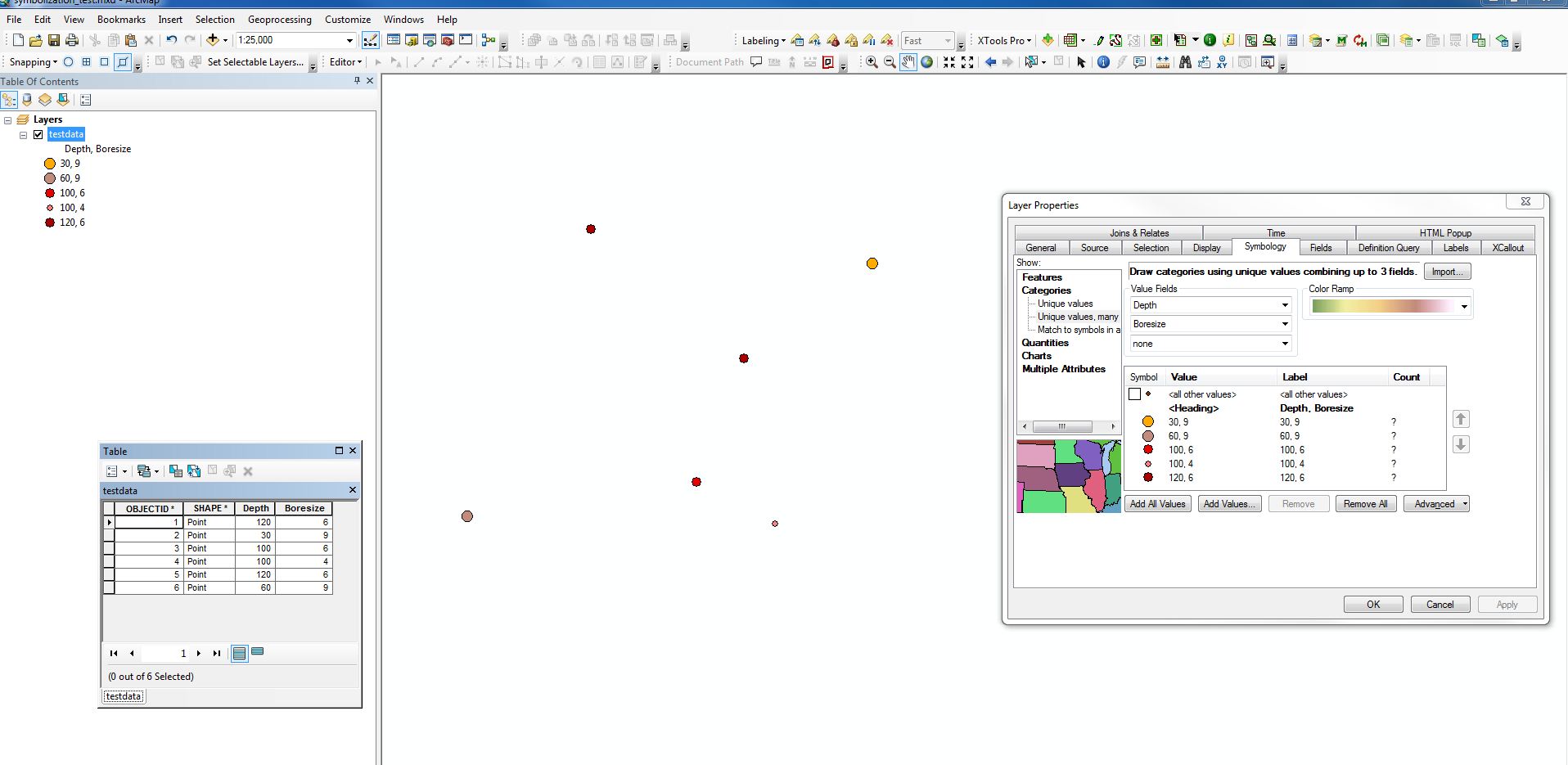
I'm assuming you want to symbolize simulataneously with two fields, so chose the "unique values, many categories". To have ArcGIS provide all the possible data combinations, hit the "Add All Values" button and it will come up with a default series of symbols for all the combinations in your data.
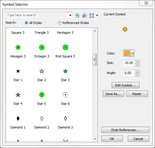
The symbology itself can then be modified to suit your needs in the window in the Layer Properties, Symbology Tab. Click on the Symbol in the "Symbol" column and a "Symbol Selector" window will come up with many symbol options, including size and color.
You can also edit the symbols by clicking on them in the Table of Contents.
Chris Donohue, GISP
- Mark as New
- Bookmark
- Subscribe
- Mute
- Subscribe to RSS Feed
- Permalink
- Report Inappropriate Content
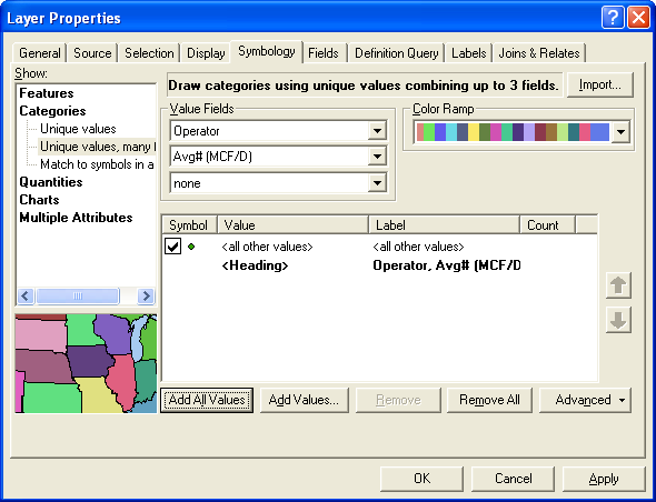
Chris,
I follow what you did in that image. I am trying to make the first value field well operator and the second value field average MCF/D of gas production. When I do this and click "Add All Values", it comes up with nothing.
- Mark as New
- Bookmark
- Subscribe
- Mute
- Subscribe to RSS Feed
- Permalink
- Report Inappropriate Content
- Mark as New
- Bookmark
- Subscribe
- Mute
- Subscribe to RSS Feed
- Permalink
- Report Inappropriate Content
Interesting. Can you post a snapshot of the first several lines of your attribute data?
- Mark as New
- Bookmark
- Subscribe
- Mute
- Subscribe to RSS Feed
- Permalink
- Report Inappropriate Content
And I need to ask, in case I missed an obvious issue, is the data already developed into a feature class or shapefile? If not, that would have to happen before it can be symbolized.
- Mark as New
- Bookmark
- Subscribe
- Mute
- Subscribe to RSS Feed
- Permalink
- Report Inappropriate Content
I just clicked add data and added the excel file I had saved. That's how I have always done it and it always works, for one variable thought. I can not show some of the data but here is a snapshot of what I am able to show you. 
- Mark as New
- Bookmark
- Subscribe
- Mute
- Subscribe to RSS Feed
- Permalink
- Report Inappropriate Content
Ah, I think I see the issue. It looks like it is not currently a shapefile or feature class. That's why the symbolization is not working as intended.
BTW, the giveaway that this might be the issue is the field names with restricted characters and the filename with the $ sign (a restricted character).
Anyway, what you can do to resolve this is convert the data to a feature class in a geodatabase or a shapefile. Then you can do the symbolization off that.
Here's a way to do the converting:
Adding x,y coordinate data as a layer
http://resources.arcgis.com/en/help/main/10.1/index.html#//00s50000001z000000
Important Notes:
Before running this process, make a copy of your Excel data. You will need to "clean" up the fields to avoid issues regarding the restricted characters. As a general rule, I would take out all the characters in the field names that are not letters or numbers. Also, remove any spaces. Otherwise the conversion might fail or be irregular due to the restricted characters in the existing field names.
Once it is added in, you can export it as a shapefile or feature class. Note that the first part of adding it in to ArcMap doesn't make it a feature class or shapefile until it is explicitly saved. It's been my experience that folks forget to finish the process by saving out the file, and then wonder why it is not allowing them to do what they want. The initial process creates an "Event Layer" which looks like a feature class, but is not one.
Chris Donohue, GISP
- Mark as New
- Bookmark
- Subscribe
- Mute
- Subscribe to RSS Feed
- Permalink
- Report Inappropriate Content
THANK YOU! One more question. I am now able to do what I have been trying to do all along...except... when I do it all instead of it being 3 or 4 colors for the 3 or 4 companies, it is a ton of different colors. Any way to do something with the categories bar in the "show" box as well as with the multiple attributes "quantity by category", That might not make any sense at all but it's frying my brain.
Thanks!
Oliver