- Home
- :
- All Communities
- :
- Services
- :
- Esri Training
- :
- Esri Training Matters Blog
- :
- Using Artistic Inspiration for Cartographic Layout...
Using Artistic Inspiration for Cartographic Layouts
- Subscribe to RSS Feed
- Mark as New
- Mark as Read
- Bookmark
- Subscribe
- Printer Friendly Page
- Report Inappropriate Content
With text written in English we have a pattern of reading, left to right, top to bottom, but with maps we have a different kind of a pattern of reading. The map is presented to the map reader all at once – but it is up to us, the mapmaker, to put the most important information in a place that it will be seen first.
Since cartography is a mix or art and science I think of maps as a piece of art. We can use some cues from the art world when thinking about how our map is read.
The rules differ for a painting versus a photograph; I consider maps to be more similar to a painting, so I use the rules that apply to paintings.
Eye Movement
When we look at a piece of art, our eyes tend to be drawn to two places first - either the top-left or top-right of the frame – if you look at paintings, we can see a pattern of how artists use a bold splash of color or an absence of color to draw the eye into the painting. Next time you are at an art gallery, I encourage you to see what paintings grab your attention and why they do!
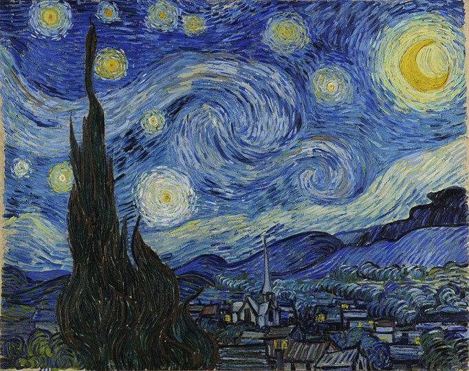
Looking at Vincent van Gogh's Starry Night we can see a fantastic example of how the moon draws our eye to the top-right of the painting...

Our eye then travels, from the point of interest in a clockwise motion around the painting. We can see in van Gogh's painting we move down from the moon, across to the village, our eye follows up to the spire, and then the swirls bring us back to the moon. We do this whole process unconsciously in a split second.
Since we are talking about cartography, let's see how this concept is applied to a map!
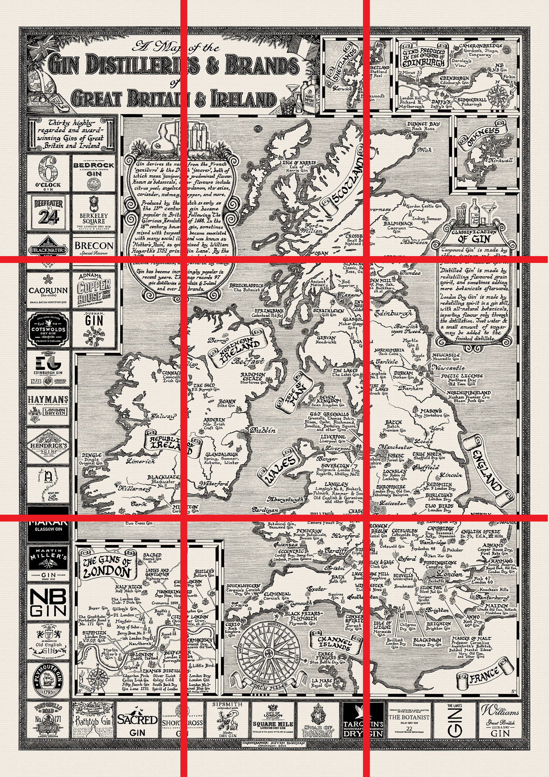
Kevin Sheehan of Manuscript Maps was kind enough to let me use his hand-drawn map of the Gin Distilleries & Brands of Great Britain and Ireland as an example...
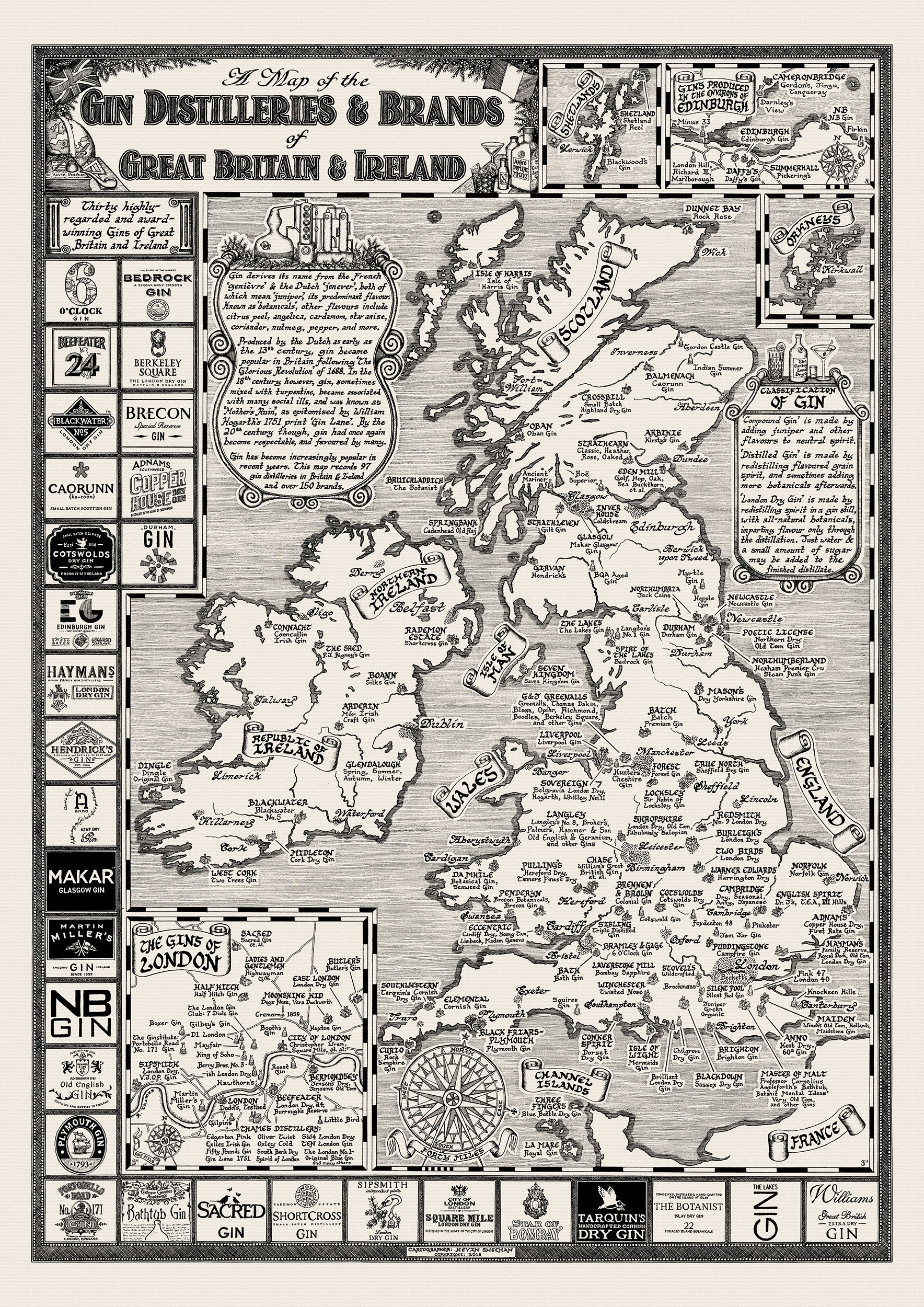
Looking at the map, our eye is drawn towards Scotland and the insets in the top right. Naturally our eye travel down the coastline of the UK until we reach the elaborate compass rose. Along with compass rose and the inset of London, it creates a focal point in the map. Our eye is next drawn up along the coast of Ireland and then across the text box of the history of Gin, which brings us back around to where we started.
Let’s talk about another artistic composition technique we can use....
Rule of Thirds
The rule of thirds is a theory, based on the Golden Ratio, that involves drawing lines vertically and horizontally, splitting the composition into thirds...
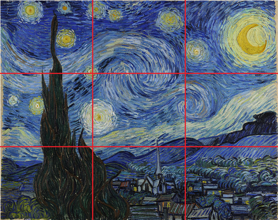
This idea works by balancing the composition, so that there are no straight lines within our composition that match up with the third line (in red). If a line matches up, like the edge of a box or a north arrow, it can throw off the composition of the map. If your map “looks off” to you, try drawing these third lines on it and if any elements are lining up with those third lines.
We can see that Kevin's map has no elements that are aligned with those third lines...
I asked Kevin if he uses the rule of thirds in his composition. He said: “not intentionally”, but since he studied art, he is “familiar with the concept”. His design instincts mean that none of the inset edges or logo boxes match up with any of the third lines. I have applied this technique to all of Kevin's hand-drawn maps and they all pass the test. Once you practice working with the rule of thirds, it should become natural for you as well!
One more tip... When these third lines cross, we also end up with an intersection. As a rule, you do not want map elements to be centered at these intersections. If a map element is centered at these intersections, it can draw the eye too much and throw the composition off balance.
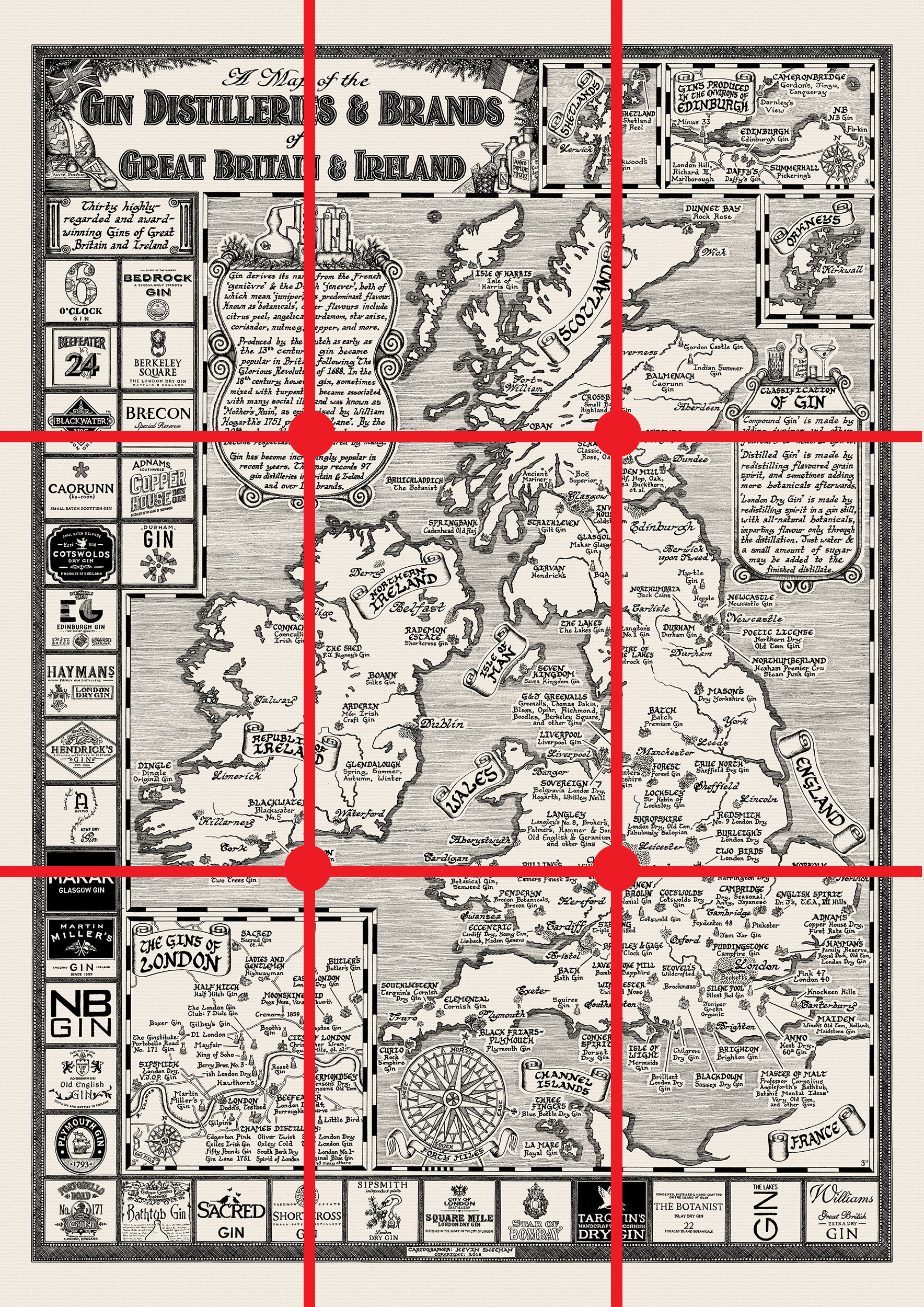
Again, with Kevin's map we can see that the text boxes and insets are offset from dead center of these intersection points. Aligning elements near but not centered on these intersection points will create visual interest.
Give these techniques a try and see if they help make your maps have a better visual balance!
Happy Mapping!
Stephanie
----
Thanks to Kevin Sheehan of Manuscript Maps!
If you are interested to learn more about eye movement:
Frontiers | Eye Movement Correlates of Expertise in Visual Arts | Human Neuroscience
You must be a registered user to add a comment. If you've already registered, sign in. Otherwise, register and sign in.
-
ArcGIS Desktop
25 -
ArcGIS Step by Step
40 -
Class Resources
13 -
e-Learning
46 -
MOOCs
20 -
Software Demos
9 -
Technical Certification
12