New ArcGIS tutorials
A Learn tutorial is a step-by-step workflow that uses a real-world scenario to introduce key ArcGIS tools, products and modern best practices. Here's a roundup of new tutorials in the ArcGIS tutorial Gallery that have appeared in the last month.

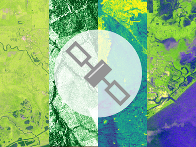
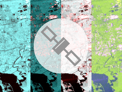
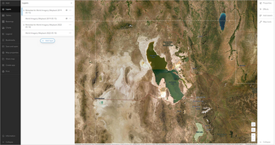
Satellites with Synthetic Aperture Radar (SAR) sensors produce images based on radar technology. One of SAR's strengths is that it can create clear images in both daytime and nighttime and regardless of the presence of clouds, smoke, and rain. It has many applications and is often used to detect changes in the environment due to natural- or human-induced events.
In this tutorial, you will explore three applications of SAR imagery: mapping deforestation, monitoring maritime activity, and identifying flooded areas. Your exploration will take you to Brazil, the Panama Canal, and Texas, and you will learn the basics of working with SAR imagery.

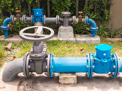
One of the most important aspects of using any dataset is knowing that the data is correct and can safely be used to make decisions. The rules of a utility network help to keep your data clean as you edit it. They ensure that features are modeled and connected correctly, and that the data meets the topological requirements of the network.
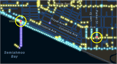
In this tutorial, you will make edits to a utility network. You will resolve connectivity errors created by your own edits and by other people. A connectivity error is a common type of topology error that occurs when two features have connectivity but do not have a corresponding connectivity rule that allows them to be connected. You will learn how to identify these errors, how to verify which connections are valid for a feature, and how to correct the errors.

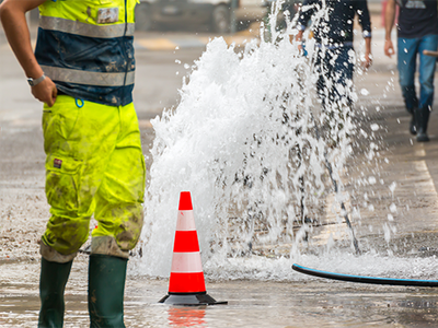
One of the most important aspects of using any dataset is knowing that the data is correct and can safely be used to make decisions. The rules of a utility network help to keep your data clean as you edit it. They ensure that features are modeled and connected correctly, and the data meets the topological requirements of the network.
In this tutorial, you will make edits to a utility network. You will resolve topology errors created by your own edits and by other people. The examples in this tutorial make assertions about what is and is not allowed to be connected. These rules are configured in the utility network topology by an administrator who understands how the data for the specific utility network should be modeled. Your job as an editor is to correct errors in the data until it complies with these rules.

One of the most important parts of using any dataset is knowing that the data is correct and can safely be used to make decisions. The rules of a utility network help to keep your data clean as you edit it. They ensure that features are modeled and connected correctly, and the data meets the topological requirements of the network.
You are encouraged to complete the tutorials Fix connectivity errors in a utility network and Fix topology errors in a utility network before this one, but they are not required. These tutorials show how to resolve errors by editing the data. In this tutorial, you are an administrator who will resolve errors by modifying utility network configurations.
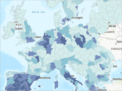
 In the late 1970s, people in the United States turned their attention toward the toxic chemicals in their environments. Several toxic exposure incidents were widely broadcast across the nation and galvanized new standards for monitoring and regulating the discharge of toxic chemicals into the environment, leading researchers to investigate the correlation between exposure and people's health. Today, promoting thoughtful urban planning and waste management that minimizes exposure to toxic chemicals is still an urgent concern and is listed as an indicator for progress toward a sustainable city under the United Nations Sustainable Development Goals. In many communities, historic and current land-use policies have resulted in a disproportionate exposure risk on communities of color. In West Virginia, there are examples of how local chemical manufacturing plants have adversely impacted nearby communities of color.
In this tutorial, as an environmental justice analyst, you'll look at toxic chemical release exposure risk to different population subgroups from facilities in the EPA's Toxics Release Inventory and assess environmental equity in Kanawha County, West Virginia, where the city of Charleston is located. You will map the results by political districts, which will allow community members to contact their representatives for direct action on the polluting facilities in their district.

Through ArcGIS Online, sharing data, maps, and apps and collaborating with other users and organizations is at your fingertips. A big part of a having a successful geospatial infrastructure is that your data and apps are shared and discoverable by the GIS community. You can share items from your ArcGIS organization to the public, and so can your partners. Another way of sharing is to create a group in ArcGIS Online that only certain members can access and share data to. In this tutorial, you will create a sharing group in ArcGIS Online, invite members to it, and share data from a trusted partner into the group. Once you have the group created and added the data, you will expand its reach by adding it to your OneMap hub so users can search the hub for shared content.
This tutorial is based on the guide available in this story.

As a geographic information officer, you have been tasked with creating a place that brings data from multiple agencies or departments in a region together. This data will help both internal and external users make informed decisions while planning projects and enable parties to work together to implement their decisions efficiently. ArcGIS Hub is an easy to configure app used to connect multiple organizations and share with internal and external stakeholders. You can build a hub page from scratch or use a template that is provided with the app. In this tutorial, you will use a template called the OneMap template to build your hub. The OneMap template includes a hub site that you can configure with your organization's branding and content. You will use the OneMap template as the basis for your organization's hub site and modify it to make it your own.

You are a researcher at a nonprofit organization. You want to create an app that shares community information in a presentation-ready and interactive format. You'll use ArcGIS Experience Builder to create an app using a Business Analyst template with the What's in My Communityinfographic. You'll customize the app to include a Justice40 web map that visualizes disadvantaged communities. You'll also change the geography of the app and add walk time ring buffers.

Argentina's tourism department wants to create a web map to help tourists navigate Buenos Aires, the nation's capital and largest city. However, the data needed for this map is spread across the transportation department, the culture department, and the retail department, each using their own enterprise geodatabase for spatial data management. The data is updated frequently, meaning the web map will become out-of-date if it uses a static copy.
This tutorial will focus on distributing data between the retail department and the tourism department using a checkout/check-in replica (other tutorials in this series focus on the transportation and culture departments and use different types of replicas). Your goal is to coordinate with the retail department to acquire a synchronized copy of their data. To do so, you'll create a replica of the retail department's enterprise geodatabase. You'll identify the appropriate type of replication, implement it, and synchronize changes after the data is updated.

Argentina's tourism department wants to create a web map to help tourists navigate Buenos Aires, the nation's capital and largest city. However, the data needed for this map is spread across the transportation department, the culture department, and the retail department, each using their own enterprise geodatabase for spatial data management. The data is updated frequently, meaning the web map will become out-of-date if it uses a static copy.
This tutorial will focus on distributing data between the culture department and the tourism department using a two-way replica (other tutorials in this series focus on the transportation and retail departments and use different types of replicas). Your goal is to coordinate with the culture department to acquire a synchronized copy of their data. To do so, you'll create a replica of the culture department's enterprise geodatabase. You'll identify the appropriate type of replication, implement it, and synchronize changes after the data is updated.

Argentina's tourism department wants to create a web map to help tourists navigate Buenos Aires, the nation's capital and largest city. However, the data needed for this map is spread across the transportation department, the culture department, and the retail department, each using their own enterprise geodatabase for spatial data management. The data is updated frequently, meaning the web map will become out-of-date if it uses a static copy.
This tutorial will focus on distributing data from the transportation department to the tourism department (other tutorials in this series focus on the culture and retail department). Your goal is to coordinate with the transportation department to acquire a synchronized copy of their data. To do so, you'll create a replica of the transportation department's enterprise geodatabase. You'll identify the appropriate type of replication, implement it, and synchronize changes after the data is updated.

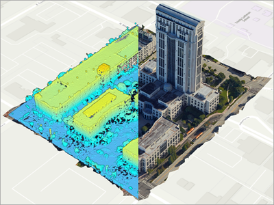
The City of Orlando is embarking on a mission to supplement their publicly available 2D image basemaps with photo-realistic 3D products. These new products will be used to support building information modeling (BIM), urban planning, and other applications. As an image analyst working for the city, you have been tasked with processing some newly acquired aerial imagery to generate a dense point cloud and a high-fidelity 3D mesh for a section of the City of Orlando.
You will do that with the support of ArcGIS Reality for ArcGIS Pro. You'll download the input data and create a workspace to manage it. You'll then improve the image alignment using tie points and photogrammetric processes. Finally, you'll generate a point cloud and a 3D mesh. While this workflow is demonstrated on a small extent for brevity, ArcGIS Reality for ArcGIS Pro is routinely used to process much larger extents, such as the layer displayed in this web map.

High resolution imagery, collected using drones, aircraft, and satellites, is increasingly accessible and can be an important resource for developing foundational data layers for mapping and creating digital twins. In this tutorial, you'll use aerial images, position data, and ground control points to create 3D derived imagery products using ArcGIS Reality Studio.
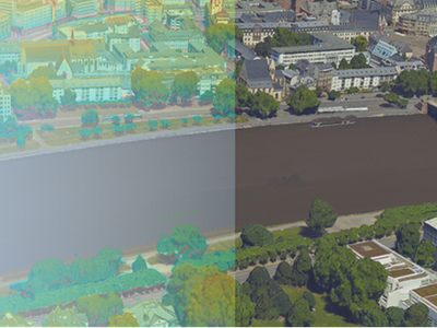
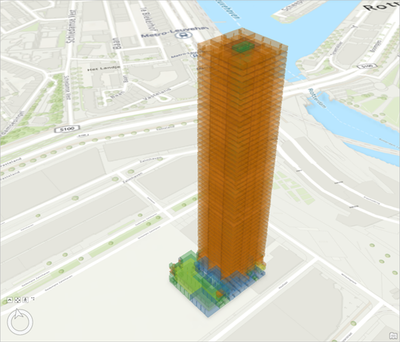
As a geospatial strategist working for the city of Frankfurt, you have been asked to provide a 3D mesh for the city center to support decision makers plan, build, maintain infrastructure, and conduct emergency operations. For that purpose, the city has tasked an aerial survey company to collect aerial images to and to provide accurate GNSS position information per image.
First, you'll create a capture session, which contains the images collected in one flight. Next, you'll perform an image alignment to refine the initial positioning information per image and correct distortion. During the alignment process, you'll use tie points and ground control points to refine the image referencing using updated measurements. Then, you'll generate a point cloud and a textured mesh city model.

Access to fresh food is a fundamental indicator of long-term health and well-being. Food deserts are places with low or severely restricted availability of nutritious, affordable food. On a systemic scale, food systems intersect with issues involving equity, raising vital questions about who has access to fresh food and where patterns of access or restriction exist within communities.
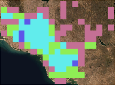
Working with data from the Open Data DC Hub and ArcGIS Living Atlas of the World, you'll use spatial analysis tools to visualize food deserts in Washington, D.C., and create an app using ArcGIS Instant Apps to share your findings.

In this tutorial, you are an equity officer for the City of Fresno and have been tasked with coordinating with various city departments and a community-based organization partner to apply for an environmental justice grant. The grant aims to allocate funding based on equity measures and requires applicants to use a state-provided equity index to demonstrate the need in your project area for environmental justice improvements. You want to work with the community to put forward an application that best reflects their needs and is based on lived experiences. As the equity officer, you want to ensure that the areas in your city that have historically been underserved receive the most benefits from this grant. The grant requires you to use an environmental justice index to demonstrate your community's need and propose an equity-based plan.
For this tutorial, you will explore CalEnviroScreen, California's environmental justice mapping tool, how it specifically relates to a city, define a priority area based on the index values and health risk data, and propose a bike path plan that will provide more connectivity for areas that currently experience higher levels of environmental injustice.

A Sentinel-1 Level 1 synthetic aperture radar (SAR) image must be processed before it can be used for visualization or analysis. The aim of processing is to improve the satellite imagery by removing unwanted noise and distortions and enhancing some image features. In this tutorial, as an environmentalist working on a Galveston Bay Protection Project in Texas, you want to use SAR imagery to examine various trends and activities in the bay and the nearby suburbs. You'll process Sentinel-1 Ground Range Detected (GRD) data in ArcGIS Pro to generate analysis-ready SAR imagery.
Issues that need to be addressed when preparing SAR imagery include updating orbit data, removing thermal noise, calibrating to retrieve a meaningful backscatter value, mitigating speckle, removing radiometric and geometric distortions, and converting the image scaling to a different unit. The Synthetic Aperture Radar toolset in the Image Analyst toolbox enables you to perform all these improvements. You can learn more about SAR processing and see an overview of the Sentinel-1 GRD workflow in the documentation.
If you're not yet familiar with SAR imagery, you may want to try the Explore SAR satellite imagery tutorial first.

You are an authoritative data provider sharing decision-ready content broadly to different audiences, including GIS users, developers, decision-makers, and the general public. You've read through the guide Good Practices for Authoritative Data Providers and downloaded the checklist. In this tutorial, you will upload a local file geodatabase to ArcGIS Online, set its metadata and display properties, use it to create a web map and web app, and ultimately share these resources with the hub so your users and partners can easily find them and use them in their work.
