ArcGIS Tutorials Blog

cancel
Showing results for 
Show  only  | Search instead for 
Did you mean: 

Other Boards in This Place

Latest Activity

(82 Posts)
NikiWong
Esri Contributor

Announcing the release of the Community Mapping for Racial Equity and Social Justice tutorial collection, designed to equip young mappers with essential ArcGIS skills and focuses on mapping local communities through the lens of Racial Equity and Social Justice (RESJ) workflow.   

Read more...

more
1 0 210
SilpaGadi
Esri Contributor

New ArcGIS tutorials
 
ArcGIS tutorial is a step-by-step workflow that uses a real-world scenario to introduce key ArcGIS tools, products and modern best practices. Here's a roundup of new tutorials in the ArcGIS tutorial Gallery that have appeared in the last month.
 
Build a community asset map 

build-a-community-asset-map-card.png

The goal of community asset mapping is to gain a baseline understanding of the strengths and weaknesses in a neighborhood. An asset is anything that builds up a community, like a resource, such as schools and green space, or a strengthening characteristic like community cohesion and resilience. By taking stock of existing opportunities and areas of need, you can visualize and prioritize what and where solutions would best serve the community. This exercise is often used in youth participatory action projects in which youth are engaged in critically assessing their neighborhoods and come up with innovative solutions to meet the challenges they uncover.


Create a community walkability survey 

create-a-community-walkabilty-survey-card.png

A walkability assessment, or walk audit, is a well-documented community engagement tool to evaluate the built environment for pedestrian safety, accessibility, and ease of use. It is a widely used exercise that brings members of a community together—from different ages, abilities, and experiences—to take action to improve their community's walkability. These assessments involve going out in pairs or small groups and walking along a route in a neighborhood while making observations of the walking experience. The findings are gathered and assessed to determine the types of improvements needed and where they should be implemented to encourage walking.

A survey can help facilitate this activity, organize the responses, and allows you to visualize the results using charts and maps. It is important to find ways to share survey findings with participants so they are included in every step of the project.

Using ArcGIS Survey123 web designer, you will build an online survey to answer the project question—what encourages or discourages walking to local parks in my community? You will build a survey with a variety of question types, demonstrating both qualitative and quantitative data collection. One of the advantages of building questions and collecting data with Survey123 is the ability to visualize the survey results in a web map. The map is a compelling and interactive way for the community and other key stakeholders to engage with the findings.


Get started with ArcGIS Excalibur 

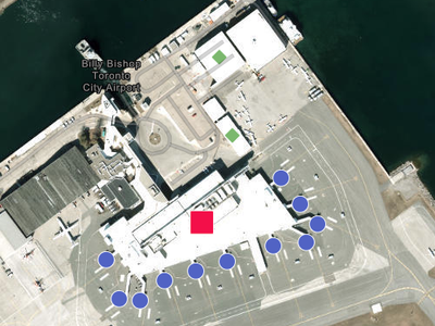
get-started-with-arcgis-excalibur-card.pngIn this tutorial, you will act first as a team lead and then as an imagery analyst working for the City of Toronto in Ontario, Canada. Your team has been tasked with helping the city inspect structural changes since 2007 around Billy Bishop Toronto City Airport. As the team lead, your job is to search for imagery of the airport and create an Excalibur project with an observation layer. As the imagery analyst, your job is to collect observations on any identified structural changes.

You will learn how to search for and connect to imagery in ArcGIS Excalibur, create a project, and create an observation layer. You will then conduct analysis to compare current and older imagery. You'll create observations and annotations on the map, and export the map to share your results with your organization.


Engage the community with a feedback survey 

engage-the-community-with-a-feedback-survey-card.png

When working on a project related to racial equity and social justice, it is important to get and integrate the perspectives of the community that has been impacted by inequity in your project. Surveys are effective tools for better understanding community experiences, opinions, and perspectives from lived experiences. The scenario in this tutorial is around determining where to place a new park, but the workflow can be applied to many other interventions to meet a local community's priorities.

In this tutorial, you have determined a few areas in your community that would most benefit from a new park and green space in Baltimore, Maryland. Research shows that there continues to be inequity in the access and quality of green spaces by race, place, and income. You will incorporate an equity approach to engaging the community through this survey.

Tell the story of your equity plan 

tell-the-story-of-your-equity-plan-card.png

In this tutorial, you will use ArcGIS StoryMaps to build a story of your equity project to identify which areas in Baltimore would most benefit from a new park and green space. Historically underserved neighborhoods experience inequity in the access and quality of green spaces by race, place, and income. Parks and greenspace are valuable community spaces for people to find relief from extreme heat, increase likelihood of improved health outcomes, and build community.


Track and visualize equity goals 

track-and-visualize-equity-goals-card2.png

The third step in applying the Racial Equity and Social Justice workflow to GIS is to monitor the performance of equity goals. In this tutorial, you conducted a survey to find out which area participants want a new park in. You will compare the race and ethnicity of those who participated in a feedback survey to the makeup of the local community. Comparing this data will help you determine how well those who participated in your survey reflect the community where the new park will be built.

You will use analysis tools and create charts to visualize the race and ethnicity data and create a web app to share your findings with the community. As more survey entries are completed, the data will automatically update in both the map and app, increasing transparency and participation in the project.


Use map analysis tools to develop parks equitably 

use-map-analysis-tools-to-develop-parks-equitably-card.png

Previously, you have assessed the strengths and needs of your community. You now want to make an equity action plan to address a community need given what you have learned. In the Racial Equity and Social Justice workflow, after you have completed the map and analyze inequities step, the next step is to operationalize, or put into action, a solution to address the challenges you identified. The step is called the operationalize positive practices step. In this tutorial, you will determine which areas in the city would most benefit from a new park space, with consideration for areas that have historically experienced unequal access to benefits and opportunities for green space.


New ArcGIS tutorial series

A tutorial series delivers multiple onboarding resources in a single-page experience. Here's a roundup of some new series in the ArcGIS tutorial Gallery that have appeared in the last month. 

The power of interactive maps and apps 

the-power-of-interactive-maps-and-apps-card.pngExplore four examples of interactive maps and apps that demonstrate the cartographic benefits of modern GIS.


Map Venice in 2D and 3D 

map-venice-in-2d-and-3d.png

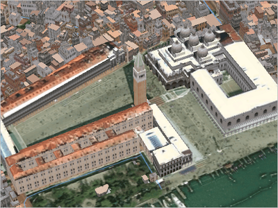
Learn how to create detailed maps and scenes of Venice, Italy, in ArcGIS Pro.


Map, analyze, and share fire incident data 

find-patterns-in-fire-incidents.png

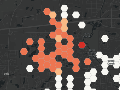
Transform a spreadsheet of fire incident data into informative, analytical, and interactive online maps and apps


more
3 0 387
HeatherSmith
Esri Contributor

Tips and techniques for designing maps with the Counts and Amounts (color) style in ArcGIS Map Viewer.

Read more...

more
4 0 230
HeatherSmith
Esri Contributor

To improve a map's legend, often all that’s needed is a bit of tidying: renaming, reordering, and removing items.

Read more...

more
2 0 140
HeatherSmith
Esri Contributor

Three short videos that explain visual hierarchy through examples in ArcGIS Online.

Read more...

more
2 0 246
SilpaGadi
Esri Contributor

New ArcGIS tutorials
 
ArcGIS tutorial is a step-by-step workflow that uses a real-world scenario to introduce key ArcGIS tools, products and modern best practices. Here's a roundup of new tutorials in the ArcGIS tutorial Gallery that have appeared in the last month.
 
Map and analyze the urban heat island effect 

map-and-analyze-the-urban-heat-island-effect-card.png

Heat islands are places that experience sustained elevated temperatures compared to surrounding areas, generally occurring in urban spaces with an abundance of impervious surfaces (such as sidewalks, rooftops, and buildings constructed using concrete, asphalt, and metal) and low tree canopy coverage. The dangerous conditions associated with urban heat islands, known as the urban heat island effect, contribute to higher rates of heat-related illnesses and deaths, compromising the health and quality of life of those living in affected communities.

Urban heat islands are also often associated with areas of historic under-investment, and they incur higher rates of energy consumption for cooling, contributing to accelerated resource consumption and emissions that worsen air quality.

In this scenario, you'll use feature and raster analysis tools to identify where the urban heat island effect impacts districts in Richmond, Virginia, and create a dashboard to monitor conditions throughout the city.


Get ready for deep learning in ArcGIS Pro 

1-gallery_image.png

Deep learning is used by ArcGIS Pro tools to solve spatial problems, detect objects, and perform pixel classification. Using these tools requires that you have the correct deep learning libraries installed on your computer. In this tutorial, you will learn how to get ready for deep learning, setting up the libraries and checking that the installation was successful. Optionally, you will also learn how to verify your computer’s settings and troubleshoot common issues that might occur.


Get started with branch versioning 

prepare-and-publish-branch-versioned-data-card.png

The National Renewable Energy Centre of Spain (CENER) wants to install solar panels on buildings in Madrid. First, they need to calculate the solar potential of each building. Buildings in a few neighborhoods have already been calculated, but it has proven to be a large project. To speed up the process going forward, multiple people will contribute to the project as data editors.

Versioning allows multiple people to edit the same data at the same time without applying locks or duplicating data. Each editor has an isolated view of the data and can merge their changes back into the default version. There are two types of versioning in ArcGIS: branch and traditional. Branch versioning facilitates multiuser editing through feature services and the Web GIS model.

This tutorial series describes the full branch versioning process for the Madrid solar project:


more
4 0 382
SilpaGadi
Esri Contributor

New ArcGIS tutorials


A Learn tutorial is a step-by-step workflow that uses a real-world scenario to introduce key ArcGIS tools, products and modern best practices. Here's a roundup of new tutorials in the ArcGIS tutorial Gallery that have appeared in the last month.


Get started with ArcGIS Video Server 

get-started-with-arcgis-video-server.png

ArcGIS Video Server for ArcGIS Enterprise enables indexing, discovering, and publishing video services with geographic and temporal data. When you collect video content from drones, security cameras, or other sensors, you can use Video Server to integrate them as a spatial layer in other enterprise GIS software.

In this tutorial, you'll publish an aerial video of an industrial facility to Video Server using ArcGIS Excalibur. Then, you'll analyze the video layer in Excalibur to inspect the facility for damage, debris, and other differences compared to satellite imagery. Finally, you'll take a screenshot of your findings and download it to share with others. The video in this scenario is useful for multiple workflows, so by uploading it to Video Server, it can be reused for a variety of purposes.


Access and prepare data for mapping 

access-and-prepare-data-for-mapping-card.png

You're a local student who has been assigned to conduct a community-based project about youth and what they do after school. You're interested in investigating how your city should distribute funding in an equitable way to local youth programs.

You love your city's public murals. All over the city, there is beautiful, inspirational, and thought-provoking art on the walls of buildings and stores. Murals are a way to build community in outdoor spaces where the local community can see themselves represented in art. (See Anchoring Parks in Community: A Creative Placemaking Primer.)

In this tutorial, you will explore different examples of how data is accessed and prepared for mapping. In any map project, the quality of your final map depends on the data used to create it, so it is important ensure you use and prepare the most appropriate data. You will create a map using a provided comma-separated values (.csv) file of the public high school locations and build your own .csv data on mural locations in your community that reflect cultural experiences and values. You will also add demographic data to better understand the racial and ethnic make-up of your community.
 

De-identify health data for visualization and sharing 

de-identify-health-data-for-visualization-and-sharing.png

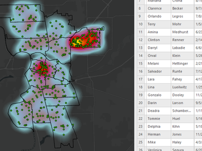
Some organizations hesitate to use GIS due to the sensitive nature of their data and concerns about individual privacy. While geography is an important identifier of individual information, there are methods that help you de-identify your data in ways that preserve spatial patterns. Which methods work best for sharing map visualizations? Which techniques support internal operations and data sharing needs? In this tutorial you will review several options, as a GIS analyst for a childhood lead poisoning prevention program.

Lead is a naturally occurring metal that can cause negative health effects, especially in children under the age of six. These include developmental delays, learning difficulties, behavioral problems, and neurological damage, which may be permanent and disabling. Leaders at your department need to use geographic information to enhance program reports and make decisions to eliminate childhood lead poisoning.

As you analyze the data requested for several departmental workflows, you'll consider the options for visualizing and sharing sensitive information without breaching individual health privacy.


Disaggregate and visualize race and ethnicity data 

1-disaggregate-demographic-data-card.png

Governments and organizations are increasingly interested in applying equity to decision making. To understand who needs additional supportive programming and where there are specific needs within a jurisdiction, organizations can use GIS to disaggregate data and make an equity plan to meet their goals.

In this tutorial, your organization is interested in developing food access resources to reach older adults who may prefer communicating in various Asian languages. An example composite index was created using senior well-being and socioeconomic data from the Census American Community Survey (ACS). However, the example index does not include information disaggregated by race and ethnicity. The index shows you where there might be the highest need for senior food security resources. But to nuance your outreach efforts, you want to consider language needs. You will accomplish this by disaggregating census data for specific Asian groups.
 

Map and chart data 

mapandchartdata.png

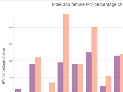
Intimate partner violence (IPV), also known as spousal or domestic violence, is a form of gender-based violence that includes physical, sexual, emotional, and financial abuse, and other types of violence and control. Mapping police-reported incident data shows where rates of IPV are highest across Canadian provinces and territories, as well as other patterns. Domestic violence shelters are one type of service available for survivors of IPV and shelter capacity varies across regions.

Working with .csv files of IPV and shelter capacity data from Statistics Canada, you'll join the data to a Canadian provinces and territories boundaries layer from ArcGIS Living Atlas of the World so you can symbolize the provinces based on the IPV data. You will style the layers, customize their pop-ups, and create charts to visualize and analyze the data. Finally, you'll create an app using ArcGIS Instant Apps to share your findings with your organization.
 

Protect patient data when geocoding 

protect-patient-data-when-geocoding.png

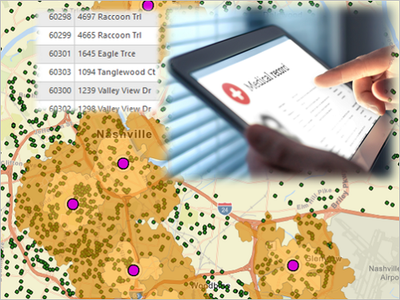
In this tutorial, you will take on the role of analyst in the strategic planning division of the fictitious Nashville Memorial Health System, in Nashville, Tennessee. You will analyze a fictitious patient population to determine the optimal location for the expansion of your organization’s facilities to provide better access to a currently under-served population. To do this, you will geocode health-care facilities within your organization and compare these to competing facilities, laying the groundwork for your expansion plan. You will calculate service areas for your facilities and compare these to your patient population. You will ensure that your analysis uses the latest data by geocoding and appending new patient data to your database, taking special care to remove all protected personal information.
 

Trace the path of mining contaminants 

trace-the-path-of-mining-contaminants.png

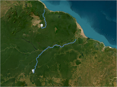
Artisanal mining is a method of extracting minerals using basic mining techniques, often with little or no concern for law, safety, or environmental impact. In parts of the Amazon, artisanal mining techniques are used to extract gold from sediments. The process involves clearing forest, making pools, washing sediment into them, and then amalgamating the small particles of gold from the sediment with mercury and burning the mercury off. The process results in deforestation, sedimentation of streams and rivers, and mercury and cyanide contamination. In this tutorial, as a researcher at an environmental nonprofit organization, you want to determine which downstream areas are impacted by contaminants that leach from mining sites into the network of streams and rivers in the Amazon basin.

To identify mining sites, you’ll use a map containing open-source data from the Amazon Mining Watch, which is generated by interpreting satellite images using machine learning. You’ll create a Sketch layer to add points at some mining sites near the rivers. Finally, you’ll use the Trace Downstream tool to create a feature layer that maps the downstream flowpaths. This output can be used in a presentation for your nonprofit on how mining impacts rivers in the Amazon.


Create an environmental justice index map 

create-an-environmental-justice-screening-tool-card.png

You are a geospatial technician in a state-level government agency concerned with environmental justice. You have been tasked with creating a screening tool that will allow state and local agencies to make decisions based on equity, ensuring that areas that are experiencing a cumulative burden of social and environmental harms are getting the most support. To accomplish this, you will design and create a composite index.

Environmental justice is the process of addressing the historic and current conditions that cause certain communities to experience a disproportionate burden of environmental hazards. It is a process that involves equity, because it recognizes that some communities—usually under-resourced communities of color—experience higher exposure to environmental hazards and are therefore more likely to develop negative health outcomes due to environmental risks. The process of mapping and analyzing inequity is an important first step in the racial equity and social justice workflow.

An index is a number that measures a subject of interest, often something that is difficult to directly measure or define, such as social vulnerability or business innovation. The Calculate Composite Index tool creates an index by combining multiple variables into a single indicator. The tool follows a three-step workflow to preprocess the variables, combine the variables, and postprocess the index. In this tutorial, you will walk through best practices for creating a composite index in ArcGIS Pro.


more
2 0 410
SilpaGadi
Esri Contributor

New ArcGIS tutorials


A Learn tutorial is a step-by-step workflow that uses a real-world scenario to introduce key ArcGIS tools, products and modern best practices. Here's a roundup of new tutorials in the ArcGIS tutorial Gallery that have appeared in the last month.

Classify areas by degree of urbanization

classify-areas-by-degree-of-urbanization.pngIn this tutorial, you'll classify the Pacific island of New Caledonia by its degree of urbanization. First, you'll create a population grid, which measures population using spatial units of uniform shape and size. You'll convert this population grid into a degree of urbanization grid, which classifies those spatial units as urban or rural based on population criteria. Last, you'll use the degree of urbanization grid to classify New Caledonia's territorial units as urban or rural.

This workflow can be repeated for any country or territory with population data and a built-up surface raster. During the workflow, you'll learn how to access a built-up surface raster for almost any location around the world, allowing you to apply the workflow to your own population data.

Identify infrastructure at risk of landslides (ArcGIS Online) 

1-gallery_landslide_pro.png

Parts of the island of Grenada are susceptible to landslides due to high levels of rainfall, steeper slopes, and various soil types. Having recently acquired high-resolution aerial imagery and elevation data, the country wants to update its GIS buildings dataset and identify infrastructure in areas that are susceptible to landslides. To support this effort, you'll upload aerial imagery for a portion of Grenada and use deep learning analysis in ArcGIS Image for ArcGIS Online to extract building footprints from the imagery. Then, you'll use raster analysis tools in ArcGIS Image for ArcGIS Online to classify the island according to landslide susceptibility and identify at-risk buildings.

Identify infrastructure at risk of landslides (ArcGIS Pro) 

1-gallery_landslide_pro.png

Parts of the island of Grenada are susceptible to landslides due to high levels of rainfall, steeper slopes, and various soil types. Having recently acquired high-resolution aerial imagery and elevation data, the government of Grenada wants to update its GIS buildings dataset and identify infrastructure in areas that are susceptible to landslides. In this tutorial, as an image analyst for the government of Grenada, you'll work with aerial imagery for a portion of Grenada and use deep learning analysis in ArcGIS Pro to extract building footprints from the imagery. Then, you'll use raster analysis tools to classify the island according to landslide susceptibility and identify at-risk buildings.

Manage your ArcGIS Online organization's members 

manage-your-arcgis-online-organization-members-card.png

Member management can save time for administrators working with an organization of any size, but it is especially crucial for larger organizations. In this tutorial, you'll manage accounts for summer interns who are temporarily joining your organization. To quickly onboard the interns, you'll create a custom role and set New Member Defaults settings.

Using custom roles and member categories to filter members allows you to perform management tasks in batch, such as provisioning licenses, assigning credits, and more. While both methods act as filters when searching for members, they have a few functional differences. Roles are a method of giving privileges and access to features of ArcGIS and can be customized for different users or work requirements as necessary. Member categories are a hierarchical structure that can be set up based on jobs, level of access, or other characteristics that act as a filter when searching for users.

Finally, once the interns have completed their summer with the company, you'll offboard them by disabling their accounts and deleting them.

Improve a deep learning model with transfer learning 

gallery-image2.png

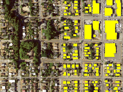
Pretrained deep learning models that can classify or detect features in imagery are available for download on ArcGIS Living Atlas of the World. Deep learning models work best on imagery that is very similar to the imagery originally used to train them. If the imagery that you have differs from that original imagery, you can improve the model’s performance by giving it examples of the features and imagery in your area of interest. This process is known as transfer learning.

In this tutorial, as a GIS analyst for the City of Seattle, you’ve been tasked with generating building footprint layers for various neighborhoods to support city planning activities. You want to use deep learning to extract building footprints from aerial imagery in ArcGIS Pro. You’ll choose a pretrained model provided by ArcGIS Living Atlas, and use the transfer learning approach to fine-tune the model’s performance on the City of Seattle imagery. You’ll provide a small number of new training samples and further train the model. You’ll then test the fine-tuned model on a Seattle neighborhood and obtain enhanced results.

Clip a layer in Map Viewer 

clip_MapViewer_gallery.png

As a field scientist, you need to be able to see specific biodiversity and distribution, but you haven't found a layer that shows this information for your location. There is, however, a global layer that contains the information you need.

In this tutorial, you will add a global layer and clip it to match the boundaries of a smaller layer. You will also learn how to style the clipped layer to match the style of the original layer.


more
3 0 549
SilpaGadi
Esri Contributor

New ArcGIS tutorials


A Learn tutorial is a step-by-step workflow that uses a real-world scenario to introduce key ArcGIS tools, products and modern best practices. Here's a roundup of new tutorials in the ArcGIS tutorial Gallery that have appeared in the last month.

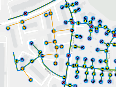
Create and manage subnetworks

create-and-manage-subnetworks-card.png

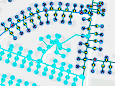
You are a GIS analyst who has just implemented a utility network at a water distribution company. You migrated your data into the utility network feature classes, cleaned up the topology and connectivity errors leftover from your previous system, and are ready to tackle the last step of the project: to configure your data so the system can accurately model the flow and pressure of water from your water treatment plants to all your customers. This flow is modeled using subnetworks, which represent your water system and pressure zones. The features that regulate these subnetworks are called subnetwork controllers.

This tutorial is the first in a series about subnetworks:


Edit and validate subnetworks 

edit-and-validate-subnetworks-card.png

You are a GIS analyst at a water utility who has recently implemented ArcGIS Utility Network. You have begun editing your data, which triggers errors. To resolve the errors, you need to validate your edits and update the subnetwork.

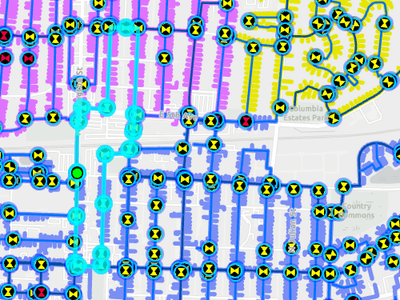
In this tutorial, you'll learn how to properly edit, validate, and update a subnetwork. You'll also assess and resolve two subnetwork errors. You'll learn how ArcGIS Utility Network tracks edits so you can identify which subnetworks are affected. You'll also learn how to identify and resolve some of the most common subnetwork errors.

Perform quality assurance on subnetworks 

perform-quality-assurance-on-subnetworks-card.png

Residents of the island of Newfoundland in Canada are considering switching to electric vehicles to reduce their carbon footprint. However, they're concerned that there won't be enough places for them to charge their vehicles.

In this tutorial, you'll determine which areas of the island are accessible to electric vehicles based on their distance from charging stations. First, you'll add Canadian charging station data to a map and filter it to Newfoundland. Then, you'll generate travel areas based on how long an electric vehicle can travel before it needs to recharge.

Get started with administering an ArcGIS Online organization 

get-started-administering-an-arcgis-online-organization-card.png

With a subscription to ArcGIS Online, organizations can manage all of their geographic content in a secure, cloud-based Esri environment. ArcGIS Online administrators are responsible for configuring the website, inviting and managing members access and licensing, and managing and monitoring resources.

In this tutorial scenario, you are a newly hired information technology specialist and have been tasked with administering your environmental consulting firm's ArcGIS Online organization. You need to understand and review the key responsibilities you have as an administrator of an ArcGIS Online organization.


Maintain your ArcGIS Online organization's content 

maintain-your-organizations-content-card.png

Spatial data, maps, and other content are a core component of an ArcGIS Onlineorganization. Whether your company uses their ArcGIS Online organization to maintain authoritative internal data or publishes content to external stakeholders, one of your most important roles as administrator is to manage and maintain content.

In this tutorial scenario, you are a newly hired information technology specialist and have been tasked with administering your environmental consulting firm's ArcGIS organization. You must understand and review the key responsibilities you have as an administrator of an ArcGIS Online organizational account.


more
3 0 387
SilpaGadi
Esri Contributor

New ArcGIS tutorials


A Learn tutorial is a step-by-step workflow that uses a real-world scenario to introduce key ArcGIS tools, products and modern best practices. Here's a roundup of new tutorials in the ArcGIS tutorial Gallery that have appeared in the last month.

Analyze aggregated data in ArcGIS Insights

analyze-aggregated-data-card.png

The number of fatal cycling accidents in Ottawa, Canada, increased between 2015 and 2018. Cycling advocates have called for the city to adopt a Vision Zero policy to eliminate traffic fatalities and increase public safety.

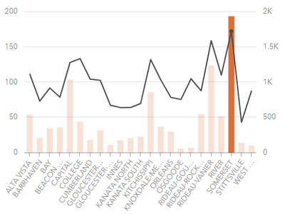
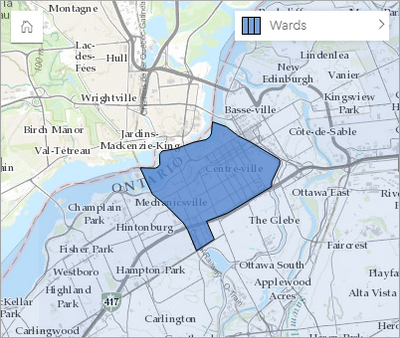
In the previous tutorial, Create a workbook in ArcGIS Insights, you created a workbook, prepared your data, and created a map of collisions. In this tutorial, you will continue the workflow by analyzing how traffic accidents are distributed across wards in Ottawa using spatial and attribute aggregation techniques.


Filter and join data in ArcGIS Insights 

Filterandjoin.png

In this tutorial, you'll look closer at the data from Somerset ward to determine the relationship between route type and number of accidents.

You know where in Ottawa the most collisions involving cyclists are occurring. But are there any patterns in the routes where collisions occur? If collisions tend to happen on specific roads, it may help city officials identify the best places to add bike routes or other bicycle safety measures.


Generate travel areas for charging stations 

generate-travel-areas-for-charging-stations.png

Residents of the island of Newfoundland in Canada are considering switching to electric vehicles to reduce their carbon footprint. However, they're concerned that there won't be enough places for them to charge their vehicles.

In this tutorial, you'll determine which areas of the island are accessible to electric vehicles based on their distance from charging stations. First, you'll add Canadian charging station data to a map and filter it to Newfoundland. Then, you'll generate travel areas based on how long an electric vehicle can travel before it needs to recharge.


more
1 1 462
107 Subscribers