- Home
- :
- All Communities
- :
- Industries
- :
- Education
- :
- Education Blog
- :
- Teaching with Heat maps of the 15 largest fast foo...
Teaching with Heat maps of the 15 largest fast food chains in the USA
- Subscribe to RSS Feed
- Mark as New
- Mark as Read
- Bookmark
- Subscribe
- Printer Friendly Page
- Report Inappropriate Content
Folks:
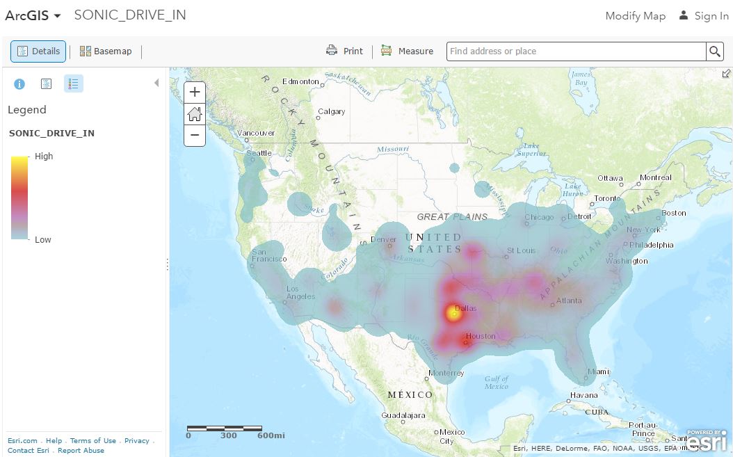
This article in Business Insider shows heat maps of the 15 largest fast food chains:
Examining this type of data might be a great way to introduce students to spatial thinking and analysis, or build on what you are already doing in the classroom. And nearly everyone has a mental map of where fast food establishments are located. Why do these patterns exist the way they do? Why do some exhibit specific regional predominance (such as Wendys, which started in Ohio, or Sonic, which started in Oklahoma, or Dunkin Donuts, which seem to be everywhere in Massachusetts)? Why are the largest sales for many chains California, Texas, Florida, or New York? What are some anomalies that can be detected?
What I like most about these maps is that underneath each one, hyperlinked to text such as “strong everywhere” or “concentrated in urban areas” are links to live web maps in ArcGIS Online, because that is where each map was generated in the first place. Try it! That means you can zoom to your own city and your students can discuss the patterns that students see between different chains, relationship to population density and busy streets and/or high schools or universities, and more. And the reason why different chains often locate near each other. When you zoom to a certain scale, the popups reveal the name of the establishment along with the sales figures. You can also change the base map, or change the symbology to analyze the sales volumes or the number of employees, or add additional layers such as zoning, traffic, and more, to really dig deeper into the investigation. All of the maps can be found in this group in ArcGIS Online.
You can even use the maps to teach about what a heat map is, using the following as one source of information:
https://www.gislounge.com/difference-heat-map-hot-spot-map/
And in ArcGIS Online (www.arcgis.com), you can create your OWN heat maps on other variables, such as crime, litter, invasive species, landfills, antique stores versus car washes, and … you get the idea.
Enjoy!
Joseph Kerski
You must be a registered user to add a comment. If you've already registered, sign in. Otherwise, register and sign in.
-
Administration
38 -
Announcements
44 -
Career & Tech Ed
1 -
Curriculum-Learning Resources
178 -
Education Facilities
24 -
Events
47 -
GeoInquiries
1 -
Higher Education
518 -
Informal Education
265 -
Licensing Best Practices
46 -
National Geographic MapMaker
10 -
Pedagogy and Education Theory
187 -
Schools (K - 12)
282 -
Schools (K-12)
184 -
Spatial data
24 -
STEM
3 -
Students - Higher Education
231 -
Students - K-12 Schools
85 -
Success Stories
22 -
TeacherDesk
1 -
Tech Tips
83
- « Previous
- Next »