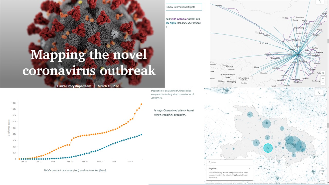
Thank you to everyone who celebrated GIS Day 2019. I invite you to share your experiences and continue the celebration by sending in your GIS Day memories to this survey and view the many events displayed on this map. As of this writing, a total of 1,583 events have been registered. The 5 free ArcGIS personal use licenses offered to each event host to distribute and the resources on the www.gisday.com website all appear to have been of high interest. This essay reports on just a few of the many inspiring stories coming in from government agencies, universities, schools, nonprofit organizations, and private companies that clearly demonstrate how GIS is making a positive difference all around the world.
Agrobiotechnical Sciences, University of Osijek, Croatia: Over 100 attendees attended a field day of UAV imaging and a workshop on the processing and interpretation of collected data. The workshop titled “Mapping of agricultural land using an unmanned aerial vehicle” was organized by the members of the Chair of Geoinformation Technologies and GIS and the AgroGIT research team. Visitors were presented with a method of point cloud, digital elevation model, and digital orthophoto generation using the collected images. The role of UAVs in the current scientific work of the research team is presented, as well as all the benefits of using precision agriculture in practice.
University of Osijek, Croatia.
Bangladesh Conservation GIS (BCGIS) and Wildlife Conservation Society: Mohammad Shamsuddoha, SCGIS Scholar 2017 and Program Officer, Wildlife Conservation Society, organized a GIS Day event in Dhaka, that included a series of events and activities for conservation professionals. These professionals came from a background in marine biology, Chiropteran biology, ornithology, fisheries, biology, and other fields. This was the first event under BCGIS which was formed by the SCGIS scholars in Bangladesh with a dream to spread the mission and vision of SCGIS. The event included information sessions, a geospatial quiz, and a hands-on mapping session, where a portion of the participants made their first maps.
Conservation focused GIS Day event in Bangladesh.
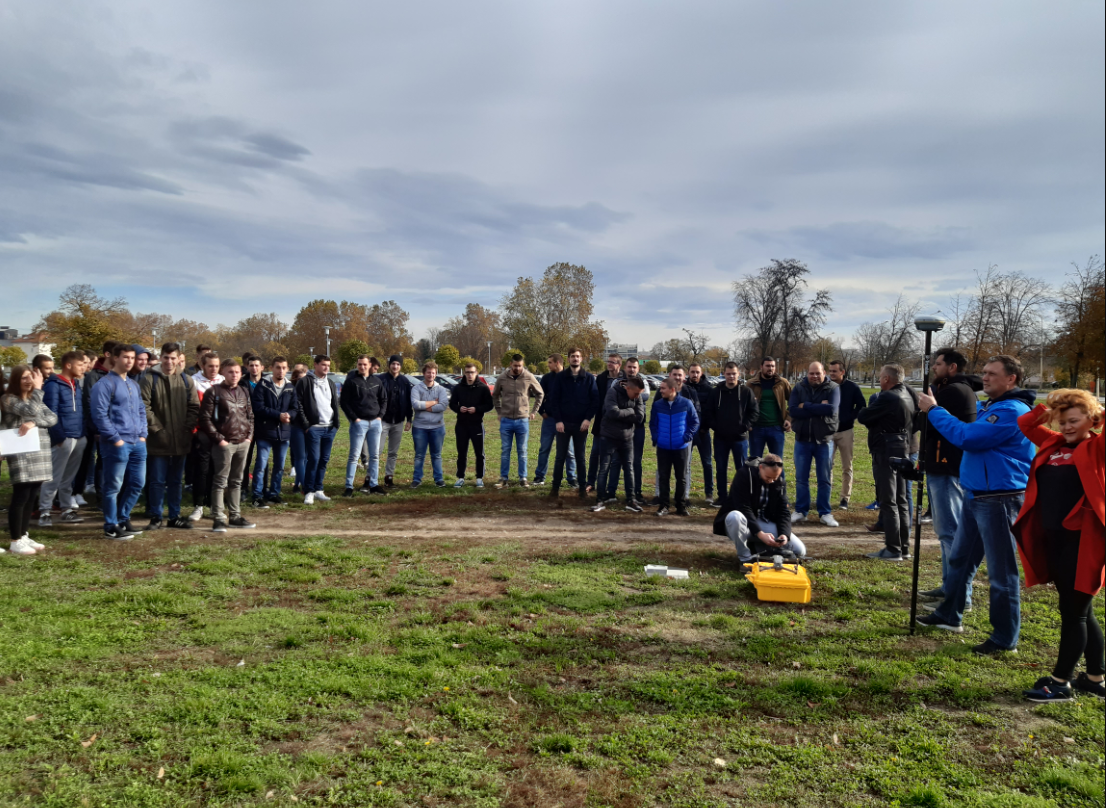
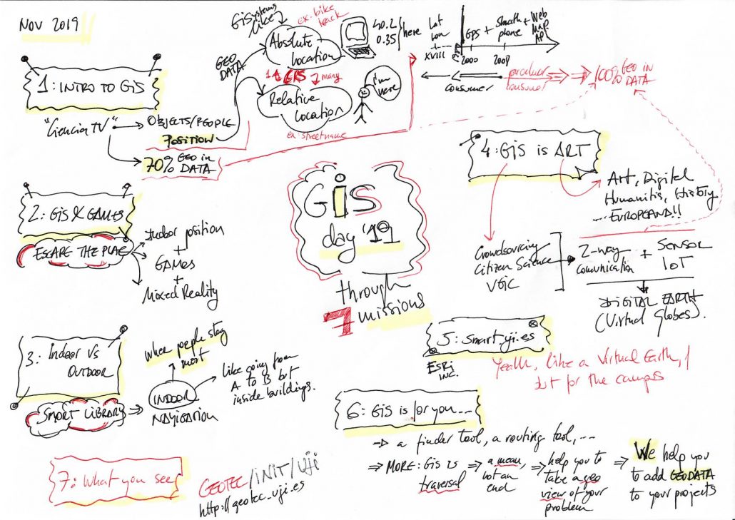
University Jaume I, Spain: The Geotec group at the university, which is near the Mediterranean Sea on the east side of the country, sponsored another successful GIS Day event. Geotec is a research group specialized in geospatial technologies and GIS development. The event was organized around a series of "Missions", which helped participants to understand how GIS is used in different fields and contexts, and they served us as an introduction to the technologies we are using everyday. Missions were perfect examples to explain projects such as A-Wear, SyMptOMS or Copernicus Academy initiative to name a few. Looking for a book in the library using indoor technologies, playing a mobile game inside a building which connects the gameplay with the current place, sharing the location of a horse sculpture at the university campus or write a post about the possible uses of GIS, were some of the missions available to complete. The last mission was to meet the staff and attend to the talk in which our colleague Carlos Granell explained how geospatial technologies supported the missions (see the sketch he prepared below). After the talk, there was opportunity for social networking, and last but not least… some prizes were also raffled.
During the event, more than 100 missions were completed by 26 participants; see the full list of missions and associated apps and tools they used at https://gisday19uji.web.app/ . A press note and some pictures about UJI GISday are also available here https://www.uji.es/com/noticies/2019/11/1q/gis-day/#. For more information on their event, see this link.
The Government of Upper Austria: Thomas Ebert from the Land Division of the Government of Upper Austria has been promoting GIS and GIS Day for many years, in conjunction with the Private University of Education. This year's celebration was one of the finest, with more than 400 students from the region converging on Linz to participate in over 30 workshops filled with hands-on activities focused on geospatial technology. See this video and these photos to experience it for yourself.
Part of the GIS Day events in Linz, Austria.
Clark College and US Forest Service: Chris Highfield, GIS Services Area Manager from the US Forest Service, reported that "Our GIS Day event was jointly held with the R6 Forest Service Data Resource Management group Customer Service Area 1 and Clark College in Vancouver Washington, who hosted the event on 15 November 2019. The enthusiasm for the event ran high before, during, and after the event. In all, 9 lightning talks were held, along with Smokey Bear picture opportunities, food and raffle items, and included people from Clark College, Clark County Planning department, Portland Community College, and Diana Perez from the Gifford Pinchot National Forest. Our Project Manager (Whitney Vonada) did an outstanding job in pulling together a really awesome event. Those that came were treated to a great experience in learning more about GIS and the Science of Where. What we learned from this year’s event will be applied to GIS Day 2020!
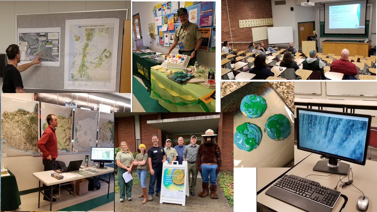
Clark College and US Forest Service GIS Day event, Vancouver Washington USA.
Texas A&M University, College Station, Texas: This event was billed as the largest GIS Day event in the world, with over 40 speakers, 30 sessions, and more than 500 attendees. All of the events were streamed and recorded for later viewing. This year's events brought geospatial computing sessions on GeoAI, the geospatial internet of things (IoT), frontiers of geospatial data science and data science applications with campus data, and geospatial social media data mining to the schedule. Event highlights included over $1,000 in prizes and awards, over 20 sponsoring organizations, over 10 organizations looking to hire, a career fair, and a crowdsourcing competition (gisday.tamu.edu).
Guatemala City, Guatemala. Silvia Paola Forno Lima organized a GIS Day held by the Municipality of Guatemala, Dirección de Información Geográfica Municipal. See attached flyer for more details on their event.
Academy of Sciences, Bulgaria: Professors Vanya Stamenova and Stefan Stamenov, students, and others participated in the GIS Day organized by Esri Bulgaria that included an exhibition "Capitals" devoted to the 140th anniversary of the establishment of Sofia as a capital of Bulgaria.
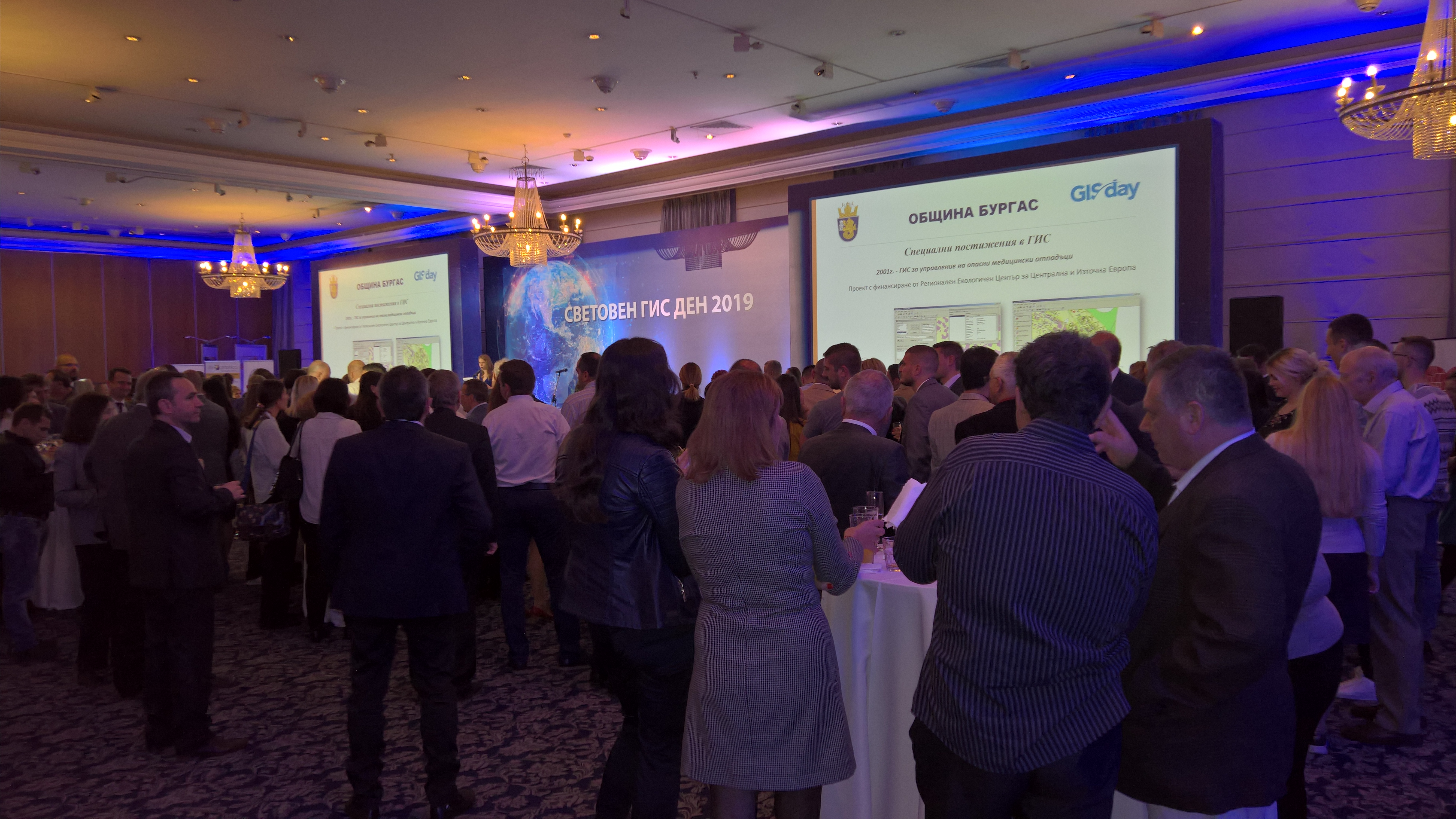
GIS Day event at the Hotel Balkan in Sofia.
Paris Training Center, Sudan: 750 people attended an event sponsored by the Paris Training Center in Sudan. The event began with seminars about GIS applications and the importance of GIS in our daily lives, as well as using GIS to achieve sustainable development goals. Workshops were conducted about GIS application with students, followed by a tour of the GIS posters, finishing up with a photo session and musical party.
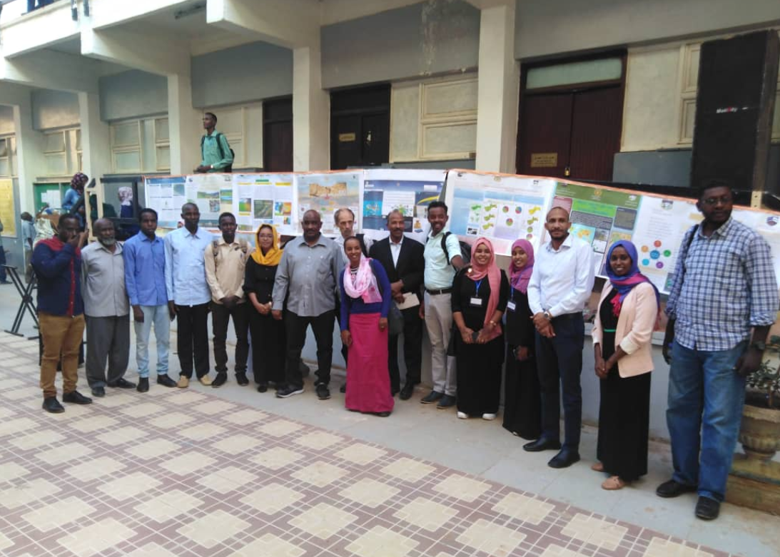
GIS Day celebration in Sudan.
On the Pakistan-China border: Survey123 and GIS were celebrated by creating awareness and work the study areas of Himalay, Karakoram, and Pamir. Students and specialists from different organizations and educators traveled from Islamabad to Khujerab to a point on the China border at 16,000 feet (4,877 m) in elevation. During the journey, tourism points, wildlife species, disaster prone areas, landslide hot spots, check points, and other important points were captured using Survey123. On the border between Pakistan and China, a one-day workshop was conducted. (Joseph's note: A beautiful and fascinating place to hold a GIS workshop!).
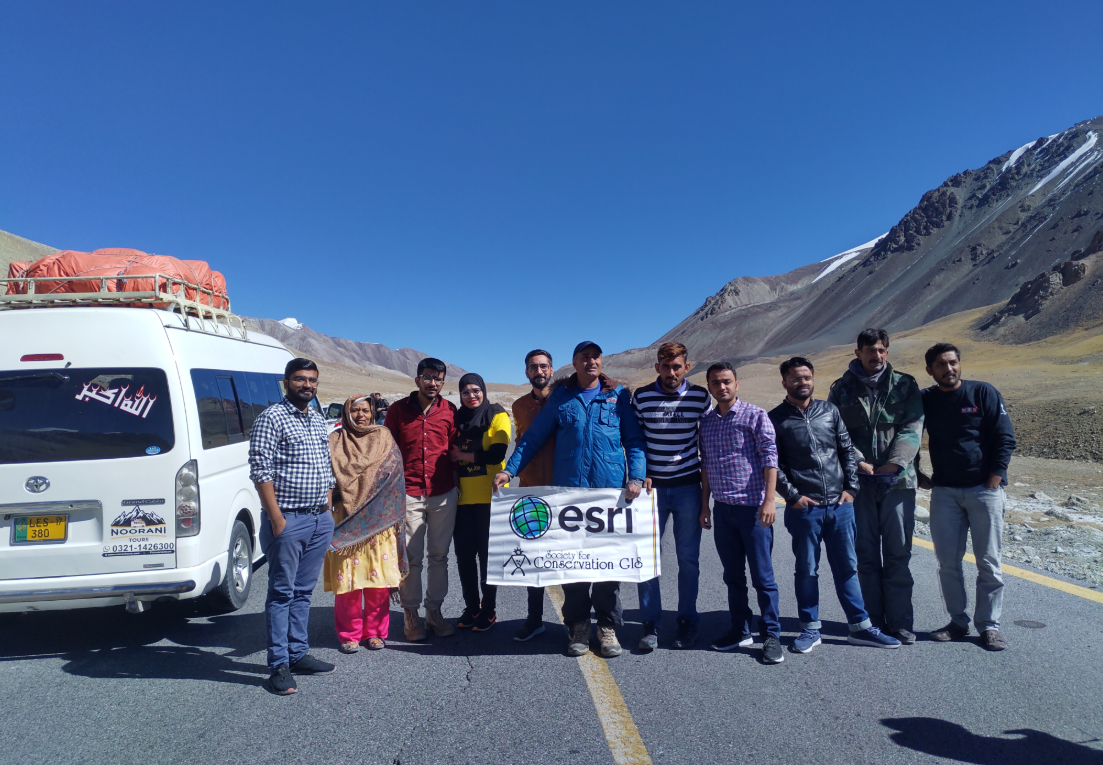
Way up high--GIS Day on the Pakistan-China border.
Weld County Colorado: Weld County, the Cities of Greeley and Evans, and the University of Northern Colorado teamed up to organize and invite local middle and high school students for a complete GIS experience. The organizing led by Geography, GIS, and Sustainability Professor Jieun Lee team created a Zombie Apocalypse Emergency scenario using Survey123, ArcGIS Online (for locating and neutralizing zombies), and an operations dashboard so students can excitingly submerge themselves in GIS experience. Their event was featured in the newspaper The Greeley Tribune.
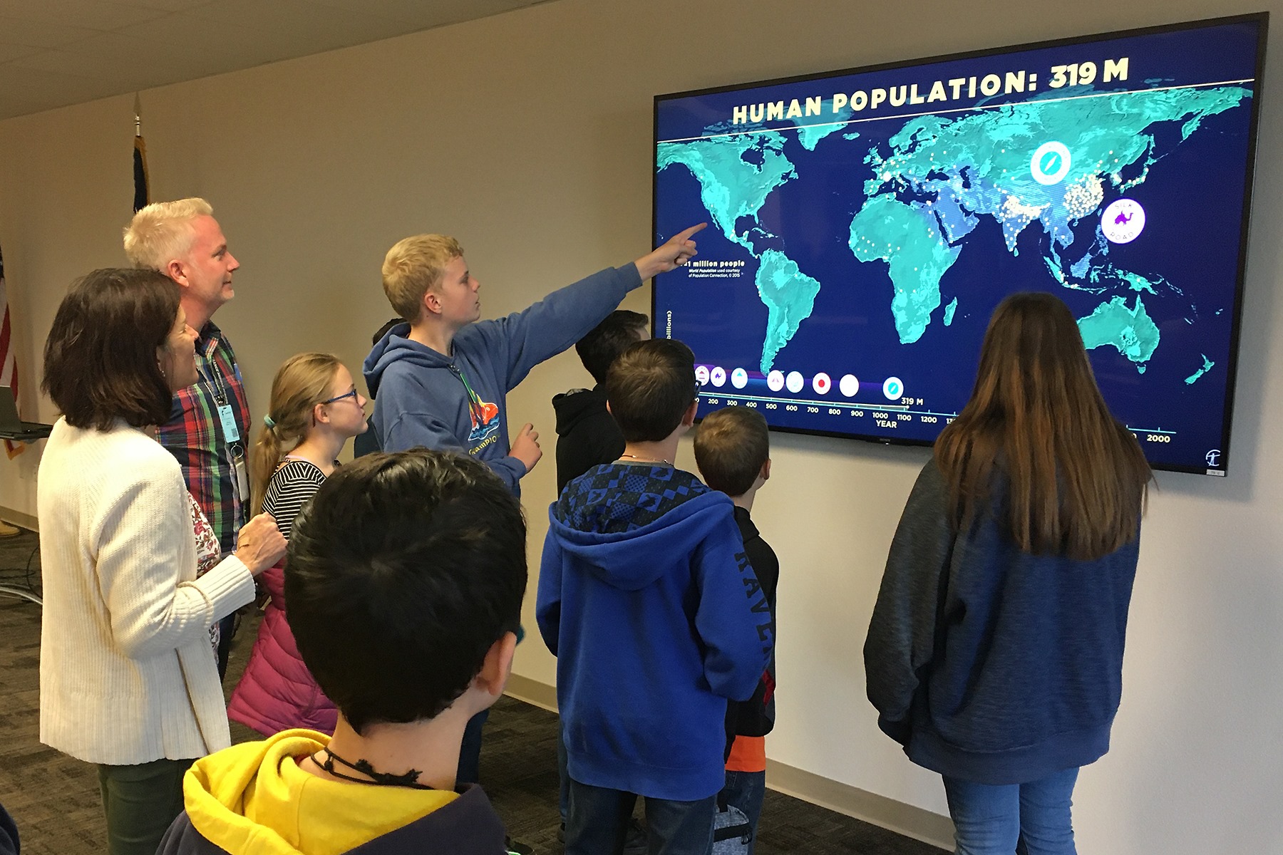
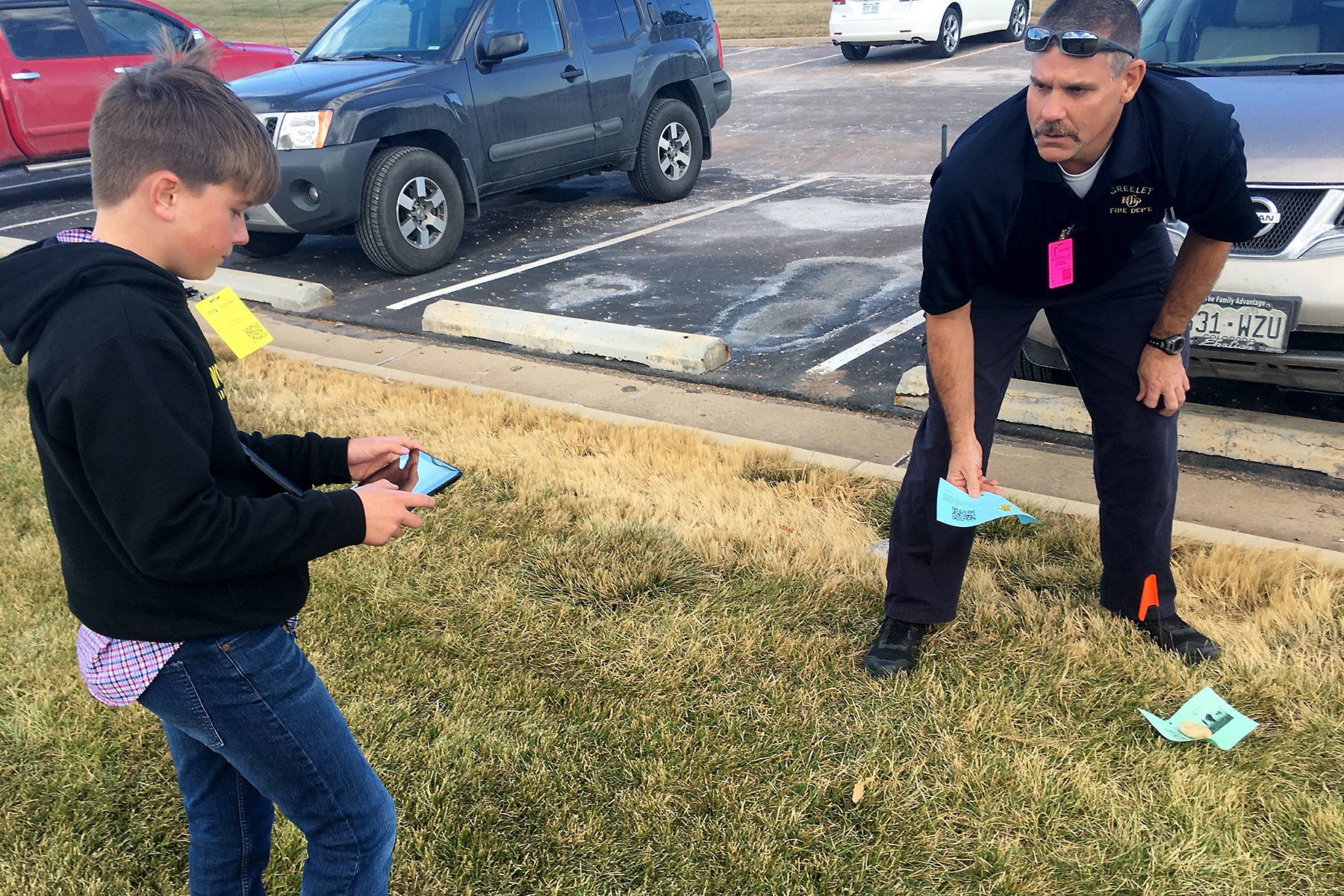
Images of Weld County Colorado's GIS Day event.
Fayetteville State University, North Carolina: Organized by Professor of Geospatial Science Dr Trung Vinh Tran, the third Annual GeoWeek and GIS 2019 Fayetteville State University included multiple activities. See the attachment for the program or visit this website. This year's multiple day program included speakers from the City of Fayetteville, Esri, the NGA Support Team – Army, 18th Airborne Corps, FT Bragg, the university History Program, and the Drone company Nine Ten Drones LLC, among others.
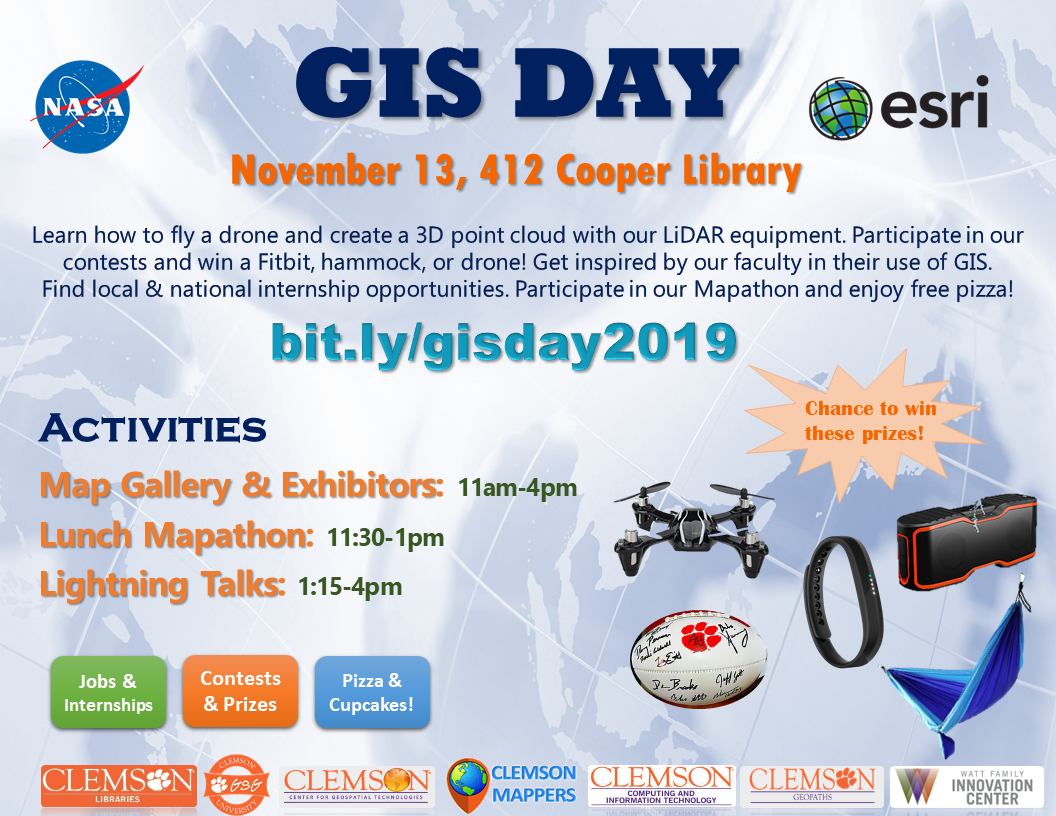
Clemson University Center for Geospatial Technologies: Clemson University's GIS events spanned two days, attracted over 425 people, and featured a series of lightning talks, a 3D printed model of campus coloring contest (which I thought was one of the most clever ideas I've ever seen), a VR topographic sandbox, exhibitors, and much more. I participated in the Clemson University event by giving a lightning talk on 5 forces in GIS, 5 trends in GIS, and 5 skills for GIS, meetings with faculty from across the campus to support their work in GIS, and conducting two hands-on workshops for students in spatial analysis in ArcGIS Online and in Business Analyst web. I was joined by two colleagues, Geoff Taylor and Zemin Dhanani, two proud Clemson alums now working for Esri, and was inspired by everyone I met and learned from. See attached for flyer for this event.
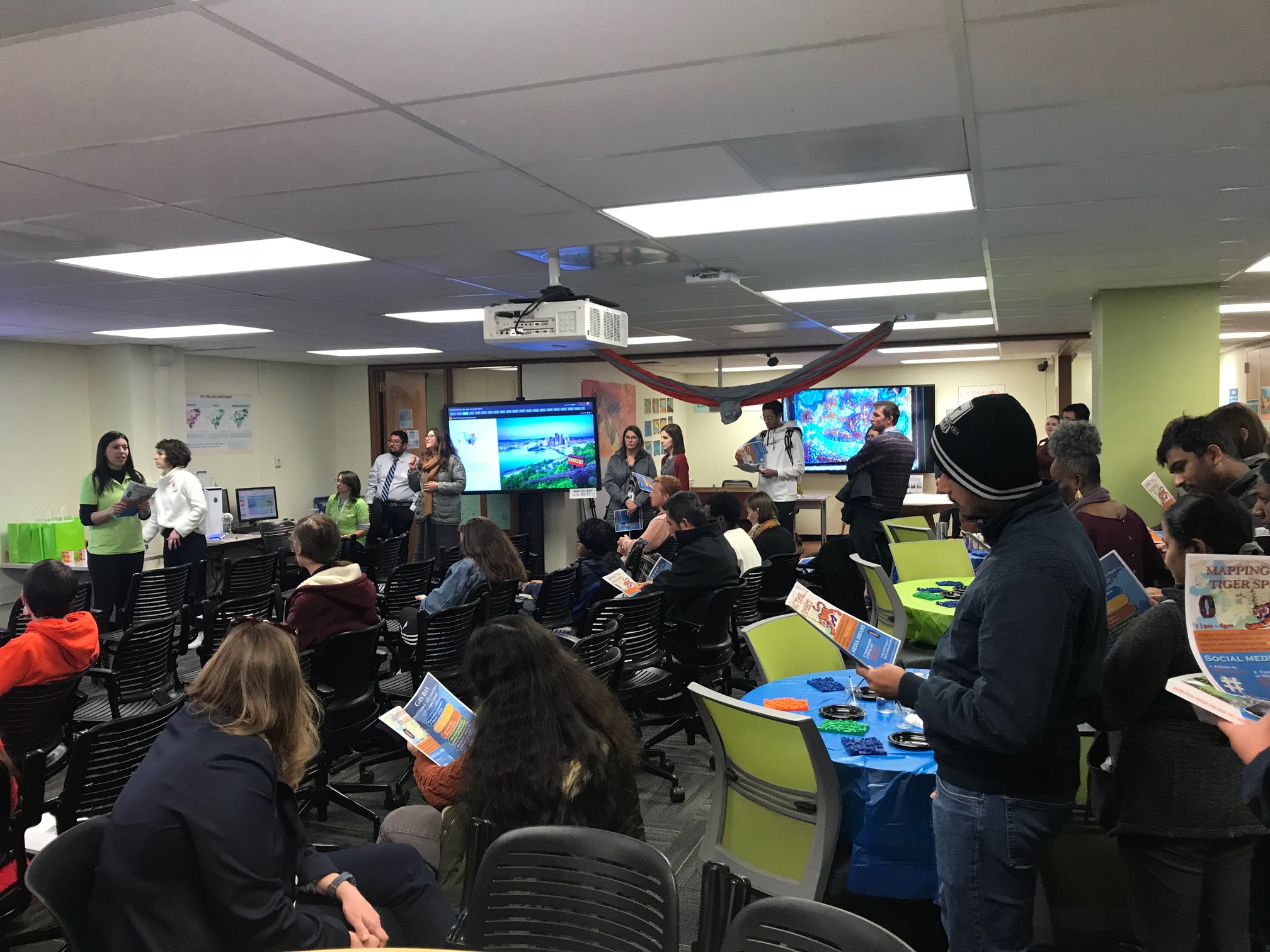
GIS Day event at Clemson University.
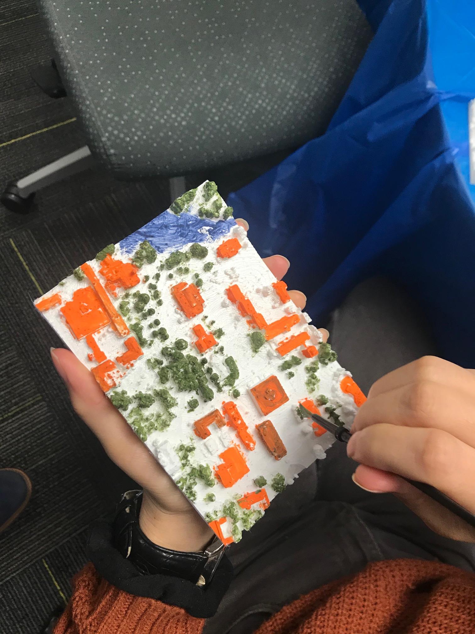
Painting contest at Clemson University where participants painted 3D models of campus that were printed on a 3D printer and made from UAV imagery.
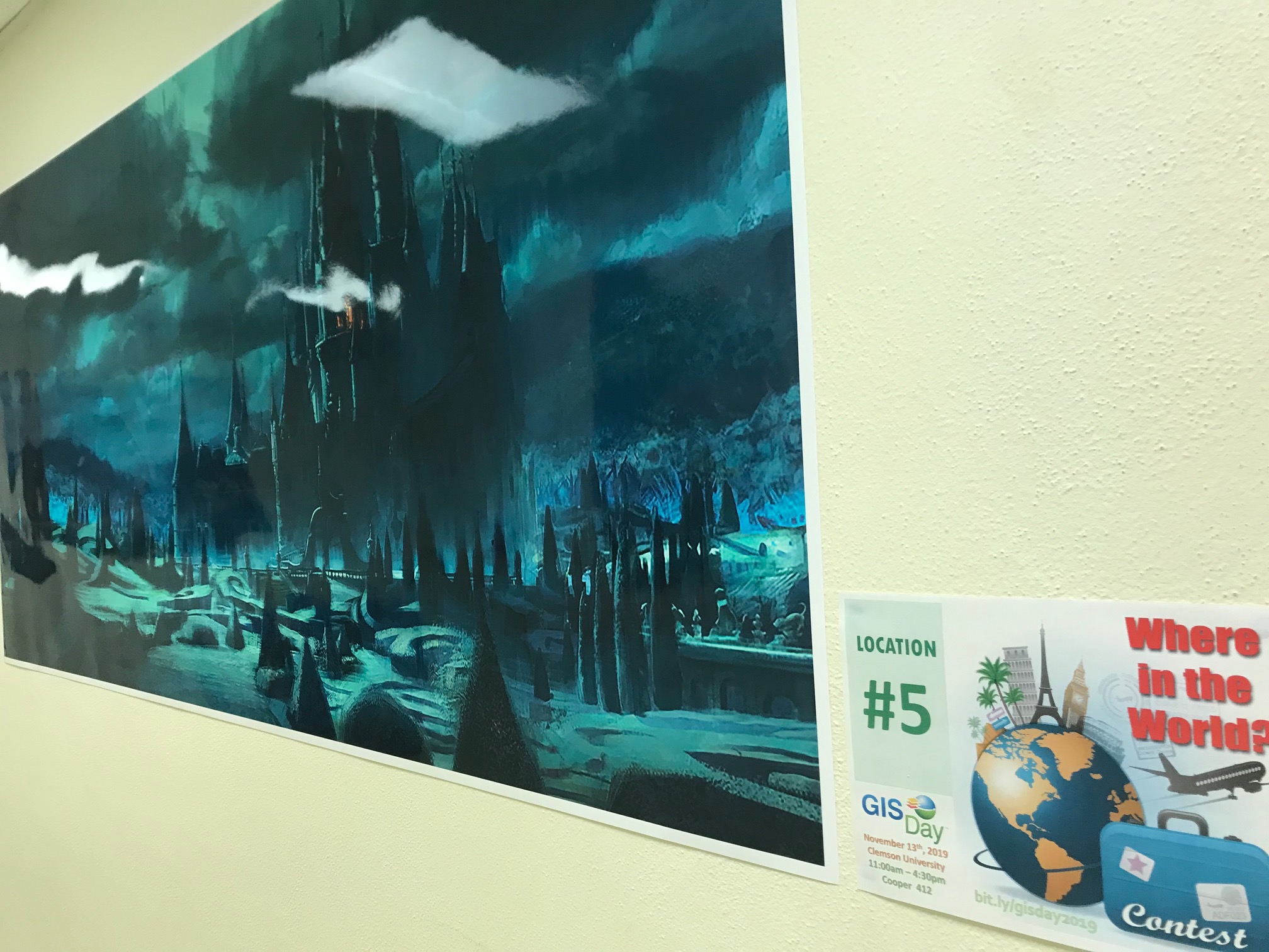
The Where in the World map contest at Clemson University was particularly challenging because many of the images were of fictitious places created for movies or books.
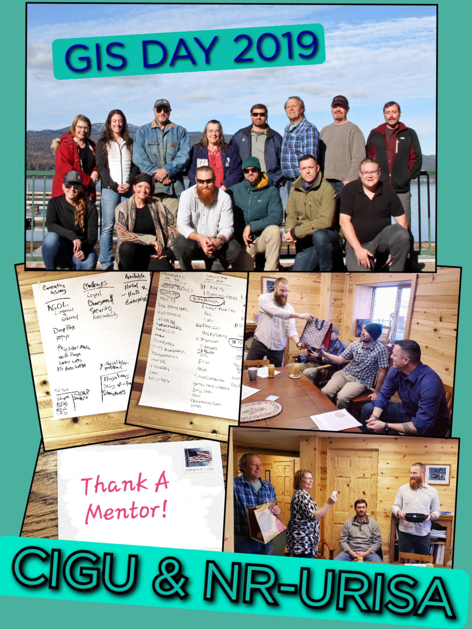
Central Idaho: Kara Utter and the Central Idaho GIS User's Group organized this year's GIS Day with raffle prizes sponsored by Esri and other items sponsored by the Northern Rockies Chapter of URISA. The diversity in
backgrounds of attendees provided for great discussion and awesome networking opportunities. Lines of communication were opened between GIS entities throughout the Central Idaho Region from local city and county governments to the US Forest Service, Surveyors and the DOD's Environmental Management Office. A committee was formed and tasked with determining how multiple jurisdictions can come together and create authoritative datasets. Enterprise Portal sharing through Sites or ArcGIS Online Sharing through Hub was introduced as a way that they can all collaborate more efficiently. Ideas for bringing GIS to the classrooms and for the planning of GIS
community projects were discussed, and finally, thank you cards were written and sent to mentors, which was an idea given in the 101 things to do on GIS Day blog essay.
The University of Illinois at Chicago: Dr Moira Zellner, professor in the department of urban planning and policy and director of the Urban Data Visualization Lab, organized an event at the University of Illinois at Chicago that was held at the Richard J. Daley Library, open to the public, and featured a range of techniques exploring different aspects of Community and Global Disparities. It included a keynote speaker, presentations, a panel, a poster session and competition, and a hands on-workshop. GIS Day brings an opportunity to learn about innovative techniques and impactful applications, and network with others interested in or working on a range of visualization approaches to classwork, research or professional activities.
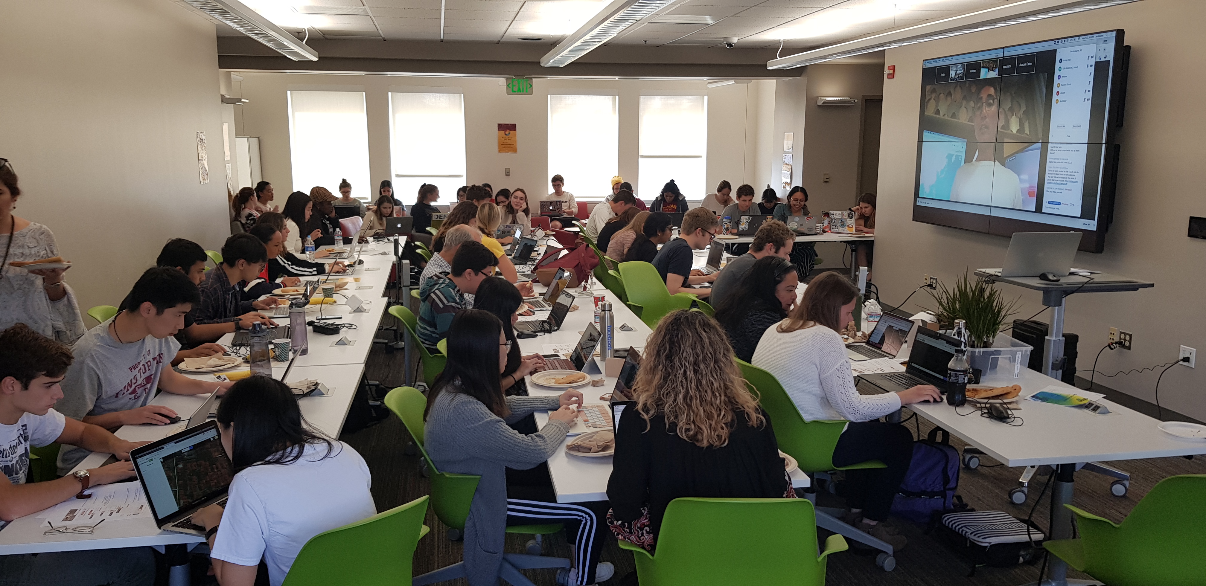
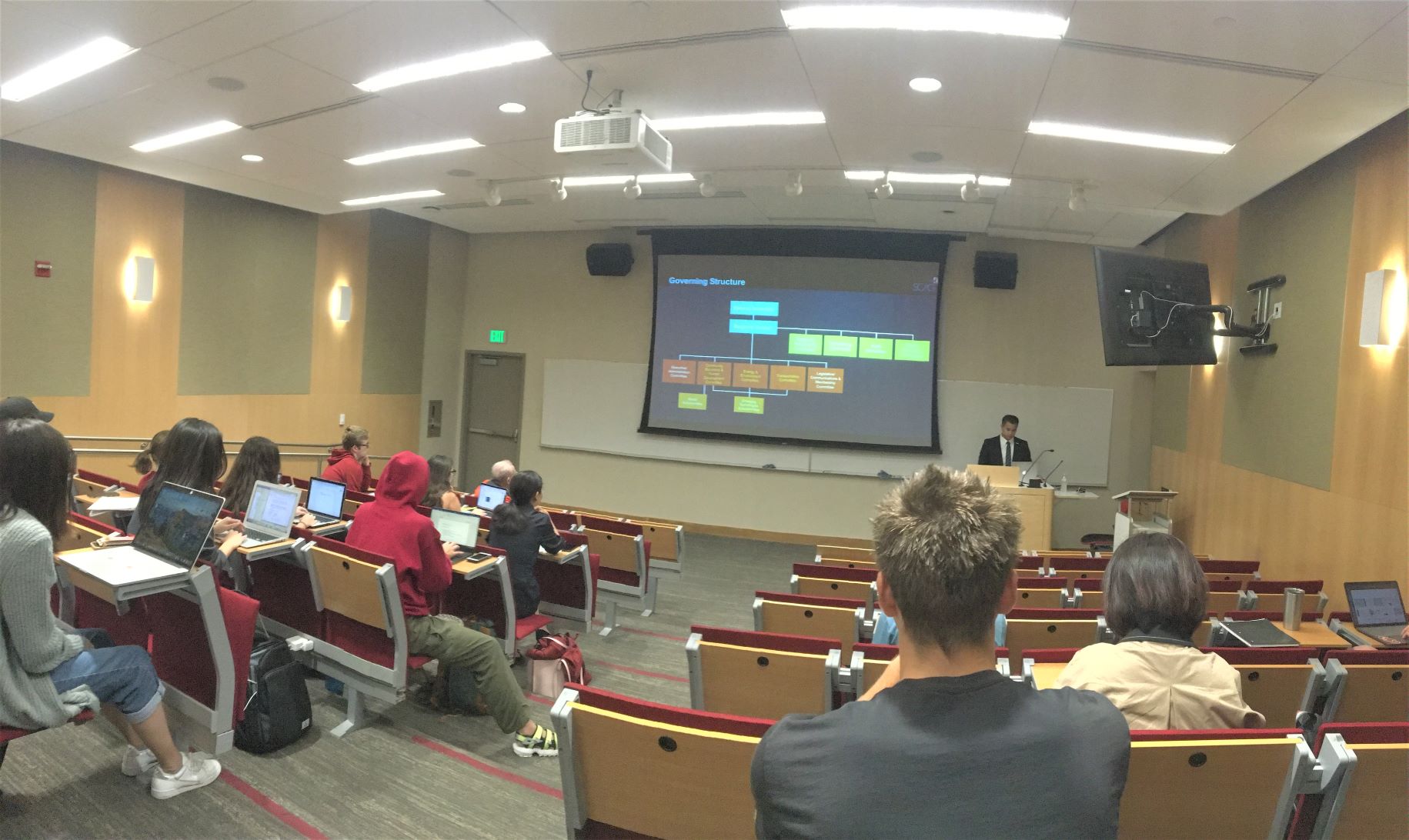
The University of Southern California's Spatial Sciences Institute: An event organized by Dr Laura Loyola of the Spatial Sciences Institute at the University of Southern California brought Tom Vo to speak at USC's 2019 GIS Day celebration. The Southern California Association of Governments (SCAG) is charged with creating a dynamic growth vision for Southern California. At SCAG’s Research and Analysis Department, Tom Vo is utilizing GIS to solve local and regional issues and promote more housing, transportation accessibility and sustainability of cities in Southern California. Andrej (Andy) Rutkowski, of the USC Libraries, in conjunction with the UCLA Institute for Digital Research, organized a USC vs UCLA Battle of the Maps event, where students from both universities mapped areas changed by natural disasters. The focus was on how climate change is impacting the environment and ways a person can make a difference through mapping on Humanitarian OpenStreetMap projects in Tegal Indonesia and in Central Asia. Collectively, 77 mappers from USC and 68 from UCLA mapped nearly 20,000 buildings!
USC vs UCLA Battle of the Maps!
GIS Day event at the University of Southern California.
Finally, shared by Esri Canada is this GIS Day cake from the land where GIS began--Canada (eh!).
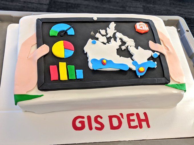
Which would you prefer? Newfoundland or Baffin Island?
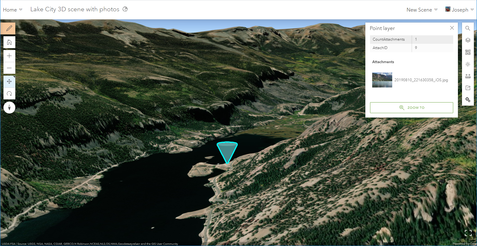
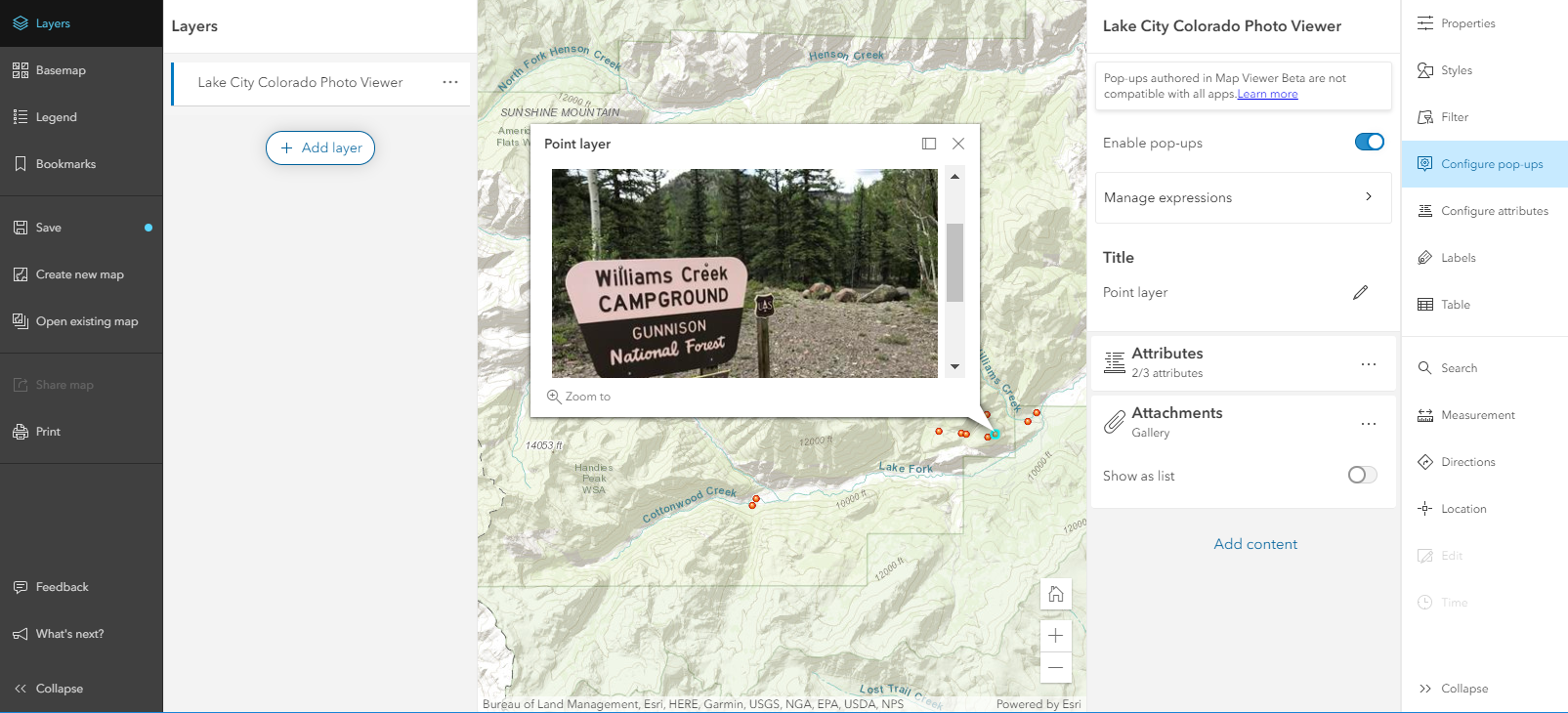
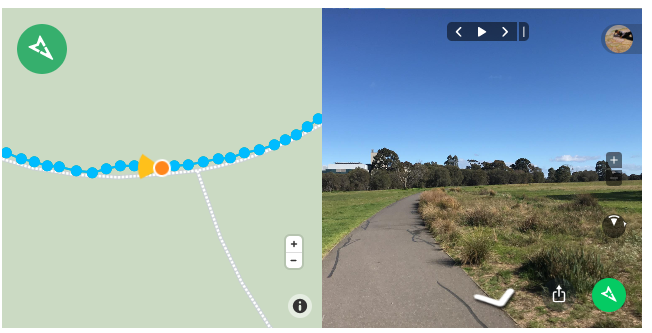
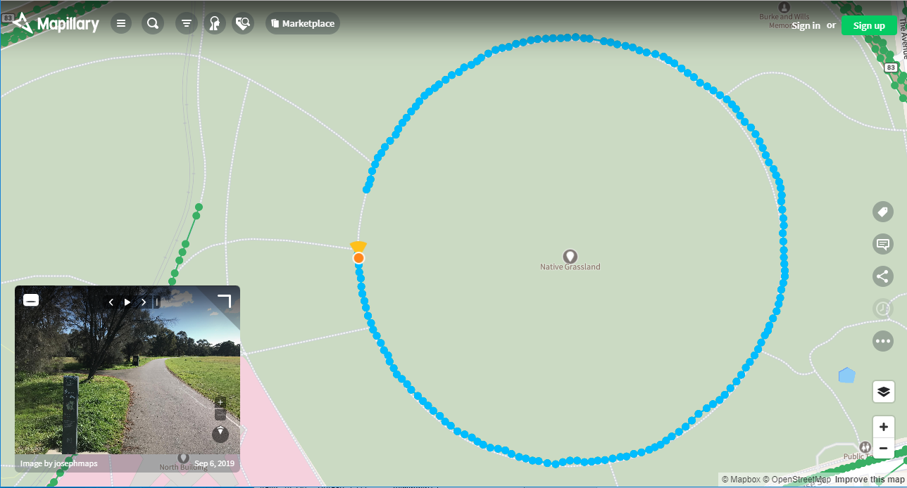
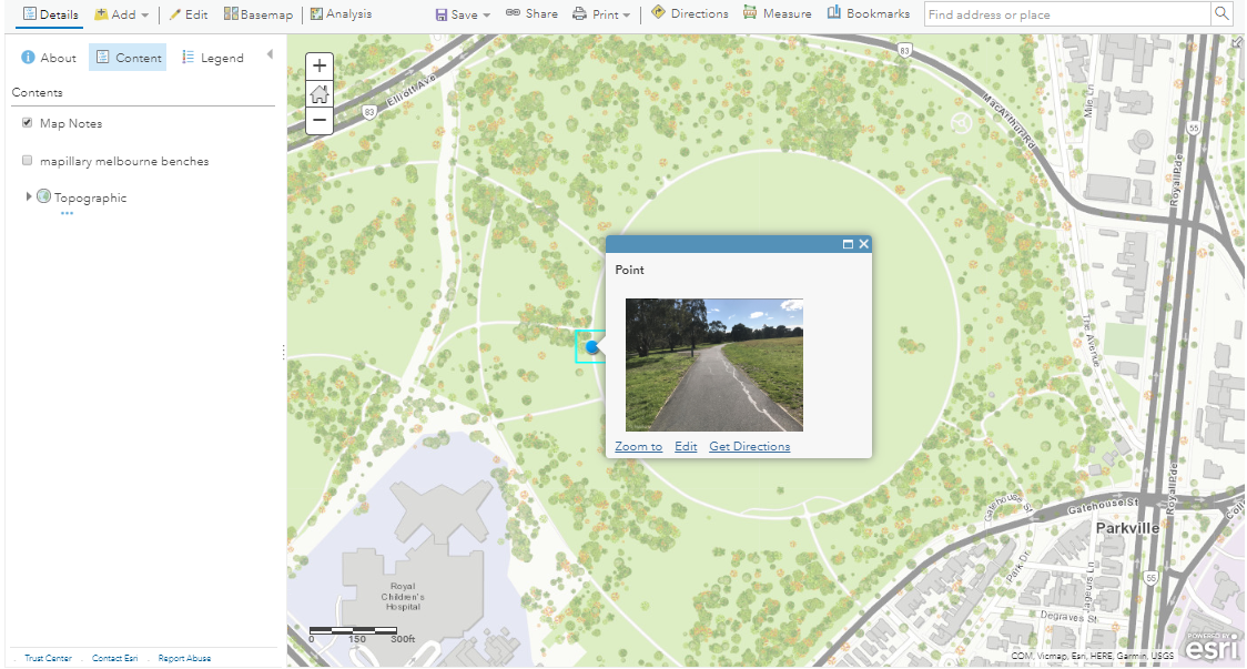
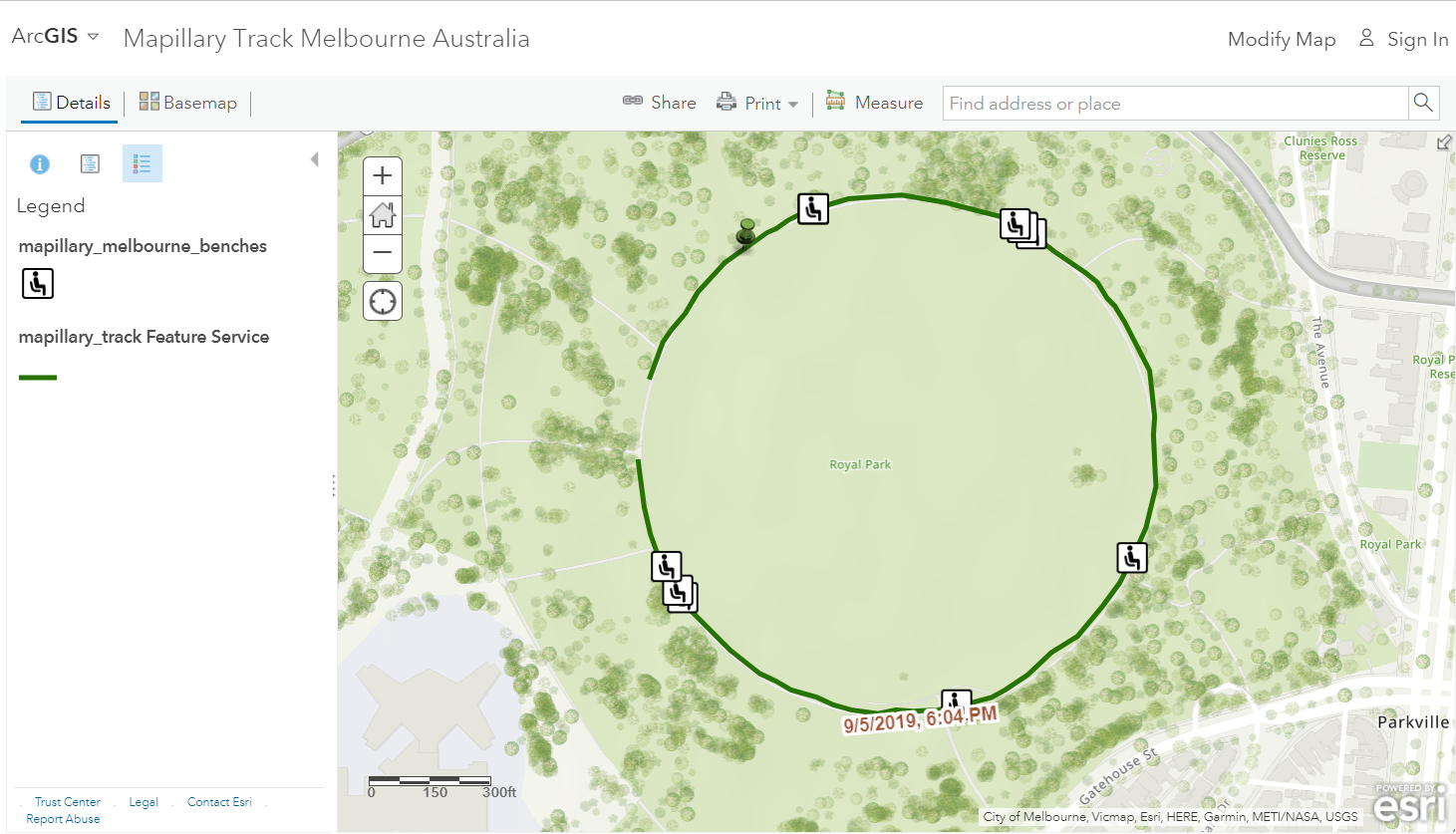
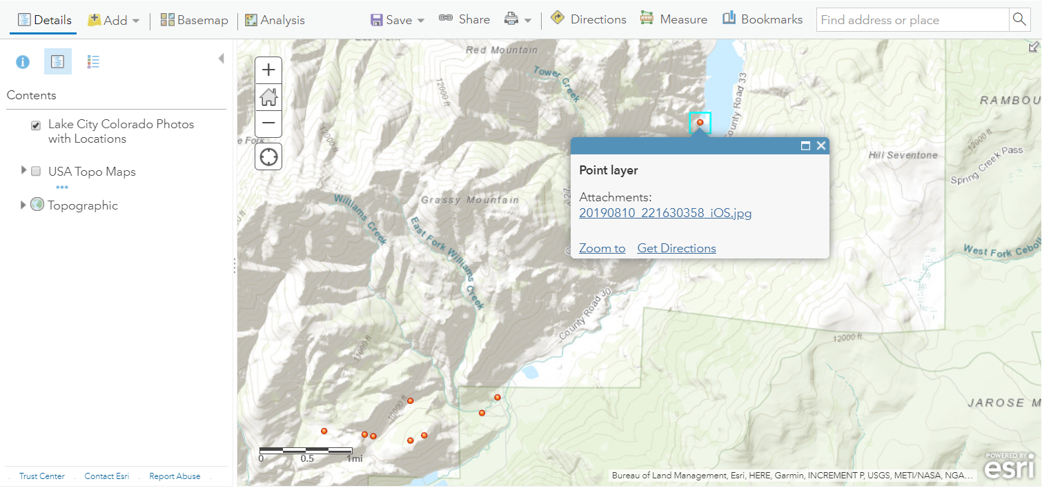 But let's say you want the photos to appear as thumbnails inside the popups. For example, see
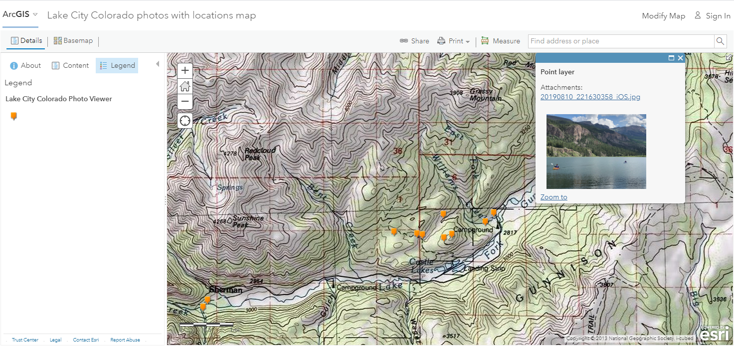