- Home
- :
- All Communities
- :
- User Groups
- :
- Coronavirus disease 2019 (COVID-19)
- :
- Questions
- :
- Re: Employee Tracking
- Subscribe to RSS Feed
- Mark Topic as New
- Mark Topic as Read
- Float this Topic for Current User
- Bookmark
- Subscribe
- Mute
- Printer Friendly Page
Employee Tracking
- Mark as New
- Bookmark
- Subscribe
- Mute
- Subscribe to RSS Feed
- Permalink
- Report Inappropriate Content
I am wanting to use the Coronavirus Business Continuity | ArcGIS Solutions
Right now this is how we keep track of who is in the office and when. The rest of the employees are at home.
We want a supervisor to keep track of when people come and go and not the individuals.
Is there a way to replicate the image below with a little modification to the solution?
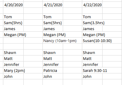
It would be nice to have a few people that are always in the office to show up. That way there is not a lot of clicking.
- Mark as New
- Bookmark
- Subscribe
- Mute
- Subscribe to RSS Feed
- Permalink
- Report Inappropriate Content
Apologies for the delayed response. The Coronavirus Business Continuity Solution does include a Team Survey that captures the information you're looking for, aggregated by a supervisor. It is outlined in the Solutions page (Coronavirus Business Continuity | ArcGIS Solutions ) and highlighted in this video: Discuss the New Coronavirus Business Continuity Solution - YouTube
Once this data is collected it can be visualized in a number of ways. By default, it gets plugged into a very nice looking dashboard. But if you have a need to have it converted into a formatted Excel document, you can use ArcGIS Notebooks (now in ArcGIS Online) and the Python API to create that document from the data, however you would like to format it: ArcGIS API for Python | ArcGIS for Developers