- Home
- :
- All Communities
- :
- Products
- :
- ArcGIS StoryMaps
- :
- Classic Esri Story Maps Questions
- :
- Re: Story Map Series Pop Up not open when map is d...
- Subscribe to RSS Feed
- Mark Topic as New
- Mark Topic as Read
- Float this Topic for Current User
- Bookmark
- Subscribe
- Mute
- Printer Friendly Page
Story Map Series Pop Up not open when map is display
- Mark as New
- Bookmark
- Subscribe
- Mute
- Subscribe to RSS Feed
- Permalink
- Report Inappropriate Content
Hi.
I have a Story Map Series. I enabled pop up custom configuration and saved it. However, I tested it and it doesn't open pop up when the map is display as it is supposed to be.
I want have this sample setting as this link sample I found.
https://uwsp.maps.arcgis.com/apps/MapSeries/index.html?appid=feae8ba75ec14bd5a3ba33586d62b2e1
Note: I am using google chrome.
Please assist. Thanks
Solved! Go to Solution.
- Mark as New
- Bookmark
- Subscribe
- Mute
- Subscribe to RSS Feed
- Permalink
- Report Inappropriate Content
It looks like this embedded app is displaying in its mobile view. It does that when the screen gets narrower or shorter. If you open the embedded app in its own window, change the window's dimensions to be shorter or narrower, and then reload the page, you should be able to see this mobile layout. I'm not sure why it has just started happening, but this change would be coming from the embedded app, not the Map Series app.
It still looks to me like the embedded app is from Web AppBuilder, but I can't tell for certain what its details are from the mobile version in the screenshot. Do you know what theme it's using and when the app was created? A screenshot of the non-mobile version might help as well.
- Mark as New
- Bookmark
- Subscribe
- Mute
- Subscribe to RSS Feed
- Permalink
- Report Inappropriate Content
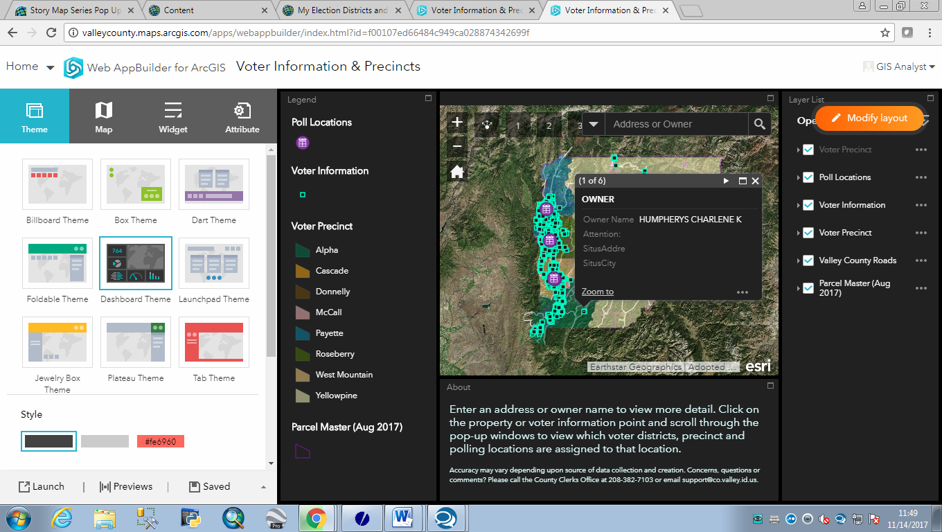
Yes, it is an app from Web AppBuilder, the Dashboard theme, here is how it looks in edit-mode:
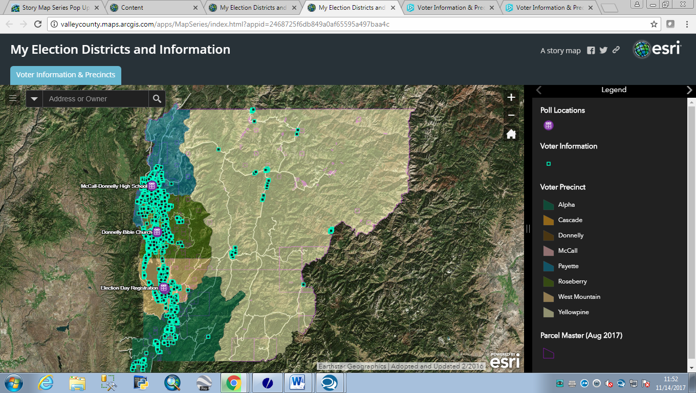
Here is how it looks when I embed it, it makes sense what you are saying about mobile transformation but I wish that it would not do that - it did not used to.
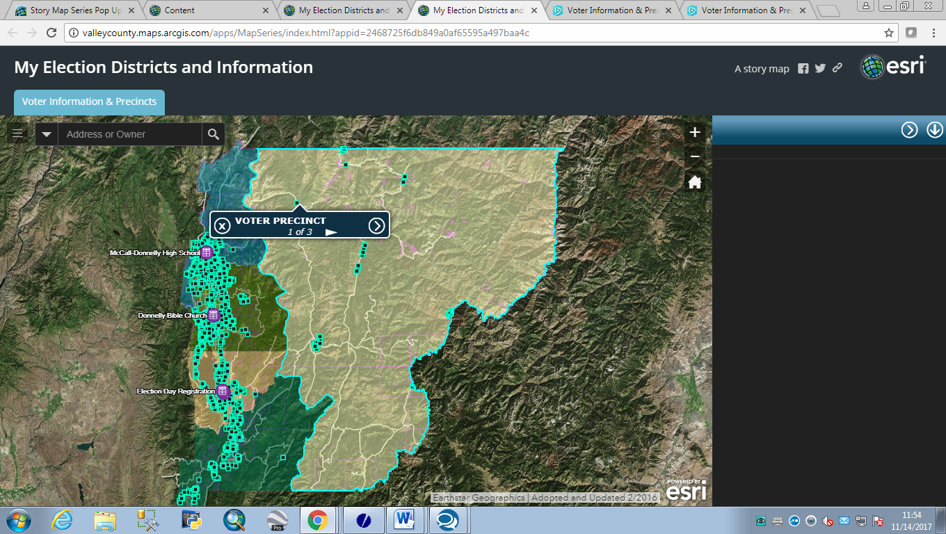
Here is how it looks when I click on an object - not only is there no longer a traditional pop-up, but there is also a blank information box that pops up on the right side of the screen:
The disappointing part is that there used to be a traditional pop up so my roads department could easily edit the information. They are limited in their understanding of this kind of technology and the less click they had to make, the better. I wonder if there is a way to get it back to where it gives the traditional pop-up again when I embed it? Otherwise, I'm at a loss. None of the story maps seem to want to allow a traditional pop-up when embedding this dashboard themed application any more.
- Mark as New
- Bookmark
- Subscribe
- Mute
- Subscribe to RSS Feed
- Permalink
- Report Inappropriate Content
Thanks for the screenshots and more information. I can reproduce this by embedding a Web AppBuilder dashboard app in a Map Series Story Map, and then viewing the result on a relatively small screen.
The Web AppBuilder app is setting its mobile layout (and thus mobile popups) based on the size of the container that it's in. It switches to mobile layout if that container is narrower than 600 pixels wide or shorter than 600 pixels tall. Because the header of a Map Series app takes up about 100px of height, this means an embedded Web AppBuilder app will display in mobile layout if your browser window is shorter than about 700px.
This isn't anything that Story Maps can control on our end -- it's entirely a function of Web AppBuilder.
It's weird that this just started happening recently -- I looked at the Web AppBuilder code, and the 600px breakpoint has been around for at least a year. MapSeries hasn't changed its formatting or sizing either. Did you recently get a different monitor, or change your monitor's settings? I ran across this question in GeoNet that seems related to what you're seeing: WAB pop-ups in mobile format on desktop browser
If nothing has changed on your end, there is a way to force your Web AppBuilder app to display in desktop mode at smaller screen sizes. When you enter the URL of your Web AppBuilder app into Map Series, you can add a url parameter to the end of the URL to change the 600px breakpoint to something smaller, like this:
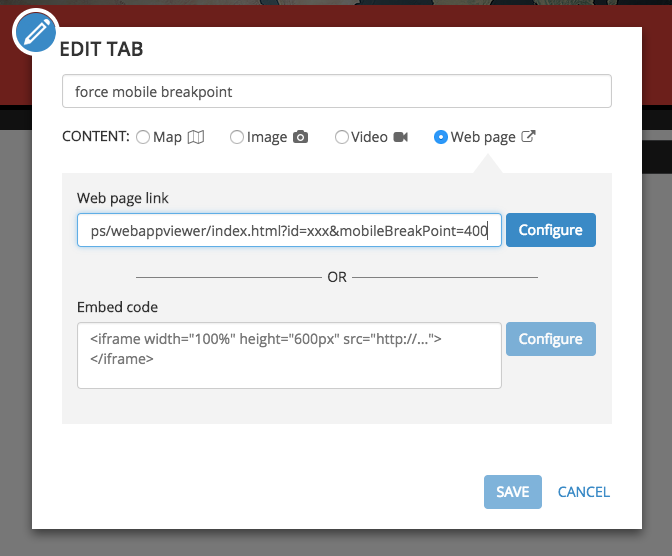
With the addition of &mobileBreakPoint=400, your embedded app will display in desktop mode all the way down to 400px high or 400px wide. If that's not small enough, make that 400 smaller.
But this will apply to all smaller screens -- so if a user is viewing your Map Series app on an actual mobile phone, they'll still get the desktop layout of the embedded Web AppBuilder.
Here is the Web AppBuilder documentation about this and other url parameters you can use with any Web AppBuilder app: Use URL parameters—Web AppBuilder for ArcGIS (Developer Edition) | ArcGIS for Developers
- Mark as New
- Bookmark
- Subscribe
- Mute
- Subscribe to RSS Feed
- Permalink
- Report Inappropriate Content
Wow! That's super helpful!!
This is a method I use only for internal departments for dashboard purposes, especially for the road department assets and the prioritization of their maintenance needs, so that 400 pixel limit will be SUPER helpful, as they will only be using desktops.
Thank you so much!! 
- « Previous
-
- 1
- 2
- Next »
- « Previous
-
- 1
- 2
- Next »