- Home
- :
- All Communities
- :
- User Groups
- :
- Cartography and Maps
- :
- Questions
- :
- Re: Tips on how to visualize demographic changes b...
- Subscribe to RSS Feed
- Mark Topic as New
- Mark Topic as Read
- Float this Topic for Current User
- Bookmark
- Subscribe
- Mute
- Printer Friendly Page
Tips on how to visualize demographic changes better?
- Mark as New
- Bookmark
- Subscribe
- Mute
- Subscribe to RSS Feed
- Permalink
- Report Inappropriate Content
Is it posible to get some feedback on maps showing dempgraphic change and plots from transportation models?
i have made 5 maps showing:
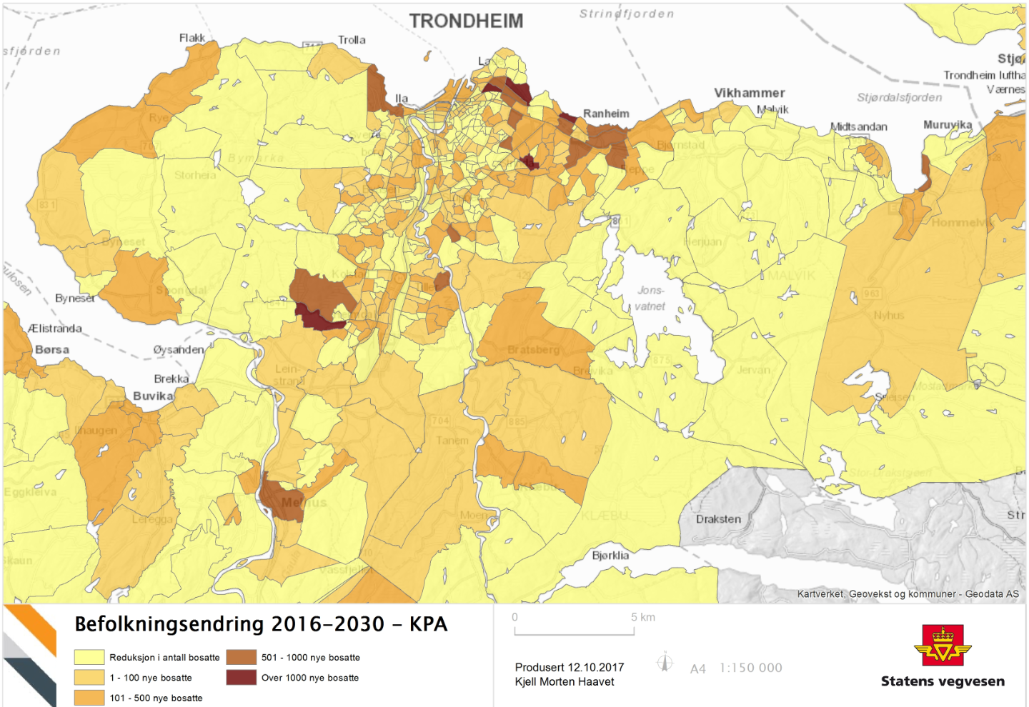
1. Demographics for 2016
2. Change from 2016-2030
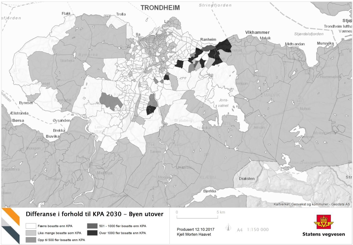
3. diffrence between old end new prognocis for 2030
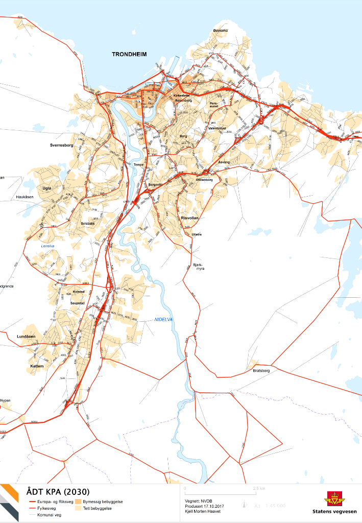
4. Results from Transportation analysis for 2030
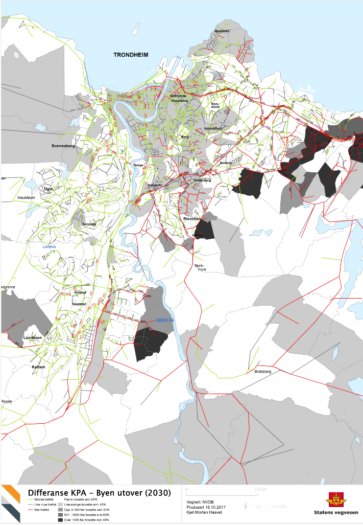
5. Plot from transportation analysis 2030 showing the diffrence between old and new demographic prognosis
Map 1: Demograpichs in 2016 divided by city zones

Map 2: Change fram 2016 - 2030 divided by city zones
Map 3: There is made a new demographic distribution for 2030, this map show the diffrence between the new distrubution and the original. Darker zones have more people then original distrubution and white have less.
Map 5: Resoult fromTransportation analysis for the original demographic distrubution for 2030. Shows amount of traffic.
Map 5. Shows resoult of transportation analysis with a new demographic distrubution. This shows the connection between population growth and traffic. Red roads have more traffic and green roads have less traffic then the origional distrubution for 2030.
Any feedback/ tips on how to make these look bether?
- Mark as New
- Bookmark
- Subscribe
- Mute
- Subscribe to RSS Feed
- Permalink
- Report Inappropriate Content
Await the 1000 opinions 
One situation that I see arising in some of the earlier maps, is that the areas which exhibit the greatest change also have a small area. Being bounded by using a conventional view of geometry, it is really hard to make them 'pop' short of using a fluorescent symbol color, or having them pulsate in the z direction.
One solution... very old school... is to use a 'Cartogram' Different types exist, but in short, the geometry is altered to reflect the importance of the attribute in question.
I won't provide links until you have ruled out other methods and want to think outside the box.
Good luck
- Mark as New
- Bookmark
- Subscribe
- Mute
- Subscribe to RSS Feed
- Permalink
- Report Inappropriate Content
Interesting, guess I have to check it out 
- Mark as New
- Bookmark
- Subscribe
- Mute
- Subscribe to RSS Feed
- Permalink
- Report Inappropriate Content
Consider using "heat maps" and possibly "infograghpics". . . I have had success with crash data and traffic count data (over time), in telling the story to the reader. Good luck!
- Mark as New
- Bookmark
- Subscribe
- Mute
- Subscribe to RSS Feed
- Permalink
- Report Inappropriate Content
thanks, im not sure about heatmaps for this use, but i`ll check it out. But i will certainly try to include some infographics in my maps.
- Mark as New
- Bookmark
- Subscribe
- Mute
- Subscribe to RSS Feed
- Permalink
- Report Inappropriate Content
....and a follow-up guestion: does Arcmap have good enough tools to make good infographics or are there other tools out there thats better for this?